

Note
Go to the end to download the full example code.
NCL_vector_4.py#
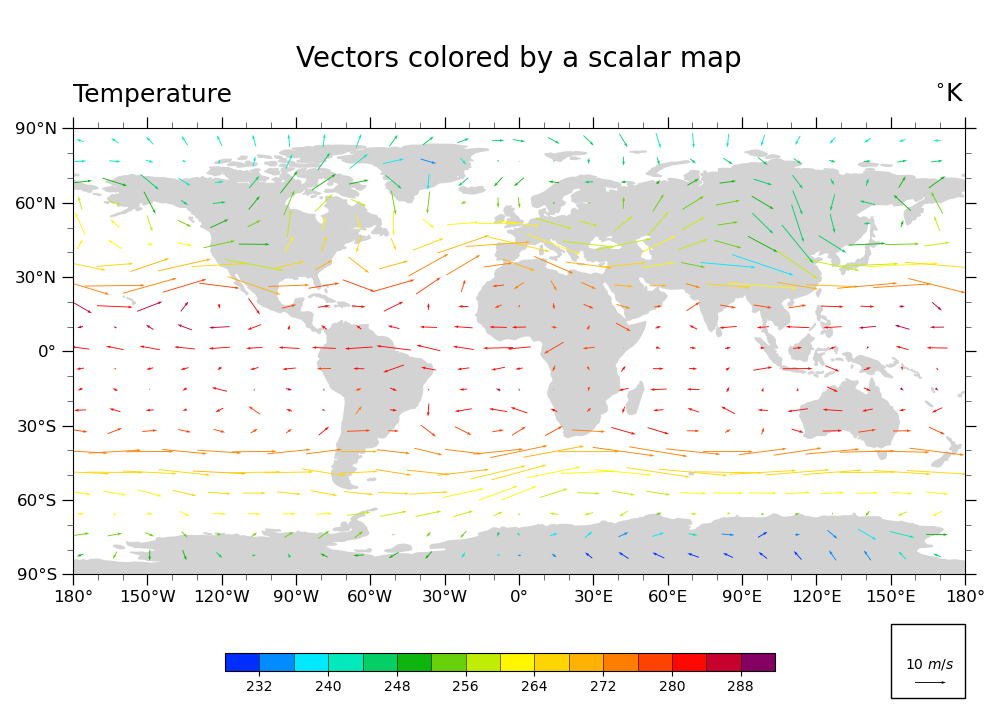
Plot U & V vectors globally, colored according to temperature
- This script illustrates the following concepts:
Coloring vectors based on temperature data
Changing the scale of the vectors on the plot
- See following URLs to see the reproduced NCL plot & script:
Original NCL script: https://www.ncl.ucar.edu/Applications/Scripts/vector_4.ncl
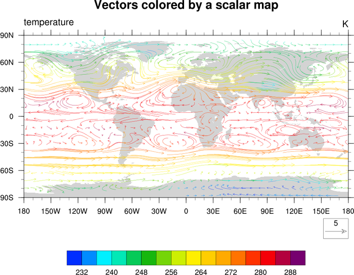
Original NCL plot: https://www.ncl.ucar.edu/Applications/Images/vector_4_lg.png
Import packages:
import xarray as xr
from matplotlib import pyplot as plt
import cartopy
import cartopy.crs as ccrs
import cmaps

import geocat.datafiles as gdf
import geocat.viz as gv
Read in data:
# Open a netCDF data file using xarray default engine and load the data into xarrays
file_in = xr.open_dataset(gdf.get("netcdf_files/83.nc"))

# Extract slices of lon and lat for first timestamp and 13th lev
ds = file_in.isel(time=0, lev=12, lon=slice(0, -1, 5), lat=slice(2, -1, 3))
Plot:
# Because there is no equivalent to ``CurlyVector`` in ``geocat.viz`` yet,
# this plot does not look as identical as the NCL version.

# Generate figure (set its size (width, height) in inches)
fig = plt.figure(figsize=(10, 7.25))

# Generate axes using Cartopy projection
ax = plt.axes(projection=ccrs.PlateCarree())

# Import an NCL colormap and truncate it for a range and color levels
cmap = gv.truncate_colormap(cmaps.BlAqGrYeOrReVi200, minval=0.03, maxval=0.95, n=16)

# Draw vector plot
# (there is no matplotlib equivalent to "CurlyVector" yet)
Q = plt.quiver(
    ds['lon'],
    ds['lat'],
    ds['U'].data,
    ds['V'].data,
    ds['T'].data,
    cmap=cmap,
    zorder=1,
    pivot="middle",
    width=0.001,
)
plt.clim(228, 292)

# Draw legend for vector plot
ax.add_patch(
    plt.Rectangle(
        (150, -140), 30, 30, facecolor='white', edgecolor='black', clip_on=False
    )
)
qk = ax.quiverkey(
    Q, 0.93, 0.06, 10, r'10 $m/s$', labelpos='N', coordinates='figure', color='black'
)

# Use geocat.viz.util convenience function to add minor and major tick lines
gv.add_major_minor_ticks(ax, labelsize=12)

# Use geocat.viz.util convenience function to make plots look like NCL plots by using latitude, longitude tick labels
gv.add_lat_lon_ticklabels(ax)

# Set major and minor ticks
plt.xticks(range(-180, 181, 30))
plt.yticks(range(-90, 91, 30))

# Use geocat.viz.util convenience function to add titles to left and right of the plot axis.
gv.set_titles_and_labels(
    ax,
    maintitle="Vectors colored by a scalar map",
    lefttitle="Temperature",
    righttitle=r"$^{\circ}$K",
)

cax = plt.axes((0.225, 0.075, 0.55, 0.025))
cbar = fig.colorbar(
    Q,
    ax=ax,
    cax=cax,
    orientation='horizontal',
    ticks=range(232, 289, 8),
    drawedges=True,
)

# Turn on continent shading
ax.add_feature(
    cartopy.feature.LAND, edgecolor='lightgray', facecolor='lightgray', zorder=0
)

# Generate plot!
plt.tight_layout()
plt.show()
/home/docs/checkouts/readthedocs.org/user_builds/geocat-examples/checkouts/latest/Gallery/Vectors/NCL_vector_4.py:110: UserWarning: This figure includes Axes that are not compatible with tight_layout, so results might be incorrect.
  plt.tight_layout()
Total running time of the script: (0 minutes 0.213 seconds)