

Note
Go to the end to download the full example code.
NCL_panel_3.py#
- This script illustrates the following concepts:
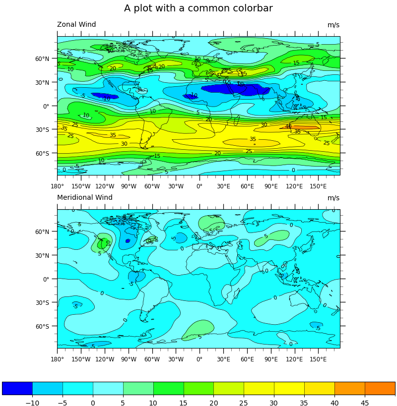
Two panel (subplot) image with shared colorbar and title
Adding a common title to paneled plots
Adding a common colorbar to paneled plots
Importing and truncating a NCL colormap
- See following URLs to see the reproduced NCL plot & script:
Original NCL script: https://www.ncl.ucar.edu/Applications/Scripts/panel_3.ncl
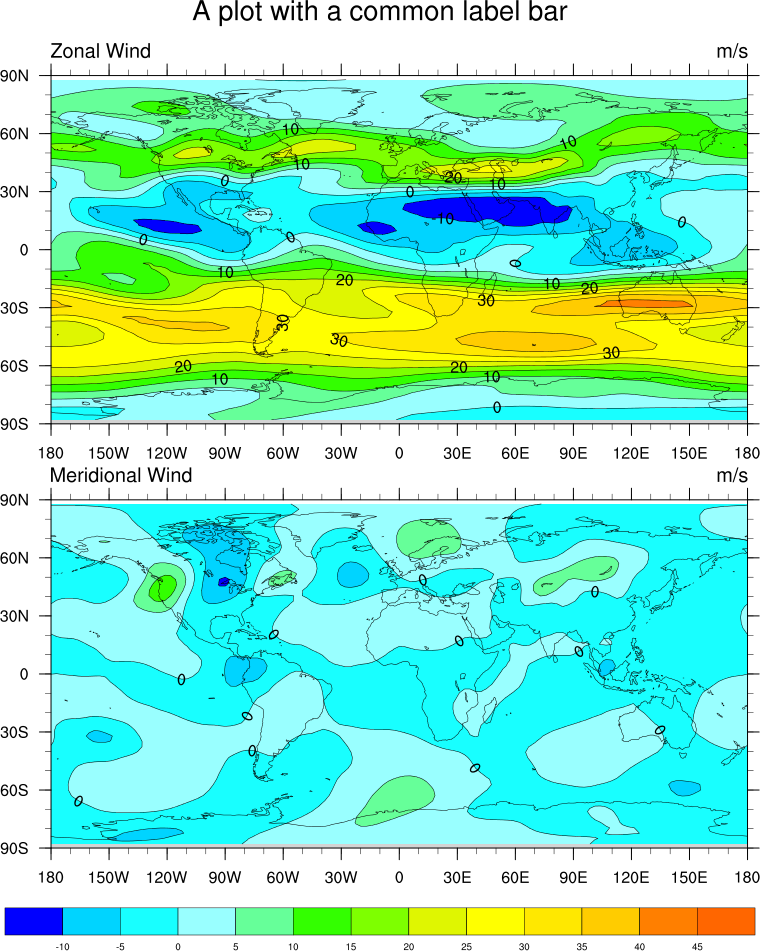
Original NCL plot: https://www.ncl.ucar.edu/Applications/Images/panel_3_lg.png
Import packages:
import cartopy.crs as ccrs
import matplotlib.pyplot as plt
import numpy as np
import xarray as xr
import cmaps

import geocat.datafiles as gdf
import geocat.viz as gv
Read in data:
# Open a netCDF data file using xarray default engine and load the data into xarrays, choosing the 2nd timestamp
ds = xr.open_dataset(gdf.get("netcdf_files/uv300.nc")).isel(time=1)
Utility Function: Labelled Filled Contour Plot:
# Define a utility plotting function in order not to repeat many lines of codes since we need to make the same figure
# with two different variables.


def plot_labelled_filled_contours(data, ax=None):
    """A utility function for convenience that plots labelled, filled contours
    with black contours marking each level.It will return a dictionary
    containing three objects corresponding to the filled contours, the black
    contours, and the contour labels."""

    # Import an NCL colormap, truncating it by using geocat.viz.util convenience function
    newcmp = gv.truncate_colormap(cmaps.gui_default, minval=0.03, maxval=0.8)

    handles = dict()
    handles["filled"] = data.plot.contourf(
        ax=ax,  # this is the axes we want to plot to
        cmap=newcmp,  # our special colormap
        levels=levels,  # contour levels specified outside this function
        xticks=np.arange(-180, 181, 30),  # nice x ticks
        yticks=np.arange(-90, 91, 30),  # nice y ticks
        transform=projection,  # data projection
        add_colorbar=False,  # don't add individual colorbars for each plot call
        add_labels=False,  # turn off xarray's automatic Lat, lon labels
    )

    # matplotlib's contourf doesn't let you specify the "edgecolors" (MATLAB terminology)
    # instead we plot black contours on top of the filled contours
    handles["contour"] = data.plot.contour(
        ax=ax,
        levels=levels,
        colors="black",  # note plurals in this and following kwargs
        linestyles="-",
        linewidths=0.5,
        add_labels=False,  # again turn off automatic labels
    )

    # Label the contours
    ax.clabel(
        handles["contour"],
        fontsize=8,
        fmt="%.0f",  # Turn off decimal points
    )

    # Add coastlines
    ax.coastlines(linewidth=0.5)

    # Use geocat.viz.util convenience function to add minor and major tick lines
    gv.add_major_minor_ticks(ax)

    # Use geocat.viz.util convenience function to make plots look like NCL plots by using latitude, longitude ticks
    gv.add_lat_lon_ticklabels(ax)

    # Use geocat.viz.util convenience function to add main title as well as titles to left and right of the plot axes.
    gv.set_titles_and_labels(
        ax,
        lefttitle=data.attrs['long_name'],
        lefttitlefontsize=10,
        righttitle=data.attrs['units'],
        righttitlefontsize=10,
    )

    return handles
Plot:
# Make two panels (i.e. subplots in matplotlib)
# Specify ``constrained_layout=True`` to automatically layout panels, colorbars and axes decorations nicely.
# See https://matplotlib.org/tutorials/intermediate/constrainedlayout_guide.html
# Generate figure and axes using Cartopy projection
projection = ccrs.PlateCarree()
fig, ax = plt.subplots(
    2, 1, constrained_layout=True, subplot_kw={"projection": projection}
)

# Set figure size (width, height) in inches
fig.set_size_inches((8, 8.2))

# Define the contour levels
levels = np.linspace(-10, 50, 13)

# Contour-plot U data, save "handles" to add a colorbar later
handles = plot_labelled_filled_contours(ds.U, ax=ax[0])

# Set a common title
ax[0].set_title("A plot with a common colorbar", fontsize=14, y=1.15)

# Contour-plot V data
plot_labelled_filled_contours(ds.V, ax=ax[1])

# Add horizontal colorbar
cbar = plt.colorbar(
    handles["filled"],
    ax=ax,
    orientation="horizontal",
    ticks=levels[:-1],  # keep the last colorbar tick from showing
    drawedges=True,
    extendrect=True,
    extendfrac='auto',
    aspect=30,
)
cbar.ax.tick_params(labelsize=10)

# Show the plot
plt.show()
/home/docs/checkouts/readthedocs.org/user_builds/geocat-examples/conda/latest/lib/python3.14/site-packages/geocat/viz/util.py:746: UserWarning: Overwriting the cmap 'trunc(gui_default,0.03,0.80)' that was already in the registry.
  mpl.colormaps.register(new_cmap, force=force)
Total running time of the script: (0 minutes 0.532 seconds)