

Note
Go to the end to download the full example code.
NCL_panel_11.py#
- This script illustrates the following concepts:
Specifying how many and where to draw plots using mosaic_subplot
- See following URLs to see the reproduced NCL plot & script:
Original NCL script: https://www.ncl.ucar.edu/Applications/Scripts/panel_11.ncl
Original NCL plot: https://www.ncl.ucar.edu/Applications/Images/panel_11_1_lg.png and https://www.ncl.ucar.edu/Applications/Images/panel_11_2_lg.png
Import packages
import numpy as np
import xarray as xr
import matplotlib.pyplot as plt

import geocat.datafiles as gdf
import geocat.viz as gv
Read in data:
# Open a netCDF data file using xarray default engine
# and load the data into xarrays
ds = xr.open_dataset(gdf.get('netcdf_files/chi200_ud_smooth.nc'))

lon = ds.lon
times = ds.time
scale = 1000000
chi = ds.CHI
chi = chi / scale
Plot:
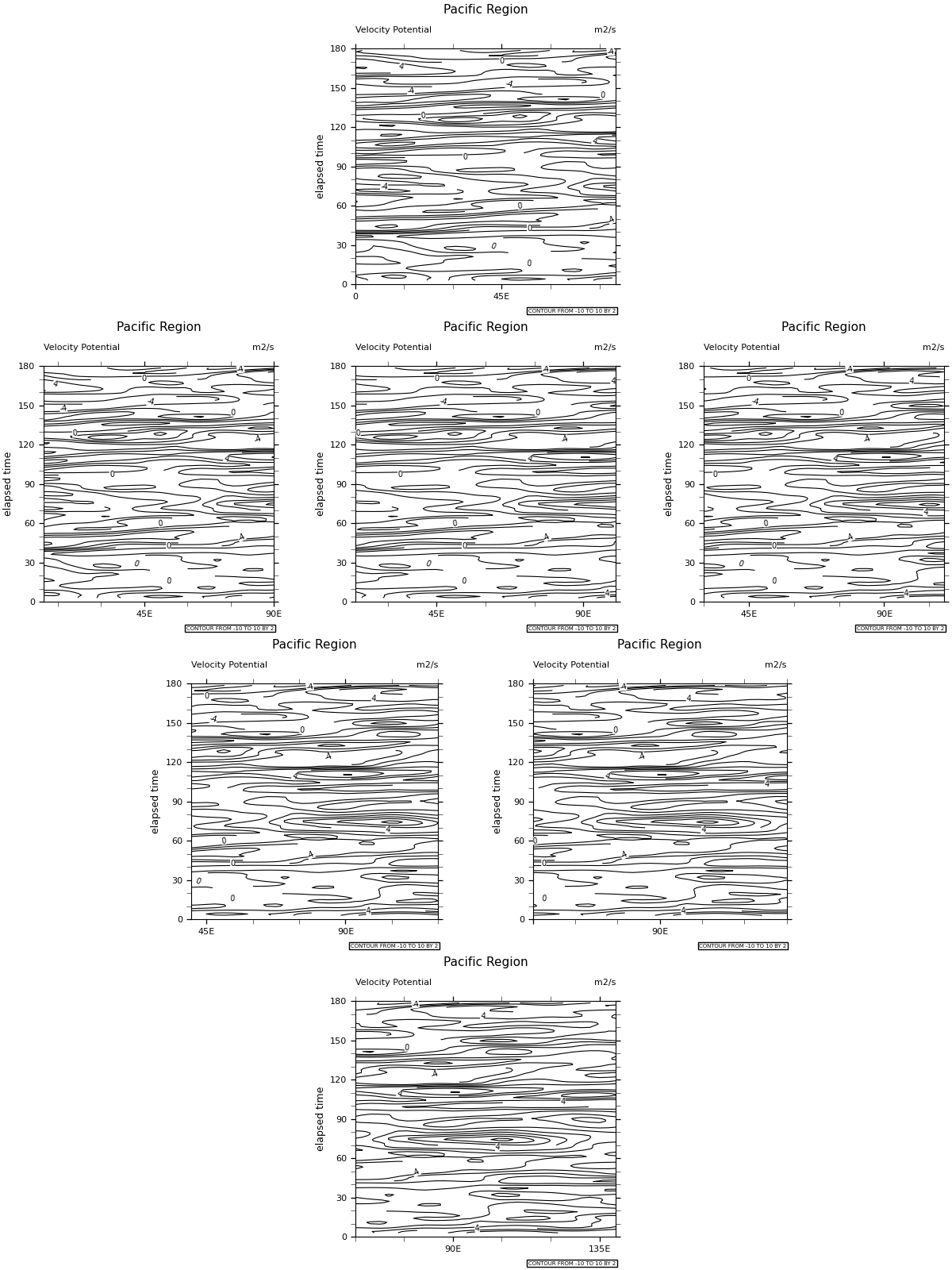
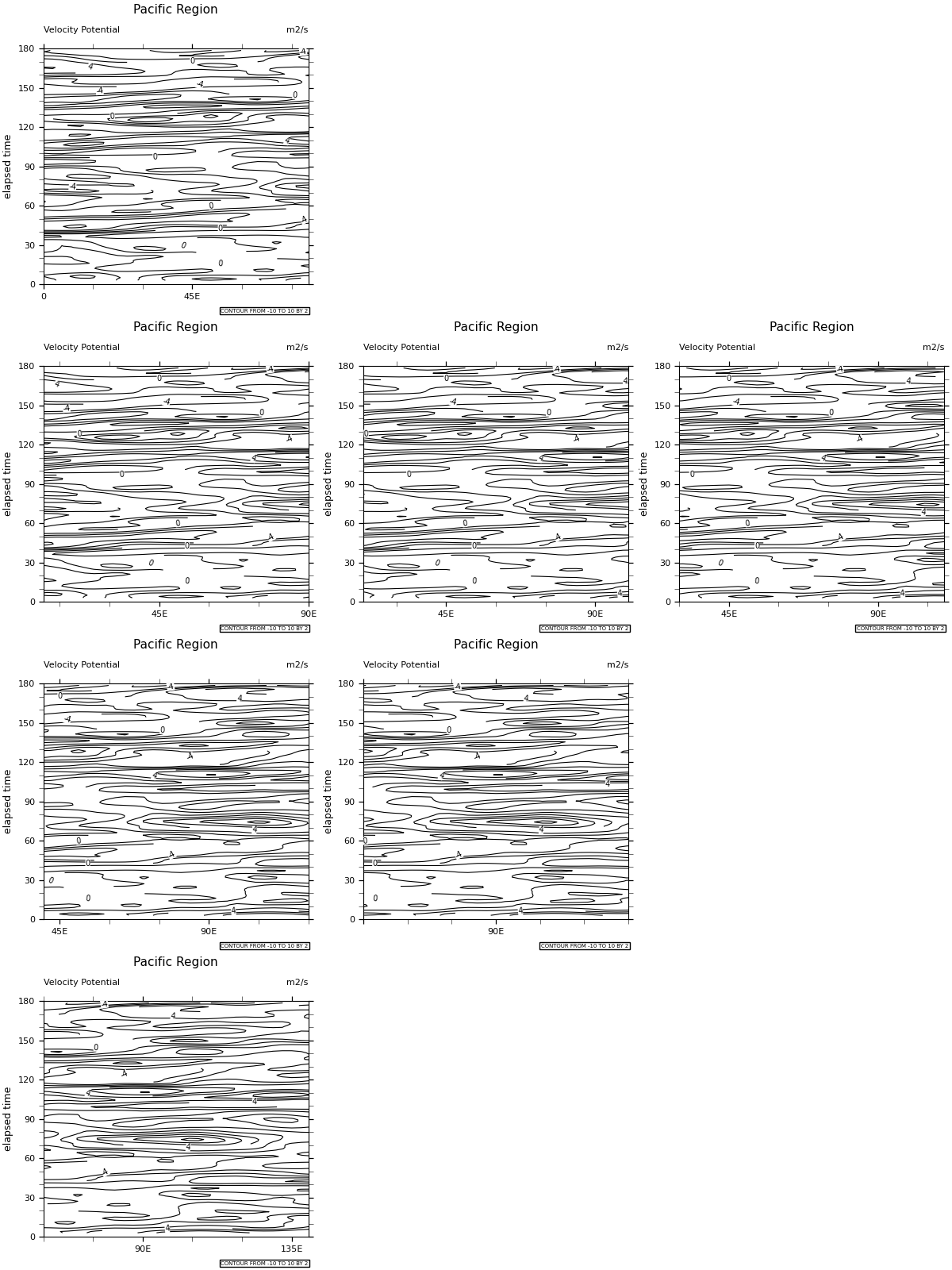
def contour_plot(fig):
    """Plots a series of contour subplots with position depending on axes in
    mosaic subplot. Takes in a defined figure and plots a contour plot, where
    each subplot progressively shifts its longitude range east. The function
    also sets a label beneath the plot, titles and axes labels, and contour
    labels.

    Parameters
    ----------
    fig: :'figure':
        A figure defined with mosaic_subplot.
    """

    # Set the starting longitude for the first subplot
    l_boundary = 0

    # Create empty list
    ax_list = []

    for letter in ["A", "B", "C", "D", "E", "F", "G"]:
        ax_list.append(fig[letter])

    for axis in ax_list:
        # Set the range of each subplot's longitude
        h_boundary = l_boundary + 80

        # Draw contour lines at levels [-10, -8, -6, -4, -2, 0, 2, 4, 6, 8, 10]
        cs = axis.contour(
            lon,
            times,
            chi,
            levels=np.arange(-10, 12, 2),
            colors='black',
            linestyles="-",
            linewidths=0.8,
        )

        # Label the contour levels -4, 0, and 4
        axis.clabel(cs, fmt='%d', levels=[-4, 0, 4], fontsize=7)

        # Put a white background behind each contour label
        for txt in cs.labelTexts:
            txt.set_bbox(dict(facecolor='white', edgecolor='none', pad=0))

        # Set x ticks and labels depending on range of longitudes shown for each subplot
        if l_boundary == 0:
            x_ticks = [0, 45]
            x_tick_labels = ["0", "45E"]
        elif l_boundary < 50:
            x_ticks = [45, 90]
            x_tick_labels = ["45E", "90E"]
        elif l_boundary == 50:
            x_ticks = [50, 90]
            x_tick_labels = ["", "90E"]
        else:
            x_ticks = [90, 135]
            x_tick_labels = ["90E", "135E"]

        # Use geocat.viz.util convenience function to add titles
        gv.set_axes_limits_and_ticks(
            axis,
            xlim=[l_boundary, h_boundary],
            ylim=[0, 1.55 * 1e16],
            xticks=x_ticks,
            yticks=np.linspace(0, 1.55 * 1e16, 7),
            xticklabels=x_tick_labels,
            yticklabels=np.linspace(0, 180, 7, dtype='int'),
        )

        # Use geocat.viz.util convenience function to add minor and major tick lines
        gv.add_major_minor_ticks(
            axis, x_minor_per_major=3, y_minor_per_major=3, labelsize=8
        )

        # Use geocat.viz.util convenience function to add titles
        gv.set_titles_and_labels(
            axis,
            maintitle="Pacific Region",
            maintitlefontsize=9,
            lefttitle="Velocity Potential",
            lefttitlefontsize=8,
            righttitle="m2/s",
            righttitlefontsize=8,
            ylabel="elapsed time",
            labelfontsize=9,
        )

        # Add lower text box
        axis.text(
            1,
            -0.12,
            "CONTOUR FROM -10 TO 10 BY 2",
            horizontalalignment='right',
            transform=axis.transAxes,
            fontsize=5,
            bbox=dict(
                boxstyle='square, pad=0.25', facecolor='white', edgecolor='black'
            ),
        )

        # Change the size of the tick marks for both axes
        axis.tick_params('both', size=4)

        # Increase the lower longitude boundary
        l_boundary += 10

    # Set plot size and show figure
    plt.gcf().set_size_inches(12, 16)
    plt.show()


# Define first figure using subplot_mosaic, which allows for subplots to be
# created with custom spacing and empty plots, represented by '.' in function
fig = plt.figure(constrained_layout=True).subplot_mosaic("""
    ..AA..
    BBCCDD
    .EEFF.
    ..GG..
    """)

# Use helper function to plot figure
contour_plot(fig)

# Define second figure using subplot_mosaic
fig2 = plt.figure(constrained_layout=True).subplot_mosaic("""
    A..
    BCD
    EF.
    G..
    """)

# Use helper function to plot figure
contour_plot(fig2)
Total running time of the script: (0 minutes 2.190 seconds)