

Note
Go to the end to download the full example code.
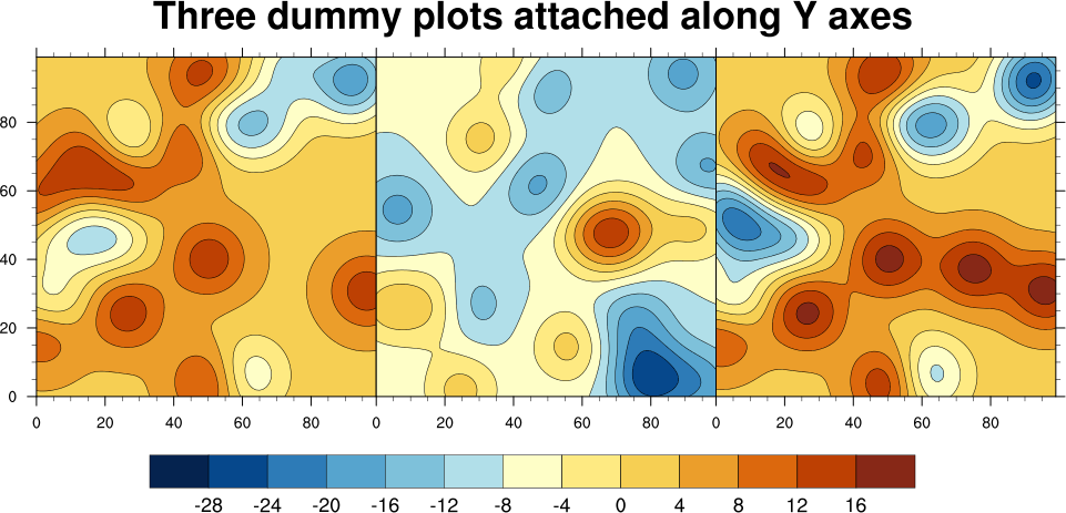
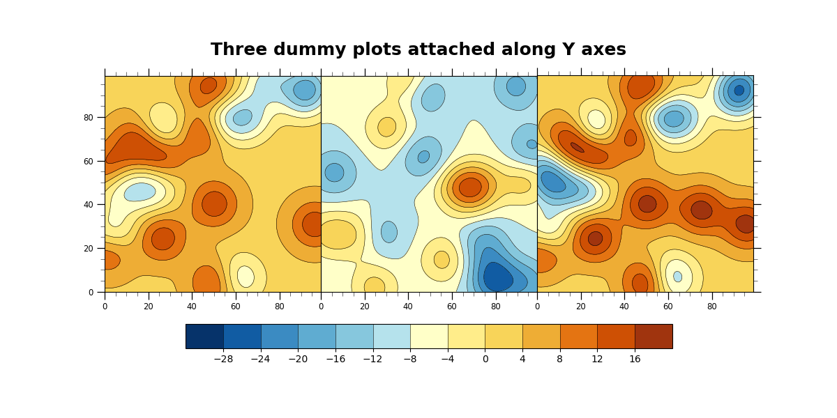
NCL_panel_35.py#
- This script illustrates the following concepts:
Attaching three filled contour plots along Y axes
Adding a common colorbar to attached plots
Adding a common title to attached plots
Drawing a custom colorbar
Drawing a custom title
Retrieving the bounding box of a plot
- See following URLs to see the reproduced NCL plot & script:
Original NCL script: http://www.ncl.ucar.edu/Applications/Scripts/panel_35.ncl
Original NCL plot: http://www.ncl.ucar.edu/Applications/Images/panel_35_lg.png
Import packages:
import matplotlib.pyplot as plt
import numpy as np
import xarray as xr
import cmaps

import geocat.viz as gv
import geocat.datafiles as gcd
Uploading random smooth 2d data from geocat.datafiles
data1 = xr.open_dataarray(gcd.get("netcdf_files/panel_35_data1.nc"), engine='netcdf4')
data2 = xr.open_dataarray(gcd.get("netcdf_files/panel_35_data2.nc"), engine='netcdf4')
data3 = xr.open_dataarray(gcd.get("netcdf_files/panel_35_data3.nc"), engine='netcdf4')
Create figure and axes using gv
fig, axs = plt.subplots(
    1, 3, figsize=(12, 6), sharex='all', sharey='all', gridspec_kw={'wspace': 0}
)

# Use geocat.viz.util convenience function to set axes tick values
gv.set_axes_limits_and_ticks(
    axs[0],
    xticks=np.arange(0, 100, 20),
    yticks=np.arange(0, 100, 20),
    xticklabels=np.arange(0, 100, 20),
    yticklabels=np.arange(0, 100, 20),
)
# Use geocat.viz.util convenience function to add minor and major tick lines
gv.add_major_minor_ticks(axs[0], x_minor_per_major=4, y_minor_per_major=4)
# Specify which edges of the subplot should have tick lines
axs[0].tick_params(axis='both', which='both', left=True, right=False)
# Force subplot to be square
axs[0].set_aspect(aspect='equal')

# Repeat for other subplots with a few changes
gv.set_axes_limits_and_ticks(
    axs[1],
    xticks=np.arange(0, 100, 20),
    yticks=np.arange(0, 100, 20),
    xticklabels=np.arange(0, 100, 20),
    yticklabels=np.arange(0, 100, 20),
)
gv.add_major_minor_ticks(axs[1], x_minor_per_major=4, y_minor_per_major=4)
axs[1].tick_params(axis='both', which='both', left=False, right=False)
axs[1].set_aspect(aspect='equal')

gv.set_axes_limits_and_ticks(
    axs[2],
    xticks=np.arange(0, 100, 20),
    yticks=np.arange(0, 100, 20),
    xticklabels=np.arange(0, 100, 20),
    yticklabels=np.arange(0, 100, 20),
)
gv.add_major_minor_ticks(axs[2], x_minor_per_major=4, y_minor_per_major=4)
axs[2].tick_params(axis='both', which='both', left=False, right=True)
axs[2].set_aspect(aspect='equal')

# Plot data and create colorbar
newcmap = cmaps.BlueYellowRed
# levels=contour_levels ensures that each plot has the same scale
contour_levels = np.arange(-32, 24, 4)

filled1 = axs[0].contourf(data1, cmap=newcmap, levels=contour_levels)
axs[0].contour(filled1, colors='black', linestyles='solid', linewidths=0.4)
filled2 = axs[1].contourf(data2, cmap=newcmap, levels=contour_levels)
axs[1].contour(filled2, colors='black', linestyles='solid', linewidths=0.4)
filled3 = axs[2].contourf(data3, cmap=newcmap, levels=contour_levels)
axs[2].contour(filled3, colors='black', linestyles='solid', linewidths=0.4)

plt.colorbar(
    filled3,
    orientation='horizontal',
    ax=axs,
    ticks=np.arange(-28, 20, 4),
    shrink=0.75,
    drawedges=True,
    pad=0.1,
)

# Add title
fig.suptitle(
    "Three dummy plots attached along Y axes",
    horizontalalignment='center',
    y=0.9,
    fontsize=18,
    fontweight='bold',
    fontfamily='sans-serif',
)

plt.show()
Total running time of the script: (0 minutes 4.212 seconds)