

Note
Go to the end to download the full example code.
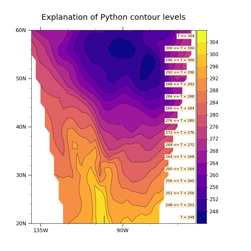
NCL_conLev_3.py#
- This script illustrates the following concepts:
Explicitly setting contour levels
Making the labelbar be vertical
Adding text to a plot
Adding units attributes to lat/lon arrays
Using cnFillPalette to assign a color palette to contours
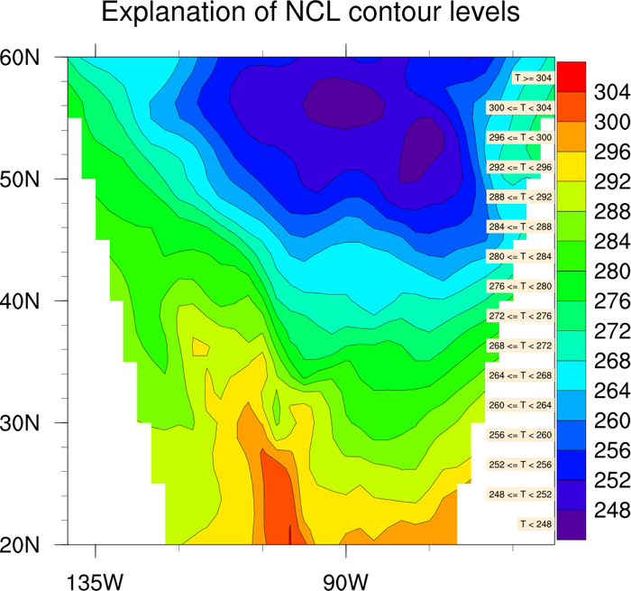
- See following URLs to see the reproduced NCL plot & script:
Original NCL script: https://www.ncl.ucar.edu/Applications/Scripts/conLev_3.ncl
Original NCL plot: https://www.ncl.ucar.edu/Applications/Images/conLev_3_lg.png
- Note:
A different colormap was used in this example than in the NCL example because rainbow colormaps do not translate well to black and white formats, are not accessible for individuals affected by color blindness, and vary widely in how they are perceived by different people. See this example for more information on choosing colormaps.
Import packages:
import numpy as np
import matplotlib.pyplot as plt
import xarray as xr
from cartopy.mpl.gridliner import LatitudeFormatter, LongitudeFormatter

import geocat.viz as gv
import geocat.datafiles as gdf
Read in data:
# Open a netCDF data file using xarray default engine and load the data into xarrays
ds = xr.open_dataset(gdf.get("netcdf_files/Tstorm.cdf"))

# Extract temperature data at the first timestep
T = ds.t.isel(timestep=0, drop=True)
Plot:
# Generate figure (set its size (width, height) in inches)
plt.figure(figsize=(8, 8))
ax = plt.axes()

# Import an NCL colormap
newcmp = 'plasma'

# Contourf-plot data (for filled contours)
num_lev = 16  # Number of levels
temp = T.plot.contourf(
    ax=ax,
    vmin=244,
    vmax=308,
    levels=np.linspace(244, 308, num_lev + 1),
    cmap=newcmp,
    add_colorbar=False,
    add_labels=False,
)

# Contour-plot data (for line contours)
T.plot.contour(
    ax=ax,
    vmin=244,
    vmax=308,
    levels=np.linspace(244, 308, num_lev + 1),
    colors='black',
    linewidths=0.5,
    add_labels=False,
)

# Add horizontal colorbar
cbar_ticks = np.arange(248, 308, 4)
cbar = plt.colorbar(temp, orientation='vertical', pad=0.005)
cbar.ax.tick_params(labelsize=11)
cbar.set_ticks(cbar_ticks)

# Use geocat.viz.util convenience function to set axes tick values
gv.set_axes_limits_and_ticks(
    ax,
    xlim=(-140, -50),
    ylim=(20, 60),
    xticks=[-135, -90],
    yticks=np.arange(20, 70, 10),
)

# Use geocat.viz.util convenience function to make plots look like NCL plots by using latitude, longitude tick labels
gv.add_lat_lon_ticklabels(ax)

# Remove the degree symbol from tick labels
ax.yaxis.set_major_formatter(LatitudeFormatter(degree_symbol=''))
ax.xaxis.set_major_formatter(LongitudeFormatter(degree_symbol=''))

# Use geocat.viz.util convenience function to add minor and major tick lines
gv.add_major_minor_ticks(ax, x_minor_per_major=3, y_minor_per_major=5, labelsize=12)

# Remove ticks on right side
ax.tick_params(which='both', right=False)

# Use geocat.viz.util convenience function to add title
gv.set_titles_and_labels(ax, maintitle="Explanation of Python contour levels")

# Create labels by colorbar
size = 8
y = 1 / num_lev / 2  # Offset from x axis in axes coordinates
ax.text(
    0.949,
    y,
    'T < 248',
    fontsize=size,
    horizontalalignment='center',
    verticalalignment='center',
    transform=ax.transAxes,
    bbox=dict(
        boxstyle='square, pad=0.25', facecolor='papayawhip', edgecolor='papayawhip'
    ),
)
text = '{} <= T < {}'
for i in range(0, 14):
    y = y + 1 / num_lev  # Vertical spacing between the labels
    ax.text(
        0.904,
        y,
        text.format(cbar_ticks[i], cbar_ticks[i + 1]),
        fontsize=size,
        horizontalalignment='center',
        verticalalignment='center',
        transform=ax.transAxes,
        bbox=dict(
            boxstyle='square, pad=0.25', facecolor='papayawhip', edgecolor='papayawhip'
        ),
    )

y = y + 1 / num_lev  # Increment height once more for top label
ax.text(
    0.94,
    y,
    'T >= 304',
    fontsize=size,
    horizontalalignment='center',
    verticalalignment='center',
    transform=ax.transAxes,
    bbox=dict(
        boxstyle='square, pad=0.25', facecolor='papayawhip', edgecolor='papayawhip'
    ),
)

# Show the plot
plt.show()
Total running time of the script: (0 minutes 0.405 seconds)