

Note
Go to the end to download the full example code.
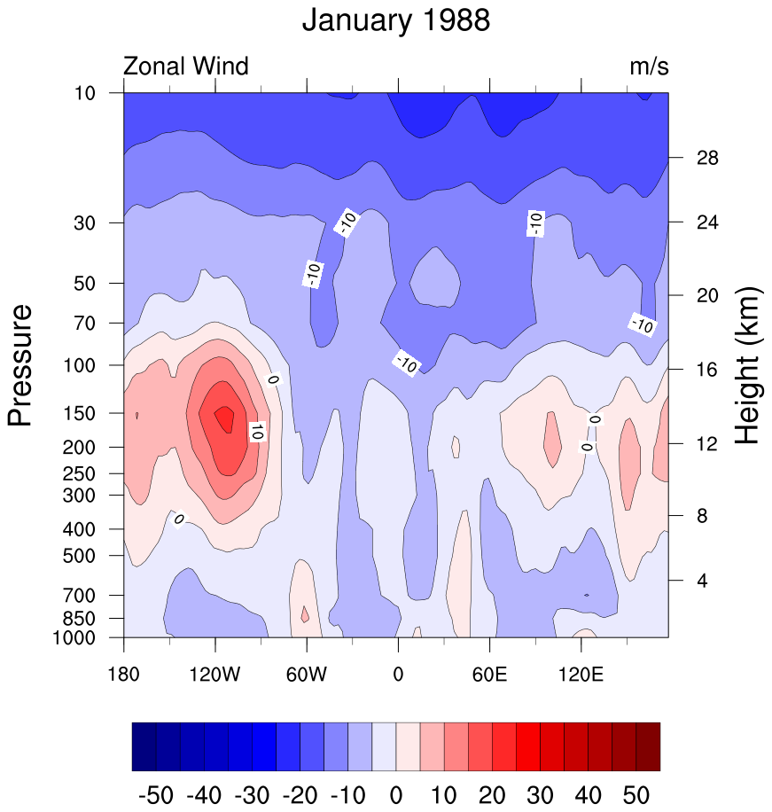
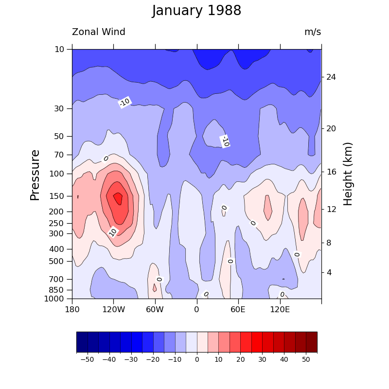
NCL_h_long_5.py#
- This script illustrates the following concepts:
Drawing filled contours of zonal wind
Changing the background color for contour labels
Drawing pressure and height scales
Using a Blue-White-Red colormap
- See following URLs to see the reproduced NCL plot & script:
Original NCL script: https://www.ncl.ucar.edu/Applications/Scripts/h_long_5.ncl
Original NCL plot: https://www.ncl.ucar.edu/Applications/Images/h_long_5_lg.png
Import packages
import numpy as np
import xarray as xr
import matplotlib.pyplot as plt
from matplotlib.ticker import ScalarFormatter
import cmaps

import geocat.datafiles as gdf
import geocat.viz as gv
Read in data:
# Open a netCDF data file using xarray default engine and load the data into xarrays
ds = xr.open_dataset(gdf.get("netcdf_files/uvt.nc"), cache=False)

# Choose the specific data to use
U = ds.U.isel(time=0)
U = U.sel(lat=-16, method="nearest")
Plot:
# Generate figure (set its size (width, height) in inches) and axes
plt.figure(figsize=(8, 8))
ax = plt.axes()

# Set y-axis to have log-scale
plt.yscale('log')

# Specify which contours should be drawn
levels = np.linspace(-55, 55, 23)

# Plot contour lines
lines = U.plot.contour(
    ax=ax,
    levels=levels,
    colors='black',
    linewidths=0.5,
    linestyles='solid',
    add_labels=False,
)

# Label contour levels at -10, 0, and 10 and set their backgrounds to be white
ax.clabel(lines, fmt='%d', levels=[-10, 0, 10])
[
    txt.set_bbox(dict(facecolor='white', edgecolor='none', pad=1))
    for txt in lines.labelTexts
]

# Plot filled contours
colors = U.plot.contourf(
    ax=ax, levels=levels, cmap=cmaps.BlWhRe, add_labels=False, add_colorbar=False
)
# Add colorbar
plt.colorbar(
    colors,
    ax=ax,
    orientation='horizontal',
    ticks=levels[1::2],
    drawedges=True,
    aspect=12,
    shrink=0.65,
    pad=0.1,
)

# Use geocat.viz.util convenience function to set axes tick values
# Set y-lim inorder for y-axis to have descending values
gv.set_axes_limits_and_ticks(
    ax,
    xticks=np.linspace(-180, 178, 7),
    xticklabels=['180', '120W', '60W', '0', '60E', "120E", ""],
    ylim=ax.get_ylim()[::-1],
    yticks=U["lev"],
)

# Change formatter or else tick values will be in exponential form
ax.yaxis.set_major_formatter(ScalarFormatter())

# Use geocat.viz.util convenience function to add major tick lines with no
# minor ticks on left hand side y axis and some minor ticks on the x axis
gv.add_major_minor_ticks(ax=ax, x_minor_per_major=2, y_minor_per_major=1, labelsize=12)

# Use geocat.viz.util convenience function to add titles and the pressure label
gv.set_titles_and_labels(
    ax,
    maintitle="January 1988",
    maintitlefontsize=18,
    lefttitle=U.long_name,
    lefttitlefontsize=14,
    righttitle=U.units,
    righttitlefontsize=14,
    ylabel=U.lev.long_name,
    labelfontsize=18,
)

# Create second y-axis to show geo-potential height.
axRHS = gv.add_height_from_pressure_axis(ax, heights=np.arange(4, 28, 4))

# Force the plot to be square by setting the aspect ratio to 1
ax.set_box_aspect(1)
axRHS.set_box_aspect(1)

plt.tight_layout()
plt.show()
Total running time of the script: (0 minutes 0.918 seconds)