

Note
Go to the end to download the full example code.
NCL_xy_12.py#
- This script illustrates the following concepts:
Emphasizing part of a curve in an XY plot
Drawing longitude labels on the X axis
- See following URLs to see the reproduced NCL plot & script:
Original NCL script: https://www.ncl.ucar.edu/Applications/Scripts/xy_12.ncl
Original NCL plots: https://www.ncl.ucar.edu/Applications/Images/xy_12_1_lg.png and https://www.ncl.ucar.edu/Applications/Images/xy_12_2_lg.png
Import packages:
import numpy as np
import xarray as xr
import matplotlib.pyplot as plt

import geocat.datafiles as gdf
import geocat.viz as gv
Read in data:
# Open a netCDF data file using xarray default engine and load the data into
# xarrays
ds = xr.open_dataset(gdf.get("netcdf_files/uv300.nc"))
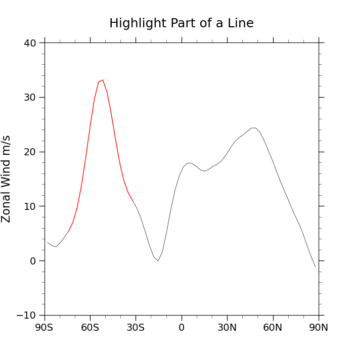
Method 1: Splitting the line into parts and coloring them differently
U = ds.isel(time=0, lon=5, drop=True).U

plt.figure(figsize=(7, 7))
ax = plt.axes()

bins = [0, 5, 20]
# Slicing data in Python excludes the last value. To include the last value we
# can increment it by 1. This ensures that the different colored line segments
# touch
start = U.data[bins[0] : bins[1] + 1]
highlight = U.data[bins[1] : bins[2] + 1]
end = U.data[bins[2] :]

ax.plot(U.lat[bins[0] : bins[1] + 1], start, color='black', linewidth=0.5)
ax.plot(U.lat[bins[1] : bins[2] + 1], highlight, color='red', linewidth=1)
ax.plot(U.lat[bins[2] :], end, color='black', linewidth=0.5)

# Use geocat.viz.util convenience function to set axes parameters
gv.set_axes_limits_and_ticks(
    ax,
    ylim=(-10, 40),
    xlim=(-90, 90),
    xticks=np.arange(-90, 91, 30),
    yticks=np.arange(-10, 41, 10),
    xticklabels=['90S', '60S', '30S', '0', '30N', '60N', '90N'],
)

# Use geocat.viz.util convenience function to add minor and major tick lines
gv.add_major_minor_ticks(ax, x_minor_per_major=3, y_minor_per_major=5, labelsize=14)

# Use geocat.viz.util convenience function to set titles and labels
gv.set_titles_and_labels(
    ax, maintitle="Highlight Part of a Line", ylabel=U.long_name + " " + U.units
)

plt.show()
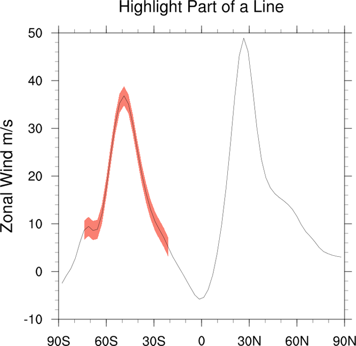
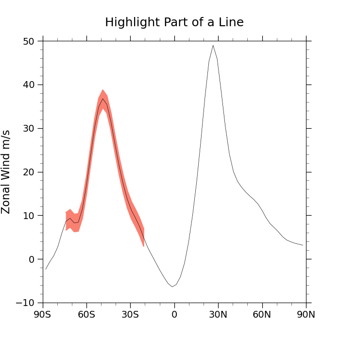
Method 2: Drawing a polygon around the section of interest
U = ds.isel(time=0, lon=84, drop=True).U

plt.figure(figsize=(7, 7))
ax = plt.axes()

bins = [5, 24]
# Slicing data in Python excludes the last value. To include the last value we
# can increment it by 1. This ensures that the highlight extends through the
# last bin value
highlight = U.data[bins[0] : bins[1] + 1]

# Define bounds for region centered on the data with a width of 4
nlat = np.shape(highlight)[0]
top = np.empty(nlat)
bottom = np.empty(nlat)

for k in range(0, nlat):
    top[k] = highlight[k] + 2
    bottom[k] = highlight[k] - 2

# Plot curves that bound the region to be colored
ax.plot(U.lat[bins[0] : bins[1] + 1], top, color='salmon')
ax.plot(U.lat[bins[0] : bins[1] + 1], bottom, color='salmon')

# Fill the area between the bounds
ax.fill_between(U.lat[bins[0] : bins[1] + 1], top, bottom, color='salmon')

ax.plot(U.lat, U.data, color='black', linewidth=0.5)

# Use geocat.viz.util convenience function to set axes parameters
gv.set_axes_limits_and_ticks(
    ax,
    ylim=(-10, 50),
    xlim=(-90, 90),
    xticks=np.arange(-90, 91, 30),
    yticks=np.arange(-10, 51, 10),
    xticklabels=['90S', '60S', '30S', '0', '30N', '60N', '90N'],
)

# Use geocat.viz.util convenience function to add minor and major tick lines
gv.add_major_minor_ticks(ax, x_minor_per_major=3, y_minor_per_major=5, labelsize=14)

# Use geocat.viz.util convenience function to set titles and labels
gv.set_titles_and_labels(
    ax, maintitle="Highlight Part of a Line", ylabel=U.long_name + " " + U.units
)

plt.show()
Total running time of the script: (0 minutes 0.164 seconds)