

Note
Go to the end to download the full example code.
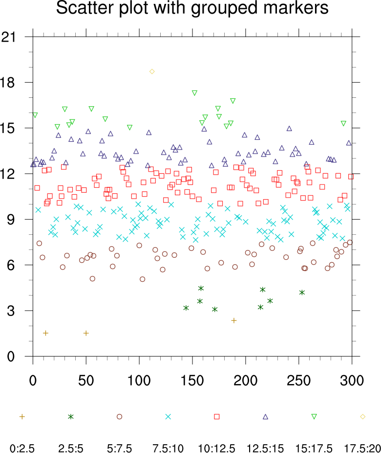
NCL_scatter_5.py#
- This script illustrates the following concepts:
Drawing a scatter plot with markers of different colors
Generating dummy data using “random.normal”
Manually creating a legend using markers and text
Customizing the label locations in a legend
Changing the orientation of a legend
Drawing a legend outside an XY plot
Changing the markers in an XY plot
Changing the marker color in an XY plot
Changing the marker size in an XY plot
- See following URLs to see the reproduced NCL plot & script:
Original NCL script: https://www.ncl.ucar.edu/Applications/Scripts/scatter_5.ncl
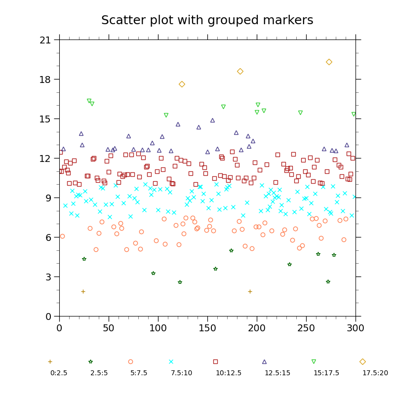
Original NCL plot: https://www.ncl.ucar.edu/Applications/Images/scatter_5_lg.png
Import packages:
import numpy as np
import matplotlib.pyplot as plt
from cycler import cycler

import geocat.viz as gv
Generate random data from a normal (Gaussian) distribution with a mean of 10 and standard deviation of 3
npts = 300
random = np.random.default_rng(seed=1)
data = random.normal(loc=10, scale=3, size=npts)
Specify colors and markers
colors = [
    'darkgoldenrod',
    'darkgreen',
    'coral',
    'cyan',
    'firebrick',
    'darkslateblue',
    'limegreen',
    'goldenrod',
]
markers = ['+', '*', 'o', 'x', 's', '^', 'v', 'D']

# This line cycles which color is used to plot the markers
plt.rcParams['axes.prop_cycle'] = cycler(color=colors)
Plot
fig = plt.figure(figsize=(8, 8))
# Adjust the axes size to accommodate the legend at the bottom
ax = plt.axes([0.15, 0.2, 0.75, 0.70])

# Divide data into 8 bins and plot
numBins = 8
indices = np.arange(0, 300)
partitions = np.linspace(0, 20, numBins + 1)
label = "{start:g}:{end:g}"
for x in range(0, numBins):
    bins = np.where(data > partitions[x], data, np.nan)
    with np.errstate(
        invalid='ignore'
    ):  # Indeed not needed, just to get rid of warnings about numpy's NaN comparisons
        bins = np.where(bins < partitions[x + 1], bins, np.nan)
    indices = np.where(bins != np.nan, indices, np.nan)
    plt.plot(
        indices,
        bins,
        marker=markers[x],
        fillstyle='none',
        linewidth=0,
        label=label.format(start=partitions[x], end=partitions[x + 1]),
    )

# `ncol` being equal to the number of labels makes it appear horizontal
legend = ax.legend(
    bbox_to_anchor=(-0.075, -0.2),
    ncol=numBins,
    loc='lower left',
    columnspacing=0.5,
    frameon=False,
)
for txt in legend.get_texts():
    txt.set_ha("center")  # horizontal alignment of text item
    txt.set_va("center")  # vertical alignment of text item
    # Move label text so it is centered under the marker
    txt.set_x(-25)  # x-position
    txt.set_y(-20)  # y-position

# Use geocat.viz.util convenience function to set axes parameters
gv.set_axes_limits_and_ticks(
    ax, xlim=(0, 300), ylim=(0, 21), xticks=range(0, 301, 50), yticks=range(0, 22, 3)
)

# Use geocat.viz.util convenience function to add minor and major tick lines
gv.add_major_minor_ticks(ax, x_minor_per_major=5, y_minor_per_major=3, labelsize=14)

# Use geocat.viz.util convenience function to set titles and labels
gv.set_titles_and_labels(ax, maintitle="Scatter plot with grouped markers")

plt.show()
Total running time of the script: (0 minutes 0.115 seconds)