

Note
Go to the end to download the full example code.
NCL_scatter_3.py#
- This script illustrates the following concepts:
Drawing a scatter plot over a map
Choosing marker color, size, and style
Drawing markers on a map indicating the locations of station data
- See following URLs to see the reproduced NCL plot & script:
Import packages:
import xarray as xr
import cartopy.crs as ccrs
import cartopy.feature as cfeature
from cartopy.mpl.gridliner import LongitudeFormatter, LatitudeFormatter
import matplotlib.pyplot as plt

import geocat.viz as gv
import geocat.datafiles as gdf
Open a netCDF data file using xarray default engine and load the data into xarrays
ds = xr.open_dataset(gdf.get("netcdf_files/95031800_sao.cdf"), decode_times=False)
lat = ds.lat.isel()
lon = ds.lon.isel()
Plot
def Plots(xlim, ylim, xtic, ytic, xminor, yminor, size, color):
"""Creates plot using user specified variables.
Parameters
----------
xext : 'tuple'
Inclusive extent of projection in format (xstart, xend) with values between -180
and 180.
yext : 'tuple'
Inclusive extent of projection in format (ystart, yend) with values between -90
and 90.
xtic : 'int'
Step number of major x tick label instances in format of number between each tick.
This is passed to range() as the 'step' argument.
ytic : 'int'
Step number of major y tick label instances in format of number between each tick.
This is passed to range() as the 'step' argument.
xminor : 'int'
Exclusive number of minor ticks between each major x-axis tick mark
yminor : 'int'
Exclusive number of minor ticks between each major y-axis tick mark
size : 'int'
Size of marker being used in format of font size number.
color : 'str'
Matplotlib color of marker being used in format 'color'.
"""
# Generate figure (set its size (width, height) in inches) and axes using Cartopy projection
plt.figure(figsize=(12, 12))
# Generate axes using Cartopy
ax = plt.axes(projection=ccrs.PlateCarree())
# Use geocat.viz.util convenience function to add minor and major tick lines
gv.add_major_minor_ticks(
ax, x_minor_per_major=xminor, y_minor_per_major=yminor, labelsize=14
)
# Use geocat.viz.util convenience function to make plots look like NCL plots by using latitude, longitude tick labels
gv.add_lat_lon_ticklabels(ax)
# Use geocat.viz.util convenience function to set axes limits & tick values without calling several matplotlib functions
gv.set_axes_limits_and_ticks(
ax,
xlim=xlim,
ylim=ylim,
xticks=range(-180, 180, xtic),
yticks=range(-90, 90, ytic),
)
# Remove the degree symbol from tick labels
ax.yaxis.set_major_formatter(LatitudeFormatter(degree_symbol=''))
ax.xaxis.set_major_formatter(LongitudeFormatter(degree_symbol=''))
# Turn on continent shading
ax.add_feature(
cfeature.LAND, edgecolor='lightgray', facecolor='lightgray', zorder=0
)
ax.add_feature(cfeature.LAKES, edgecolor='white', facecolor='white', zorder=0)
# Scatter-plot the location data on the map
plt.scatter(lon, lat, s=size, c=color, marker='+', linewidth=0.5, zorder=1)
plt.title("Locations of stations", loc="center", y=1.03, size=15, fontweight="bold")
plt.show()
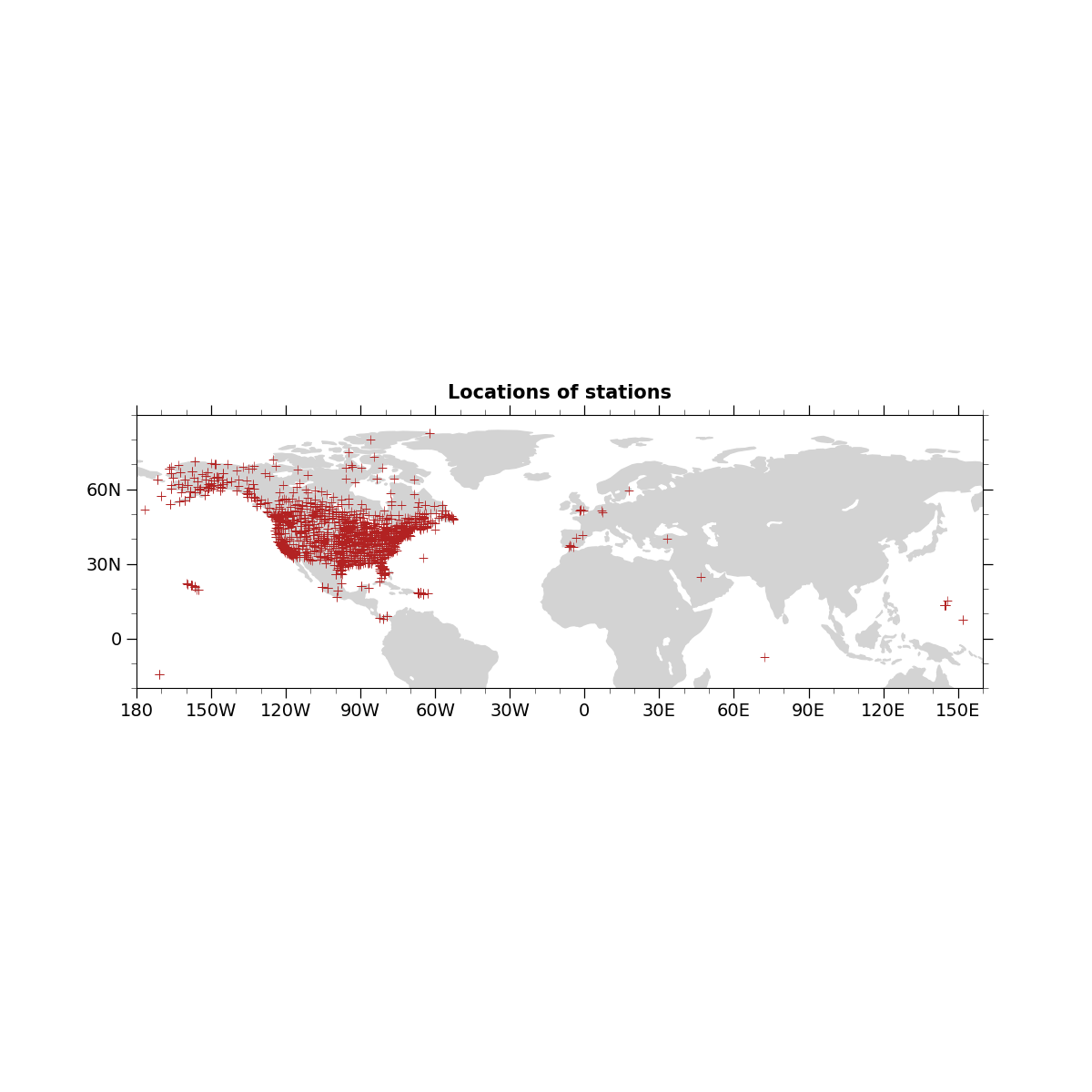
Plots((-180, 160), (-20, 90), 30, 30, 3, 3, 50, 'firebrick')
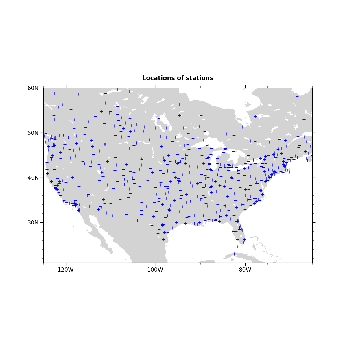
Plots((-125, -65), (21, 60), 20, 10, 4, 5, 50, 'blue')
Total running time of the script: (0 minutes 0.579 seconds)