Note
Go to the end to download the full example code
NCL_h_lat_7.py#
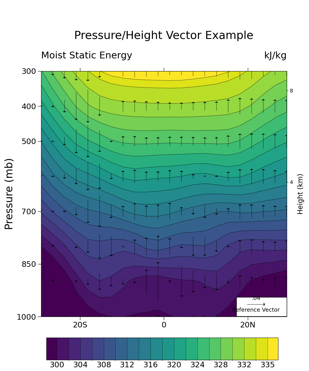
- This script illustrates the following concepts:
Drawing vectors over filled contours
Drawing pressure and height scales
Interpolate to user specified pressure levels
Using the geocat-comp method interp_hybrid_to_pressure
Using a different color scheme to follow best practices for visualizations
- See following URLs to see the reproduced NCL plot & script:
Original NCL script: https://www.ncl.ucar.edu/Applications/Scripts/h_lat_7.ncl
Original NCL plot: https://www.ncl.ucar.edu/Applications/Images/h_lat_7_lg.png
Import packages:
import xarray as xr
from matplotlib import pyplot as plt
import numpy as np
import metpy.calc as mpcalc
from metpy.units import units

import geocat.datafiles as gdf
import geocat.viz as gv
from geocat.comp import interp_hybrid_to_pressure
Read in data:
# Open a netCDF data file using xarray default engine and load the data into xarrays
ds = xr.open_dataset(gdf.get("netcdf_files/atmos.nc"), decode_times=False)

# Extract variables
T = ds.T  # temperature (K)
V = ds.V  # meridional wind (m/s)
Z = ds.Z3  # geopotential height (m)
omega = ds.OMEGA  # vertical pressure velocity (mb/day)
lev = ds.lev  # pressure levels (millibars)
lev = 100 * lev  # change units to Pa
q = ds.Q  # specific humidity (g/kg)
q = q / 1000  # change units to kg/kg

# Calculate moist static energy (h)
g = 9.81
L = 2.5e6
Cp = 1004.0

h = Cp * T + g * Z + L * q
h = h / 1000  # Convert to kJ/kg

# Convert h and omega to pressure levels
hyam = ds.hyam
hybm = ds.hybm
P0mb = ds.P0 * 0.01
ps = ds.PS
ps = ps / 100  # Convert from pascal to millibar
lev_p = np.array([300, 400, 500, 600, 700, 800, 900, 1000])

# interp_hybrid_to_pressure is the Python version of vinth2p in NCL script
hp = interp_hybrid_to_pressure(data=h,
                               ps=ps,
                               hyam=hyam,
                               hybm=hybm,
                               p0=P0mb,
                               new_levels=lev_p,
                               method='log')
# Assign attribute values
hp.attrs['units'] = "kJ/kg"
hp.attrs['long_name'] = "Moist Static Energy"

op = interp_hybrid_to_pressure(data=omega,
                               ps=ps,
                               hyam=hyam,
                               hybm=hybm,
                               p0=P0mb,
                               new_levels=lev_p,
                               method='log')
vp = interp_hybrid_to_pressure(data=V,
                               ps=ps,
                               hyam=hyam,
                               hybm=hybm,
                               p0=P0mb,
                               new_levels=lev_p,
                               method='log')

# Extract slices of the data
hp = hp.isel(time=0).sel(lat=slice(-30, 30)).sel(lon=210, method='nearest')
op = op.isel(time=0).sel(lat=slice(-30, 30)).sel(lon=210, method='nearest')
vp = vp.isel(time=0).sel(lat=slice(-30, 30)).sel(lon=210, method='nearest')

# Set vp equal to zero so that we plot only the vertical component
# while retaining the coordinate information
vp = xr.zeros_like(vp)
Plot:
# Generate figure (set its size (width, height) in inches)
fig = plt.figure(figsize=(10, 12))

# Generate axes
ax = plt.axes()

# Specify which contours should be drawn
levels = np.arange(300, 335, 2)
levels = np.append(levels, 335)

# Plot contour lines
hp.plot.contour(ax=ax,
                colors='black',
                levels=levels,
                linewidths=0.5,
                linestyles='solid',
                add_labels=False)

# Plot filled contours
colors = hp.plot.contourf(ax=ax,
                          levels=levels,
                          cmap='viridis',
                          add_labels=False,
                          add_colorbar=False)

# Draw vector plot
# (there is no matplotlib equivalent to "CurlyVector" yet)
Q = ax.quiver(
    hp['lat'],  # horizontal location
    hp['plev'],  # vertical location
    vp,  # horizontal component of the vectors
    op,  # vertical component of the vectors
    color='black',
    pivot="middle",
    width=0.001,
    headwidth=15,
    zorder=1)

# Draw legend for vector plot
ax.add_patch(
    plt.Rectangle(
        (17.3,
         944),  # location of the SW corner of box in the same units as the data
        12,  # the width of the box in the same units as the x axis
        55,  # the height of the box in the same units as the y axis
        facecolor='white',
        edgecolor='black',
        clip_on=False))
# Call quiver key twice to draw the text above and below the key arrow
qk = ax.quiverkey(
    Q,
    0.828,  # x coordinate of the center of the arrow as a percent of the plot width
    0.18,  # y coordinate of the center of the arrow as a percent of the plot height
    0.04,  # the size of the arrow in the same units as the data
    'Reference Vector',
    labelpos='S',
    coordinates='figure',
    color='black',
    fontproperties={'size': 13})
qk = ax.quiverkey(
    Q,
    0.828,  # x coordinate of the center of the arrow as a percent of the plot width
    0.18,  # y coordinate of the center of the arrow as a percent of the plot height
    0.04,  # the size of the arrow in the same units as the data
    '.04',
    labelpos='N',
    coordinates='figure',
    color='black',
    fontproperties={'size': 13})

# Use geocat.viz.util convenience function to add minor and major tick lines
gv.add_major_minor_ticks(ax,
                         x_minor_per_major=4,
                         y_minor_per_major=1,
                         labelsize=18)

# Use geocat.viz.util convenience function to set axes tick values
gv.set_axes_limits_and_ticks(ax,
                             ylim=ax.get_ylim()[::-1],
                             xticks=np.array([-20, 0, 20]),
                             yticks=np.array([300, 400, 500, 700, 850, 1000]),
                             xticklabels=['20S', '0', '20N'])

# Use geocat.viz.util convenience function to add titles and the pressure label
gv.set_titles_and_labels(ax,
                         maintitle="Pressure/Height Vector Example",
                         maintitlefontsize=24,
                         lefttitle=hp.long_name,
                         lefttitlefontsize=22,
                         righttitle=hp.units,
                         righttitlefontsize=22,
                         ylabel='Pressure (mb)',
                         labelfontsize=24)

# Create second y-axis to show geo-potential height.
axRHS = gv.add_height_from_pressure_axis(ax, heights=np.arange(4, 28, 4))

# Force the plot to be square by setting the aspect ratio to 1
ax.set_box_aspect(1)
axRHS.set_box_aspect(1)

# Turn off minor ticks on Y axis on the left hand side
ax.tick_params(axis='y', which='minor', left=False, right=False)

# Add a color bar after calling tight_layout function to prevent user warnings
plt.tight_layout()

cax = plt.axes((0.15, 0.03, 0.75, 0.06))
cab = fig.colorbar(colors,
                   ax=ax,
                   cax=cax,
                   orientation='horizontal',
                   ticks=levels[::2],
                   extendrect=True,
                   drawedges=True,
                   spacing='uniform')

# Set colorbar ticklabel font size
cab.ax.xaxis.set_tick_params(length=0, labelsize=18)

# Show plot
plt.show()

Total running time of the script: (0 minutes 0.555 seconds)