

Note
Go to the end to download the full example code.
NCL_polyg_4.py#
- This script illustrates the following concepts:
Drawing a cylindrical equidistant map
Zooming in on a particular area on a cylindrical equidistant map
Attaching an outlined box to a map plot
Attaching filled polygons to a map plot
Filling in polygons with a shaded pattern
Changing the color and thickness of polylines
Changing the color of a filled polygon
Labeling the lines in a polyline
Changing the density of a fill pattern
Adding text to a plot
- See following URLs to see the reproduced NCL plot & script:
Original NCL script: https://www.ncl.ucar.edu/Applications/Scripts/polyg_4.ncl
Original NCL plot: https://www.ncl.ucar.edu/Applications/Images/polyg_4_1_lg.png and https://www.ncl.ucar.edu/Applications/Images/polyg_4_2_lg.png
Import packages:
import numpy as np
import xarray as xr
import cartopy
import cartopy.crs as ccrs
import matplotlib.pyplot as plt

import geocat.datafiles as gdf
import geocat.viz as gv
Read in data:#
# Open a netCDF data file using xarray default engine and load the data into xarrays, choosing the 2nd timestamp
ds = xr.open_dataset(gdf.get("netcdf_files/uv300.nc")).isel(time=1)
Utility Function: Make Base Plot:#
# Define a utility function to create the basic contour plot, which will get used twice to create two slightly
# different plots
def make_base_plot():
    # Generate axes using Cartopy projection
    ax = plt.axes(projection=ccrs.PlateCarree())

    # Add continents
    continents = cartopy.feature.NaturalEarthFeature(
        name="coastline",
        category="physical",
        scale="50m",
        edgecolor="None",
        facecolor="lightgray",
    )
    ax.add_feature(continents)

    # Set map extent
    ax.set_extent([-130, 0, -20, 40], crs=ccrs.PlateCarree())

    # Define the contour levels. The top range value of 44 is not included in the levels.
    levels = np.arange(-12, 44, 4)

    # Using a dictionary prevents repeating the same keyword arguments twice for the contours.
    kwargs = dict(
        levels=levels,  # contour levels specified outside this function
        xticks=[-120, -90, -60, -30, 0],  # nice x ticks
        yticks=[-20, 0, 20, 40],  # nice y ticks
        transform=ccrs.PlateCarree(),  # ds projection
        add_colorbar=False,  # don't add individual colorbars for each plot call
        add_labels=False,  # turn off xarray's automatic Lat, lon labels
        colors="gray",  # note plurals in this and following kwargs
        linestyles="-",
        linewidths=0.5,
    )

    # Contourf-plot data (for filled contours)
    hdl = ds.U.plot.contour(x="lon", y="lat", ax=ax, **kwargs)

    # Add contour labels.   Default contour labels are sparsely placed, so we specify label locations manually.
    # Label locations only need to be approximate; the nearest contour will be selected.
    label_locations = [
        (-123, 35),
        (-116, 17),
        (-94, 4),
        (-85, -6),
        (-95, -10),
        (-85, -15),
        (-70, 35),
        (-42, 28),
        (-54, 7),
        (-53, -5),
        (-39, -11),
        (-28, 11),
        (-16, -1),
        (-8, -9),  # Python allows trailing list separators.
    ]
    ax.clabel(
        hdl,
        fontsize="small",
        colors="black",
        fmt="%.0f",  # Turn off decimal points
        manual=label_locations,  # Manual label locations
        inline=False,
    )  # Don't remove the contour line where labels are located.

    # Create a rectangle patch, to color the border of the rectangle a different color.
    # Specify the rectangle as a corner point with width and height, to help place border text more easily.
    left, width = -90, 45
    bottom, height = 0, 30
    right = left + width
    top = bottom + height

    # Draw rectangle patch on the plot
    p = plt.Rectangle(
        (left, bottom),
        width,
        height,
        fill=False,
        zorder=3,  # Plot on top of the purple box border.
        edgecolor='red',
        alpha=0.5,
    )  # Lower color intensity.
    ax.add_patch(p)

    # Draw text labels around the box.
    # Change the default padding around a text box to zero, making it a "tight" box.
    # Create "text_args" to keep from repeating code when drawing text.
    text_shared_args = dict(
        fontsize=8,
        bbox=dict(boxstyle='square, pad=0', facecolor='white', edgecolor='white'),
    )

    # Draw top text
    ax.text(
        left + 0.6 * width,
        top,
        'test',
        horizontalalignment='right',
        verticalalignment='center',
        **text_shared_args,
    )

    # Draw bottom text.   Change text background to match the map.
    ax.text(
        left + 0.5 * width,
        bottom,
        'test',
        horizontalalignment='right',
        verticalalignment='center',
        fontsize=8,
        bbox=dict(
            boxstyle='square, pad=0', facecolor='lightgrey', edgecolor='lightgrey'
        ),
    )

    # Draw left text
    ax.text(
        left,
        top,
        'test',
        horizontalalignment='center',
        verticalalignment='top',
        rotation=90,
        **text_shared_args,
    )

    # Draw right text
    ax.text(
        right,
        bottom,
        'test',
        horizontalalignment='center',
        verticalalignment='bottom',
        rotation=-90,
        **text_shared_args,
    )

    # Add lower text box.  Box appears off-center, but this is to leave room
    # for lower-case letters that drop lower.
    ax.text(
        1.0,
        -0.20,
        "CONTOUR FROM -12 TO 40 BY 4",
        fontname='Helvetica',
        horizontalalignment='right',
        transform=ax.transAxes,
        bbox=dict(boxstyle='square, pad=0.15', facecolor='white', edgecolor='black'),
    )

    # Use geocat.viz.util convenience function to add main title as well as titles to left and right of the plot axes.
    gv.set_titles_and_labels(
        ax,
        lefttitle="Zonal Wind",
        lefttitlefontsize=12,
        righttitle="m/s",
        righttitlefontsize=12,
    )

    # Use geocat.viz.util convenience function to add minor and major tick lines
    gv.add_major_minor_ticks(ax, y_minor_per_major=4)

    # Use geocat.viz.util convenience function to make plots look like NCL plots by using latitude, longitude tick labels
    gv.add_lat_lon_ticklabels(ax)

    return ax
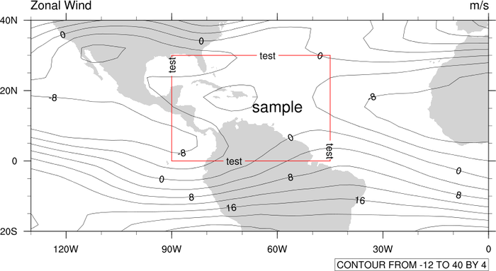
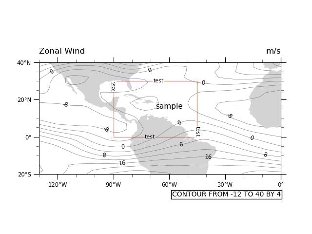
Plot 1 (Text inside a box):#
# Create the base figure
ax = make_base_plot()

# Draw text inside of box
ax.text(-60.0, 15.0, "sample", fontsize=11, horizontalalignment='center')

# Show the plot
plt.show()
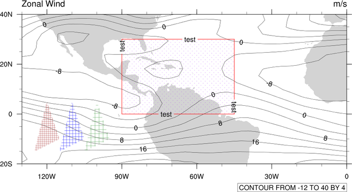
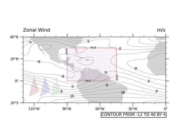
Utility Function: Draw Hatch Polygon:#
# Define a utility function that draws a polygon and then erases its border with another polygon.
def draw_hatch_polygon(xvals, yvals, hatchcolor, hatchpattern):
    """Draw a polygon filled with a hatch pattern, but with no edges on the
    polygon."""
    ax.fill(
        xvals,
        yvals,
        edgecolor=hatchcolor,
        zorder=-1,  # Place underneath contour map (larger zorder is closer to viewer).
        fill=False,
        linewidth=0.5,
        hatch=hatchpattern,
        alpha=0.3,  # Reduce color intensity
    )

    # Hatch color and polygon edge color are tied together, so we have to draw a white polygon edge
    # on top of the original polygon to remove the edge.
    ax.fill(
        xvals,
        yvals,
        edgecolor='white',
        zorder=0,  # Place on top of other polygon (larger zorder is closer to viewer).
        fill=False,
        linewidth=1,  # Slightly larger linewidth removes ghost edges.
    )
Plot 2 (Polygons with hatch patterns):#
# Make this figure the thumbnail image on the HTML page.
# sphinx_gallery_thumbnail_number = 2

# Create the base figure
ax = make_base_plot()

# Plot the hatch pattern "underneath" the red box, to hide the purple border that is unavoidably attached to producing
# the hatch pattern.
x_points = [-90.0, -45.0, -45.0, -90.0, -90.0]
y_points = [30.0, 30.0, 0.0, 0.0, 30.0]

ax.fill(
    x_points,
    y_points,
    edgecolor='purple',  # Box hatch pattern is purple.
    zorder=2,  # Place on top of map (larger zorder is closer to viewer).
    fill=False,
    hatch='...',  # Adding more or fewer dots to '...' will change hatch density.
    linewidth=0.5,  # Make each dot smaller
    alpha=0.2,  # Make hatch semi-transparent using alpha level in range [0, 1].
)

# Draw some triangles with various hatch pattern densities.
x_tri = np.array([-125, -115, -120])
y_tri = np.array([-15, -10, 5])

draw_hatch_polygon(x_tri, y_tri, 'brown', '++++')

draw_hatch_polygon(x_tri + 10, y_tri, 'blue', '+++')

draw_hatch_polygon(x_tri + 20, y_tri, 'forestgreen', '++')

# Show the plot
plt.show()
Total running time of the script: (0 minutes 0.305 seconds)