

Note
Go to the end to download the full example code.
NCL_stream_1.py#
- This script illustrates the following concepts:
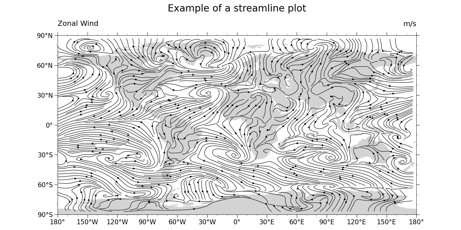
Drawing a black-and-white streamline plot over a map
- See following URLs to see the reproduced NCL plot & script:
Original NCL script: https://www.ncl.ucar.edu/Applications/Scripts/stream_1.ncl
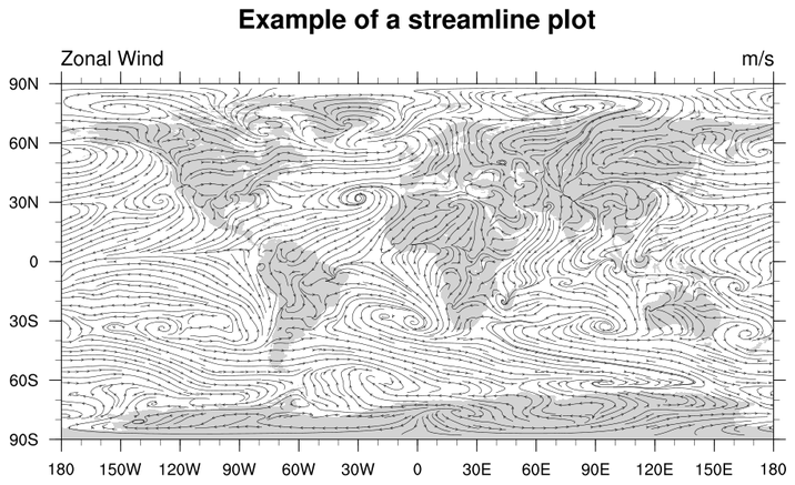
Original NCL plot: https://www.ncl.ucar.edu/Applications/Images/stream_1_lg.png
Note: The streamlines generated in this plot approximate, but do not exactly match those generated by the NCL version. This is primarily because the seed point generation algorithm used by NCL is opaque.
Import packages:
import numpy as np
import xarray as xr
import cartopy.crs as ccrs
import matplotlib.pyplot as plt
import cartopy.feature as cfeature

import geocat.datafiles as gdf
import geocat.viz as gv
Read in data:
# Open a netCDF data file using xarray default engine and load the data into xarrays
ds = xr.open_dataset(gdf.get('netcdf_files/uvt.nc'))
# Extract a 2D horizontal slice from the first time step of the 3D U and V variables at the bottom level
U = ds.U.isel(time=0, lev=0)
V = ds.V.isel(time=0, lev=0)
Plot:
# Generate figure (set its size (width, height) in inches)
plt.figure(figsize=(16, 8))

# Generate axes using Cartopy projection
projection = ccrs.PlateCarree()
ax = plt.axes(projection=projection)

# Use global map
ax.set_global()

# Stream-plot the data
# There is no Xarray streamplot function, yet. So need to call matplotlib.streamplot directly. Not sure why, but can't
# pass xarray.DataArray objects directly: fetch NumPy arrays via 'data' attribute'
ax.streamplot(
    U.lon.data,
    U.lat.data,
    U.data,
    V.data,
    linewidth=1,
    density=4,
    color='black',
    zorder=1,
)

# Use geocat.viz.util convenience function to add minor and major tick lines
gv.add_major_minor_ticks(ax, labelsize=16)

# Use geocat.viz.util convenience function to make plots look like NCL plots by using latitude, longitude tick labels
gv.add_lat_lon_ticklabels(ax)

# Use geocat.viz.util convenience function to set axes tick values without calling two different matplotlib functions
gv.set_axes_limits_and_ticks(
    ax, xticks=np.linspace(-180, 180, 13), yticks=np.linspace(-90, 90, 7)
)

# Draw filled polygons for land
ax.add_feature(cfeature.LAND, zorder=0, edgecolor='black', color='lightgray')

# Use geocat.viz.util convenience function to add titles to left and right of the plot axis.
gv.set_titles_and_labels(
    ax,
    maintitle="Example of a streamline plot",
    maintitlefontsize=22,
    lefttitle=U.long_name,
    lefttitlefontsize=18,
    righttitle=U.units,
    righttitlefontsize=18,
    xlabel="",
    ylabel="",
)

# Show the plot
plt.tight_layout()
plt.show()
Total running time of the script: (0 minutes 3.618 seconds)