

Note
Go to the end to download the full example code.
NCL_eof_1_1.py#
Calculate EOFs of the Sea Level Pressure over the North Atlantic.
- This script illustrates the following concepts:
Calculating EOFs
Drawing a time series plot
Using coordinate subscripting to read a specified geographical region
Rearranging longitude data to span -180 to 180
Calculating symmetric contour intervals
Drawing filled bars above and below a given reference line
Drawing subtitles at the top of a plot
Reordering an array
- See following URLs to see the reproduced NCL plot & script:
Original NCL script: https://www.ncl.ucar.edu/Applications/Scripts/eof_1.ncl
Original NCL plot: https://www.ncl.ucar.edu/Applications/Images/eof_1_1_lg.png and https://www.ncl.ucar.edu/Applications/Images/eof_1_2_lg.png
- Note (1):
So-called original NCL plot “eof_1_2_lg.png” given in the above URL is likely not identical to what the given NCL original script generates. When the given NCL script is run, it generates a plot with identical data to that is plotted by this Python script.
Import packages:
import xarray as xr
import numpy as np
import matplotlib.pyplot as plt
import cartopy.crs as ccrs
import cmaps

import geocat.datafiles as gdf
import geocat.viz as gv
from geocat.comp import eofunc_eofs, eofunc_pcs, month_to_season
User defined parameters and a convenience function:
# In order to specify region of the globe, time span, etc.
latS = 25.0
latN = 80.0
lonL = -70.0
lonR = 40.0

yearStart = 1979
yearEnd = 2003

neof = 3  # number of EOFs
Read in data:
# Open a netCDF data file using xarray default engine and load the data into xarrays
ds = xr.open_dataset(gdf.get('netcdf_files/slp.mon.mean.nc'))
/home/docs/checkouts/readthedocs.org/user_builds/geocat-examples/conda/latest/lib/python3.14/site-packages/xarray/coding/times.py:215: SerializationWarning: Ambiguous reference date string: 1-1-1 00:00:0.0. The first value is assumed to be the year hence will be padded with zeros to remove the ambiguity (the padded reference date string is: 0001-1-1 00:00:0.0). To remove this message, remove the ambiguity by padding your reference date strings with zeros.
  ref_date = _ensure_padded_year(ref_date)
Flip and sort longitude coordinates:
# To facilitate data subsetting

ds["lon"] = ((ds["lon"] + 180) % 360) - 180

# Sort longitudes, so that subset operations end up being simpler.
ds = ds.sortby("lon")
Place latitudes in increasing order:
# To facilitate data subsetting

ds = ds.sortby("lat", ascending=True)
Limit data to the specified years:
startDate = f'{yearStart}-01-01'
endDate = f'{yearEnd}-12-31'

ds = ds.sel(time=slice(startDate, endDate))
Compute desired global seasonal mean using month_to_season()
# Choose the winter season (December-January-February)
season = "DJF"
SLP = month_to_season(ds, season)
Create weights: sqrt(cos(lat)) [or sqrt(gw) ]
clat = SLP['lat'].astype(np.float64)
clat = np.sqrt(np.cos(np.deg2rad(clat)))
Multiply SLP by weights:
# Xarray will apply latitude-based weights to all longitudes and timesteps automatically.
# This is called "broadcasting".

wSLP = SLP
wSLP['slp'] = SLP['slp'] * clat

# For now, metadata for slp must be copied over explicitly; it is not preserved by binary operators like multiplication.
wSLP['slp'].attrs = ds['slp'].attrs
wSLP['slp'].attrs['long_name'] = 'Wgt: ' + wSLP['slp'].attrs['long_name']
Subset data to the North Atlantic region:
xw = wSLP.sel(lat=slice(latS, latN), lon=slice(lonL, lonR))
Compute the EOFs:
# Transpose data to have 'time' in the first dimension
# as `eofunc` functions expects so for xarray inputs for now
xw_slp = xw["slp"].transpose('time', 'lat', 'lon')

eofs = eofunc_eofs(xw_slp, neofs=neof, meta=True)

pcs = eofunc_pcs(xw_slp, npcs=neof, meta=True)

# Change the sign of the second EOF and its time-series for
# consistent visualization purposes. See this explanation:
# https://www.ncl.ucar.edu/Support/talk_archives/2009/2015.html
# about that EOF signs are arbitrary and do not change the physical
# interpretation.
eofs[1, :, :] = eofs[1, :, :] * (-1)
pcs[1, :] = pcs[1, :] * (-1)
Normalize time series:
# Sum spatial weights over the area used.
nLon = xw.sizes["lon"]

# Bump the upper value of the slice, so that latitude values equal to latN are included.
clat_subset = clat.sel(lat=slice(latS, latN + 0.01))
weightTotal = clat_subset.sum() * nLon
pcs = pcs / weightTotal
Utility function:
# Define a utility function for creating a contour plot.
def make_contour_plot(ax, dataset):
    lat = dataset['lat']
    lon = dataset['lon']
    values = dataset.data

    # Import an NCL colormap
    cmap = cmaps.BlWhRe

    # Specify contour levelstamam
    v = np.linspace(-0.08, 0.08, 9, endpoint=True)

    # The function contourf() produces fill colors, and contour() calculates contour label locations.
    cplot = ax.contourf(
        lon,
        lat,
        values,
        levels=v,
        cmap=cmap,
        extend="both",
        transform=ccrs.PlateCarree(),
    )

    p = ax.contour(
        lon, lat, values, levels=v, linewidths=0.0, transform=ccrs.PlateCarree()
    )

    # Label the contours
    ax.clabel(p, fontsize=8, fmt="%0.2f", colors="black")

    # Add coastlines
    ax.coastlines(linewidth=0.5)

    # Use geocat.viz.util convenience function to add minor and major tick lines
    gv.add_major_minor_ticks(ax, x_minor_per_major=3, y_minor_per_major=4, labelsize=10)

    # Use geocat.viz.util convenience function to set axes tick values
    gv.set_axes_limits_and_ticks(ax, xticks=[-60, -30, 0, 30], yticks=[40, 60, 80])

    # Use geocat.viz.util convenience function to make plots look like NCL plots, using latitude & longitude tick labels
    gv.add_lat_lon_ticklabels(ax)

    return cplot, ax
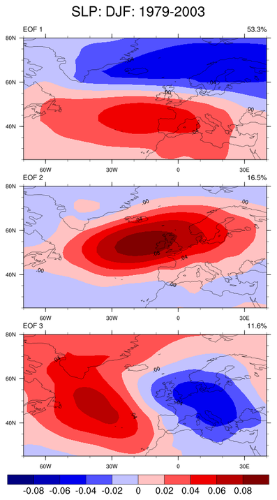
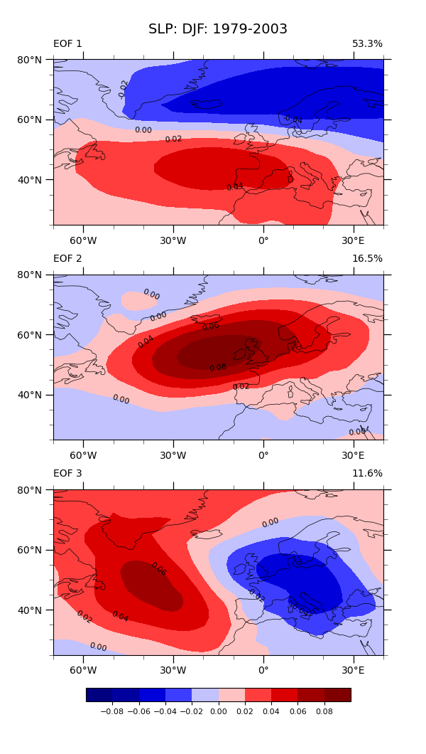
Plot (1): Draw a contour plot for each EOF
# Generate figure and axes using Cartopy projection  and set figure size (width, height) in inches
fig, axs = plt.subplots(
    neof, 1, subplot_kw={"projection": ccrs.PlateCarree()}, figsize=(6, 10.6)
)

# Add multiple axes to the figure as contour and contourf plots
for i in range(neof):
    eof_single = eofs.sel(eof=i)

    # Create contour plot for the current axes
    cplot, axs[i] = make_contour_plot(axs[i], eof_single)

    # Use geocat.viz.util convenience function to add titles to left and right of the plot axis.
    pct = eofs.attrs['varianceFraction'].values[i] * 100
    gv.set_titles_and_labels(
        axs[i],
        lefttitle=f'EOF {i + 1}',
        lefttitlefontsize=10,
        righttitle=f'{pct:.1f}%',
        righttitlefontsize=10,
    )

# Adjust subplot spacings and locations
plt.subplots_adjust(bottom=0.07, top=0.95, hspace=0.15)

# Add horizontal colorbar
cbar = plt.colorbar(
    cplot,
    ax=axs,
    orientation='horizontal',
    shrink=0.9,
    pad=0.05,
    fraction=0.02,
    extendrect=True,
    extendfrac='auto',
)
cbar.ax.tick_params(labelsize=8)

# Set a common title
axs[0].set_title(f'SLP: DJF: {yearStart}-{yearEnd}', fontsize=14, y=1.12)

# Show the plot
plt.show()
Utility function:
# Define a utility function for creating a bar plot.


def make_bar_plot(ax, dataset):
    years = list(dataset.time.dt.year)
    values = list(dataset.values)
    colors = ['blue' if val < 0 else 'red' for val in values]

    ax.bar(years, values, color=colors, width=1.0, edgecolor='black', linewidth=0.5)
    ax.set_ylabel('Pa')

    # Use geocat.viz.util convenience function to add minor and major tick lines
    gv.add_major_minor_ticks(ax, x_minor_per_major=4, y_minor_per_major=5, labelsize=8)

    # Use geocat.viz.util convenience function to set axes tick values
    gv.set_axes_limits_and_ticks(
        ax, xticks=np.linspace(1980, 2000, 6), xlim=[1978.5, 2003.5]
    )

    return ax
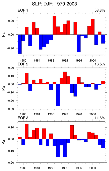
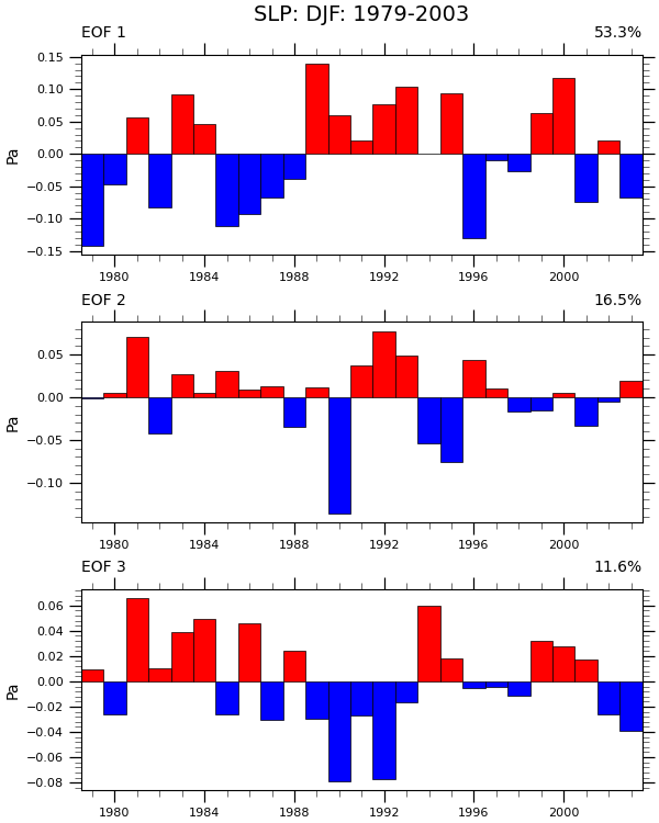
Plot (2): Produce a bar plot for each EOF.
# Generate figure and axes using Cartopy projection and set figure size (width, height) in inches
fig, axs = plt.subplots(neof, 1, constrained_layout=True, figsize=(6, 7.5))

# Add multiple axes to the figure as bar-plots
for i in range(neof):
    eof_single = pcs.sel(pc=i)

    axs[i] = make_bar_plot(axs[i], eof_single)
    pct = eofs.attrs['varianceFraction'].values[i] * 100
    gv.set_titles_and_labels(
        axs[i],
        lefttitle=f'EOF {i + 1}',
        lefttitlefontsize=10,
        righttitle=f'{pct:.1f}%',
        righttitlefontsize=10,
    )

# Set a common title
axs[0].set_title(f'SLP: DJF: {yearStart}-{yearEnd}', fontsize=14, y=1.12)

# Show the plot
plt.show()
Total running time of the script: (0 minutes 1.973 seconds)