

Note
Go to the end to download the full example code.
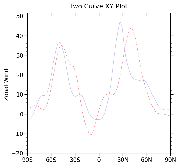
NCL_xy_2_1.py#
- This script illustrates the following concepts:
Drawing an XY plot with multiple curves
Changing the line color for multiple curves in an XY plot
Changing the line thickness for multiple curves in an XY plot
Drawing XY plot curves with both lines and markers
Changing the default markers in an XY plot
Making all curves in an XY plot solid.
- See following URLs to see the reproduced NCL plot & script:
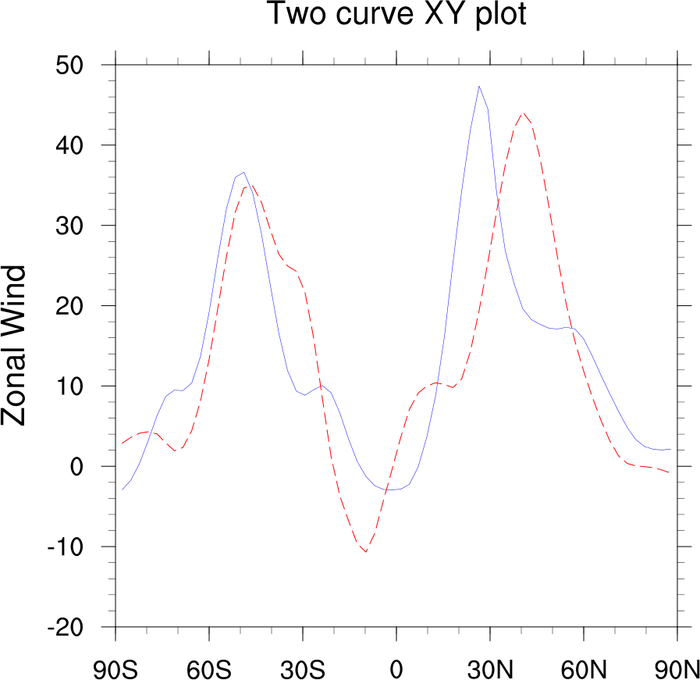
Original NCL script: https://www.ncl.ucar.edu/Applications/Scripts/xy_2.ncl
Original NCL plot: https://www.ncl.ucar.edu/Applications/Images/xy_2_1_lg.png
Import packages:
import numpy as np
import xarray as xr
import matplotlib.pyplot as plt

import geocat.datafiles as gdf
import geocat.viz as gv
Read in data:
# Open a netCDF data file using xarray default engine and load the data into xarrays
ds = xr.open_dataset(gdf.get("netcdf_files/uv300.nc"))
U = ds.U
Plot:
# Generate figure (set its size (width, height) in inches) and axes
plt.figure(figsize=(7, 6.5))
ax = plt.gca()

# Plot slices of data
U.isel(time=0).sel(lon=82, method='nearest').plot(
    x="lat", marker='', color='#C0C2EA', linewidth=1.1
)
U.isel(time=0).sel(lon=-69, method='nearest').plot(
    x="lat",
    marker='',
    color='#E28D90',
    linewidth=1.1,
    linestyle='--',
    dashes=[6.5, 3.7],
)

# Use geocat.viz.util convenience function to add minor and major tick lines
gv.add_major_minor_ticks(ax, x_minor_per_major=3, y_minor_per_major=5, labelsize=16)

# Use geocat.viz.util convenience function to set axes parameters without calling several matplotlib functions
# Set axes limits, tick values, and tick labels to show latitude & longitude (i.e. North (N) - South (S))
gv.set_axes_limits_and_ticks(
    ax,
    xlim=(-90, 90),
    ylim=(-20, 50),
    xticks=np.linspace(-90, 90, 7),
    yticks=np.linspace(-20, 50, 8),
    xticklabels=['90S', '60S', '30S', '0', '30N', '60N', '90N'],
)

# Use geocat.viz.util convenience function to set titles and labels without calling several matplotlib functions
gv.set_titles_and_labels(
    ax, maintitle="Two Curve XY Plot", xlabel="", ylabel="Zonal Wind"
)

# Show the plot
plt.tight_layout()
plt.show()
Total running time of the script: (0 minutes 0.118 seconds)