

Note
Go to the end to download the full example code.
NCL_polyg_18.py#
- This script illustrates the following concepts:
Adding lines, markers, and polygons to a map
Drawing lines, markers, polygons, and text in inset axes
- See following URLs to see the reproduced NCL plot & script:
Original NCL script: https://www.ncl.ucar.edu/Applications/Scripts/polyg_18.ncl
Original NCL plot: https://www.ncl.ucar.edu/Applications/Images/polyg_18_2_lg.png
Import packages:
import matplotlib.pyplot as plt
import matplotlib.patches as mpatches
import cartopy
import cartopy.crs as ccrs
from cartopy.mpl.ticker import LatitudeFormatter, LongitudeFormatter
import numpy as np

import geocat.viz as gv
Define helper function to remove ticks/frames from axes
def removeTicks(axis):
    axis.get_xaxis().set_visible(False)
    axis.get_yaxis().set_visible(False)
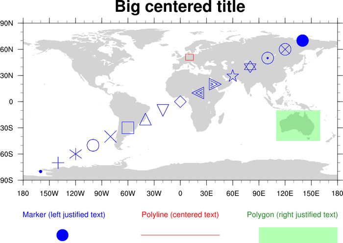
Plot map, markers, and polygons
# Set size of figure
fig = plt.figure(figsize=(10, 10))

# Make grid on figure with 2 rows, 1 column
grid = plt.GridSpec(2, 20, figure=fig)

# Make subplot for map
ax = plt.subplot(grid[:-1, 1:], projection=ccrs.PlateCarree())

# Add continents
continents = cartopy.feature.NaturalEarthFeature(
    name='land',
    category='physical',
    scale='50m',
    edgecolor='None',
    facecolor='lightgray',
)

ax.add_feature(continents)

# Set map extent
ax.set_global()

# Create arrays with location of each marker
lon = np.arange(-160, 160, 20)
lat = np.arange(-80, 80, 10)

# Create array with marker symbols
# Matplotlib provides a different set of markers than NCL, so plot appearance differs
marker = [
    '.',
    '+',
    '*',
    'o',
    'x',
    's',
    '^',
    'v',
    'D',
    '>',
    '<',
    'p',
    'h',
    '8',
    'X',
    'd',
]

# Draw markers on diagonal line across graph
for x in range(len(lon)):
    ax.plot(
        lon[x],
        lat[x],
        marker=marker[x],
        color='blue',
        fillstyle='none',
        markersize=18,
        zorder=3,
    )

# Draw small red box in upper center
ax.add_patch(
    mpatches.Rectangle(
        xy=[7, 47],
        width=9,
        height=7,
        facecolor='None',
        edgecolor='red',
        alpha=1.0,
        transform=ccrs.PlateCarree(),
        zorder=5,
    )
)

# Draw green window in bottom right
ax.add_patch(
    mpatches.Rectangle(
        xy=[110, -45],
        width=50,
        height=35,
        facecolor='lime',
        alpha=0.3,
        transform=ccrs.PlateCarree(),
        zorder=5,
    )
)

# Use gv function to set the ticks on axes
gv.set_axes_limits_and_ticks(
    ax,
    xlim=None,
    ylim=None,
    xticks=np.arange(-180, 210, 30),
    yticks=np.arange(-90, 120, 30),
    xticklabels=None,
    yticklabels=None,
)

# Use gv function to give ticks W/N/E/S labels
gv.add_lat_lon_ticklabels(ax, zero_direction_label=True, dateline_direction_label=True)

# Took out degree symbols in latitude/longitude
ax.yaxis.set_major_formatter(LatitudeFormatter(degree_symbol=''))
ax.xaxis.set_major_formatter(LongitudeFormatter(degree_symbol=''))

# Use gv function to set title of plot
# Set title font to bold using the r"$\bf{_____}$" formatting characters
# Spaces in title will not show up if included in curly brackets
gv.set_titles_and_labels(
    ax,
    maintitle=r"$\bf{Big}$" + " " + r"$\bf{centered}$" + " " + r"$\bf{title}$",
    maintitlefontsize=25,
)

# Use gv function to plot three minor ticks for every major tick on axes
gv.add_major_minor_ticks(
    ax, x_minor_per_major=3, y_minor_per_major=3, labelsize="small"
)

# Make second subplot for legend
ax2 = plt.subplot(grid[-1, 1:], frameon=False)
removeTicks(ax2)

# Create 6 inset axes within subplot for each field in legend
# Inset_axes positional array argument takes four values:
# [starting (bottom left) x coordinate of window, starting y coordinate of window, width of field, height of field]

# Add circle
axin1 = ax2.inset_axes([0.1, 0.8, 0.1, 0.1], frameon=False)
removeTicks(axin1)
axin1.add_patch(mpatches.Circle((0.1, 0.1), radius=0.1, color='blue'))
axin1.axis('equal')

# Add label for circle
axin2 = ax2.inset_axes([0.0, 0.65, 0.20, 0.5], frameon=False)
removeTicks(axin2)
axin2.text(
    0,
    0.7,
    'Marker (left justified text)',
    color='blue',
    fontsize=12,
    verticalalignment='center',
)

# Add red line
axin3 = ax2.inset_axes([0.30, 0.6, 0.33, 0.5], frameon=False)
removeTicks(axin3)
axin3.plot([0, 4], [3, 3], color='red')
axin1.axis('scaled')

# Add label for red line
axin4 = ax2.inset_axes([0.33, 0.65, 0.33, 0.5], frameon=False)
removeTicks(axin4)
axin4.text(
    0,
    0.7,
    'Polyline (centered text)',
    color='red',
    fontsize=12,
    verticalalignment='center',
)

# Add green polygon
axin5 = ax2.inset_axes([0.62, 0.6, 0.33, 0.5], frameon=False)
removeTicks(axin5)
axin5.add_patch(
    mpatches.Rectangle(
        xy=[0.3, 0.3], width=0.6, height=0.3, facecolor='lime', alpha=0.3
    )
)
axin1.axis('scaled')

# Add label for green polygon
axin6 = ax2.inset_axes([0.66, 0.65, 0.33, 0.5], frameon=False)
removeTicks(axin6)
axin6.text(
    0,
    0.7,
    'Polygon (right justified text)',
    color='lime',
    fontsize=12,
    verticalalignment='center',
)

plt.show()
Total running time of the script: (0 minutes 0.316 seconds)