

Note
Go to the end to download the full example code.
NCL_ce_3_2.py#
- This script illustrates the following concepts:
Drawing color-filled contours over a cylindrical equidistant map
Selecting a different color map
Changing the contour level spacing
Turning off contour lines
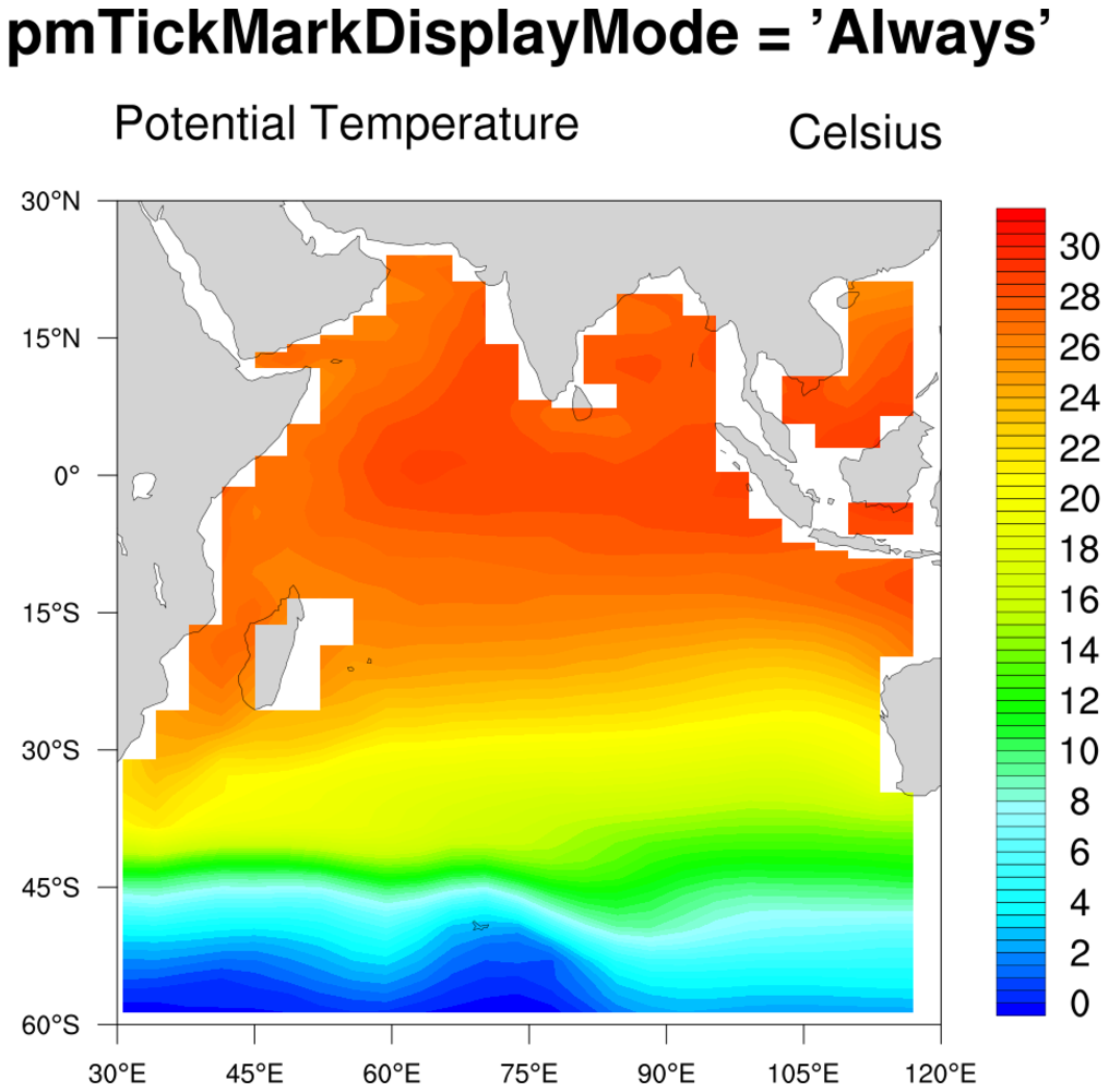
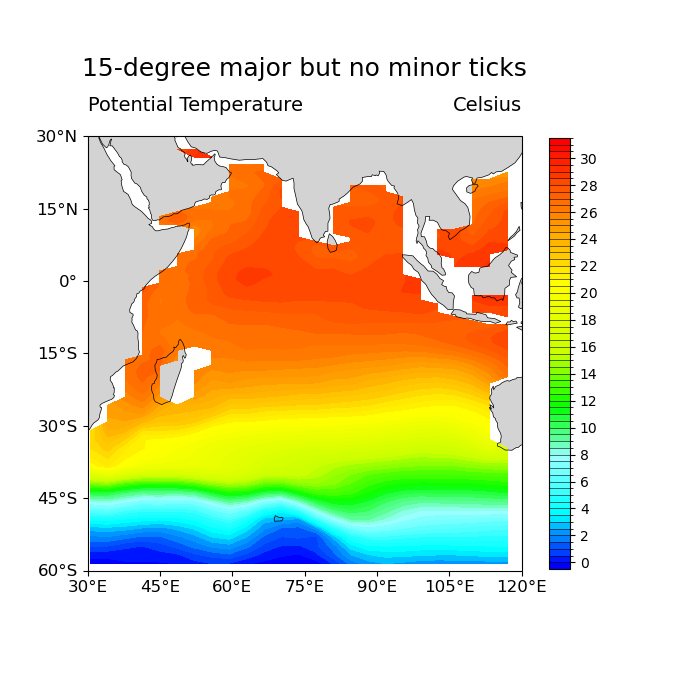
Comparing styles of map tickmarks labels
Changing the stride of the colorbar labels
Zooming in on a particular area on the map
Turning off the addition of a longitude cyclic point
- See following URLs to see the reproduced NCL plot & script:
Original NCL script: https://www.ncl.ucar.edu/Applications/Scripts/ce_3.ncl
Original NCL plot: https://www.ncl.ucar.edu/Applications/Images/ce_3_2_lg.png
Import packages:
import numpy as np
import xarray as xr
import cartopy.crs as ccrs
import cartopy.feature as cfeature
import matplotlib.pyplot as plt
import cmaps

import geocat.datafiles as gdf
import geocat.viz as gv
Read in data:
# Open a netCDF data file using xarray default engine and load the data into xarrays
ds = xr.open_dataset(gdf.get('netcdf_files/h_avg_Y0191_D000.00.nc'), decode_times=False)
# Extract a slice of the data
t = ds.T.isel(time=0, z_t=0).sel(lat_t=slice(-60, 30), lon_t=slice(30, 120))
Plot:
# Generate figure (set its size (width, height) in inches)
fig = plt.figure(figsize=(7, 7))

# Generate axes, using Cartopy, drawing coastlines, and adding features
projection = ccrs.PlateCarree()
ax = plt.axes(projection=projection)
ax.coastlines(linewidths=0.5)
ax.add_feature(cfeature.LAND, facecolor='lightgray')

# Import an NCL colormap
newcmp = cmaps.BlAqGrYeOrRe

# Contourf-plot data
heatmap = t.plot.contourf(
    ax=ax,
    transform=projection,
    levels=np.arange(0, 32, 0.5),
    vmin=0,
    vmax=32,
    cmap=newcmp,
    add_colorbar=False,
)

# Add colorbar
cbar = plt.colorbar(
    heatmap,
    shrink=0.8,
    drawedges=True,
    ticks=np.arange(0, 32, 2),
    extendrect=True,
    extendfrac='auto',
)
cbar.ax.set_yticklabels([str(i) for i in np.arange(0, 32, 2)])

# Adjust tick label size
ax.tick_params(labelsize=12)

# Use geocat.viz.util convenience function to set axes parameters without calling several matplotlib functions
# Set axes limits, and tick values
gv.set_axes_limits_and_ticks(
    ax,
    xlim=(30, 120),
    ylim=(-60, 30),
    xticks=np.linspace(-180, 180, 25),
    yticks=np.linspace(-90, 90, 13),
)

# Use geocat.viz.util convenience function to make plots look like NCL plots by using latitude, longitude tick labels
gv.add_lat_lon_ticklabels(ax)

# Use geocat.viz.util convenience function to set titles and labels without calling several matplotlib functions
gv.set_titles_and_labels(
    ax,
    maintitle="15-degree major but no minor ticks",
    maintitlefontsize=16,
    lefttitle="Potential Temperature",
    lefttitlefontsize=14,
    righttitle="Celsius",
    righttitlefontsize=14,
    xlabel="",
    ylabel="",
)

# Show the plot
plt.show()
Total running time of the script: (0 minutes 0.203 seconds)