

Note
Go to the end to download the full example code.
NCL_coneff_11.py#
- This script illustrates the following concepts:
Filling contours with multiple styles of hatches
Changing the color of hatches in a contour plot and colorbar
Changing the size of hatches in a contour plot
Changing the density hatches in a contour plot
- See following URLs to see the reproduced NCL plot & script:
Import packages:
import numpy as np
import xarray as xr
import matplotlib.pyplot as plt

import geocat.datafiles as gdf
import geocat.viz as gv
Read in data
# Open a netCDF data file using xarray default engine and load the data into xarrays
ds = xr.open_dataset(gdf.get('netcdf_files/atmos.nc'), decode_times=False)

# Select meridional wind at lowest pressure level
v = ds.V.isel(time=0, lev=0)
Plot
# Generate figure (set its size (width, height) in inches)
plt.figure(figsize=(8, 10))
ax = plt.axes()
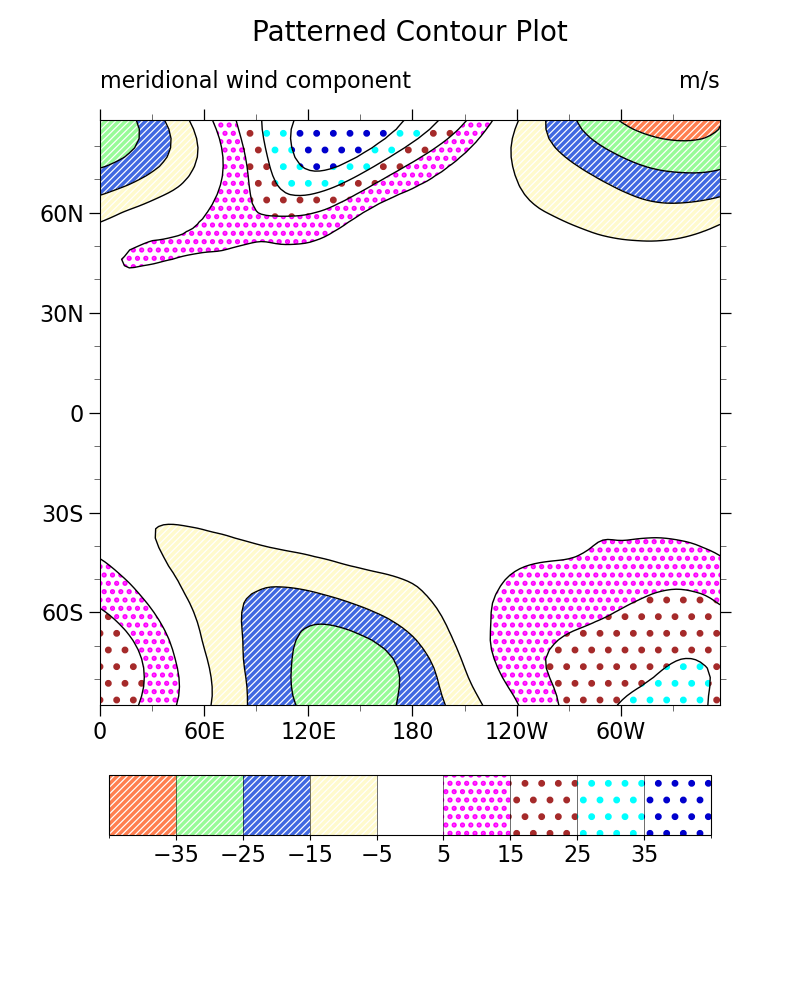
# Choose hatches to fill the contours
hatches = ['/////', '/////', '/////', '/////', None, '..', '.', '.', '.']
# Choose colors for the hatches
colors = [
'coral',
'palegreen',
'royalblue',
'lemonchiffon',
'white',
'fuchsia',
'brown',
'cyan',
'mediumblue',
]
# Create a filled contour plot
p = v.plot.contourf(
ax=ax,
vmin=-45.0,
vmax=45,
levels=10,
add_colorbar=False,
hatches=hatches,
cmap='white',
) # Use white cmap to have a white background
# Set the colors for the hatches
p.set_edgecolors(colors)
p.set_linewidth(0.0)
# Set linewidth of hatches
plt.rcParams['hatch.linewidth'] = 2.5
# Plot the contour lines
c = v.plot.contour(
ax=ax,
vmin=-45.0,
vmax=45,
levels=10,
colors='k',
linewidths=1,
add_colorbar=False,
linestyles='solid',
)
# Add horizontal colorbar
cbar = plt.colorbar(
p, orientation='horizontal', shrink=0.97, aspect=10, pad=0.09, drawedges=True
)
cbar.ax.tick_params(labelsize=16)
cbar.set_ticks(np.arange(-35, 40, 10))
# Color the hatches in colorbar
# We need to do this manually because matplotlib only uses information
# from the contourf call to create the colorbar.
for i, patch in enumerate(cbar.solids_patches):
patch.set(edgecolor=colors[i % len(colors)])
# Use geocat-viz utility function to format latitude and longitude labels
gv.add_lat_lon_ticklabels(ax)
# Use geocat-viz utility function to format major and minor ticks
gv.add_major_minor_ticks(ax, x_minor_per_major=2, y_minor_per_major=3, labelsize=16)
# Use geocat-viz utility function to set titles and labels
gv.set_titles_and_labels(
ax,
maintitle="Patterned Contour Plot",
maintitlefontsize=18,
lefttitle="meridional wind component",
lefttitlefontsize=16,
righttitle="m/s",
righttitlefontsize=16,
)
# Remove default x and y labels
ax.set_xlabel(None)
ax.set_ylabel(None)
# Use geocat-viz utility function to set tick marks and tick labels
gv.set_axes_limits_and_ticks(
ax,
xticks=np.arange(0, 360, 60),
yticks=np.arange(-60, 90, 30),
xticklabels=['0', '60E', '120E', '180', '120W', '60W'],
yticklabels=['60S', '30S', '0', '30N', '60N'],
)
plt.show()
Total running time of the script: (0 minutes 0.184 seconds)