

Note
Go to the end to download the full example code.
NCL_conLev_4.py#
- This script illustrates the following concepts:
Explicitly setting contour levels
Explicitly setting the fill colors for contours
Reordering an array
Removing the mean
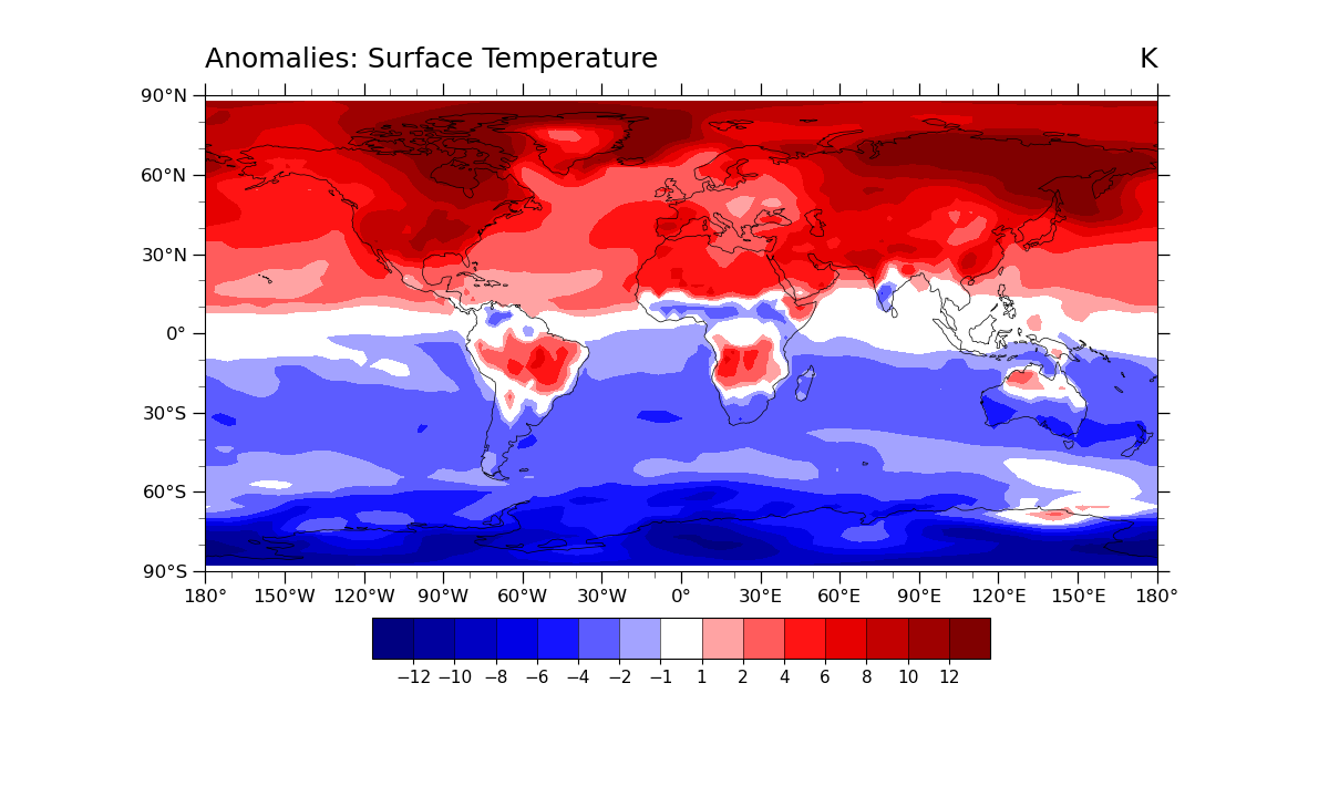
Drawing color-filled contours over a cylindrical equidistant map
Turning off contour line labels
Turning off contour lines
Turning off map fill
Turning on map outlines
- See following URLs to see the reproduced NCL plot & script:
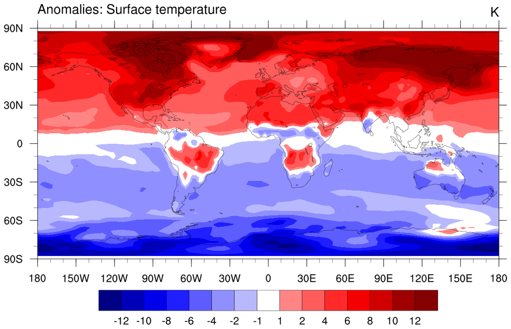
Original NCL script: https://www.ncl.ucar.edu/Applications/Scripts/conLev_4.ncl
Original NCL plot: https://www.ncl.ucar.edu/Applications/Images/conLev_4_lg.png
Import packages:
import numpy as np
import xarray as xr
import matplotlib.pyplot as plt
import cmaps

import cartopy.crs as ccrs
import geocat.datafiles as gdf
import geocat.viz as gv
Read in data:
# Open a netCDF data file using xarray default engine and load the data into xarrays
ds = xr.open_dataset(gdf.get("netcdf_files/b003_TS_200-299.nc"), decode_times=False)
x = ds.TS

# Apply mean reduction from coordinates as performed in NCL's dim_rmvmean_n_Wrap(x,0)
# Apply this only to x.isel(time=0) because NCL plot plots only for time=0
newx = x.mean('time')
newx = x.isel(time=0) - newx

# Fix the artifact of not-shown-data around 0 and 360-degree longitudes
newx = gv.xr_add_cyclic_longitudes(newx, "lon")
Plot:
# Generate figure (set its size (width, height) in inches)
plt.figure(figsize=(12, 7.2))

# Generate axes using Cartopy projection
projection = ccrs.PlateCarree()
ax = plt.axes(projection=projection)

# Use global map and draw coastlines
ax.set_global()
ax.coastlines(linewidth=0.5, resolution="110m")

# Import an NCL colormap
newcmp = cmaps.BlRe
newcmp.colors[len(newcmp.colors) // 2] = [
    1,
    1,
    1,
]  # Set middle value to white to match NCL

# Contourf-plot data (for filled contours)
p = newx.plot.contourf(
    ax=ax,
    vmin=-1,
    vmax=10,
    levels=[-12, -10, -8, -6, -4, -2, -1, 1, 2, 4, 6, 8, 10, 12],
    cmap=newcmp,
    add_colorbar=False,
    transform=projection,
    add_labels=False,
)

# Add horizontal colorbar
cbar = plt.colorbar(
    p,
    orientation='horizontal',
    shrink=0.6,
    extendrect=True,
    extendfrac='auto',
    pad=0.075,
    aspect=15,
    drawedges=True,
)
cbar.ax.tick_params(labelsize=11)
cbar.set_ticks([-12, -10, -8, -6, -4, -2, -1, 1, 2, 4, 6, 8, 10, 12])

# Use geocat.viz.util convenience function to set axes tick values
gv.set_axes_limits_and_ticks(
    ax, xticks=np.linspace(-180, 180, 13), yticks=np.linspace(-90, 90, 7)
)

# Use geocat.viz.util convenience function to make plots look like NCL plots by using latitude, longitude tick labels
gv.add_lat_lon_ticklabels(ax)

# Use geocat.viz.util convenience function to add minor and major tick lines
gv.add_major_minor_ticks(ax, labelsize=12)

# Use geocat.viz.util convenience function to add titles to left and right of the plot axis.
gv.set_titles_and_labels(ax, lefttitle='Anomalies: Surface Temperature', righttitle='K')

# Show the plot
plt.show()
Total running time of the script: (0 minutes 0.432 seconds)