

Note
Go to the end to download the full example code.
NCL_conwomap_1.py#
- This script illustrates the following concepts:
Drawing a simple line contour plot
Drawing a line contour plot with multiple colors
Increasing the thickness of contour lines
- See following URLs to see the reproduced NCL plot & script:
Original NCL script: https://www.ncl.ucar.edu/Applications/Scripts/conwomap_1.ncl
Original NCL plot: https://www.ncl.ucar.edu/Applications/Images/conwomap_1_2_lg.png
Import packages:
import numpy as np
import xarray as xr
import matplotlib.pyplot as plt
import cmaps

import geocat.datafiles as gdf
import geocat.viz as gv
Read in data:
# Open a netCDF data file using xarray default engine and load the data into xarrays
ds = xr.open_dataset(gdf.get("netcdf_files/cone.nc"))
u = ds.u.isel(time=4)
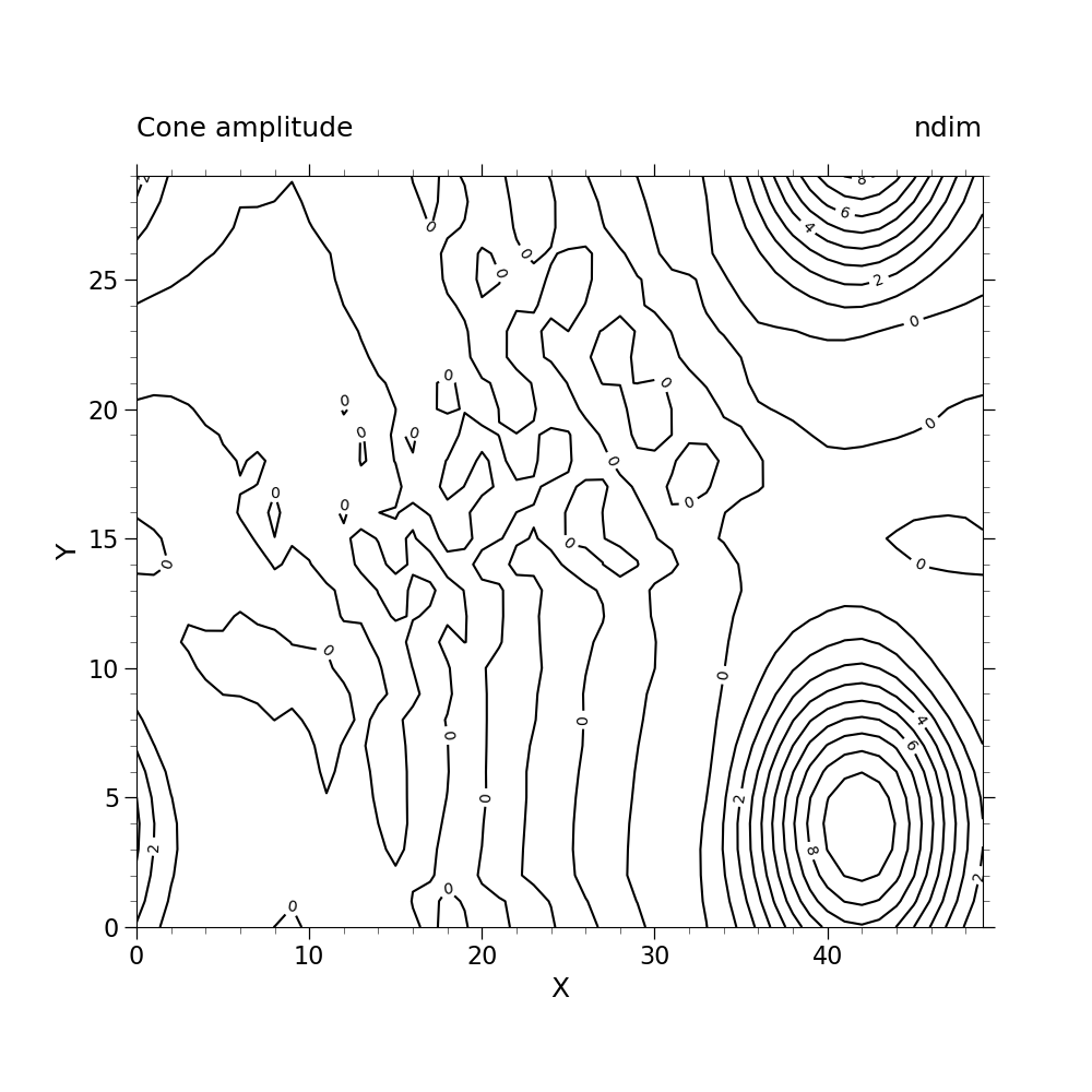
Plot Without Enhancements:
# create figure
plt.figure(figsize=(10, 10))

# create axes
ax = plt.axes()
ax.set_aspect(1.5)

# contour plot data
p = u.plot.contour(ax=ax, vmin=0, vmax=10, levels=11, add_labels=False, colors="black")

# label contours
ax.clabel(p, np.arange(0, 9, 2), colors='black', fmt="%.0f")

# Use geocat.viz.util convenience function to set axes limits & tick values without calling several matplotlib functions
gv.set_axes_limits_and_ticks(
    ax,
    xlim=(0, 49),
    ylim=(0, 29),
    xticks=np.linspace(0, 40, 5),
    yticks=np.linspace(0, 25, 6),
)

# Use geocat.viz.util convenience function to add minor and major tick lines
gv.add_major_minor_ticks(ax, x_minor_per_major=5, y_minor_per_major=5, labelsize=16)

# Use geocat.viz.util convenience function to add titles to left and right of the plot axis.
gv.set_titles_and_labels(
    ax,
    lefttitle="Cone amplitude",
    lefttitlefontsize=18,
    righttitle="ndim",
    righttitlefontsize=18,
    xlabel="X",
    ylabel="Y",
    labelfontsize=18,
)

plt.show()
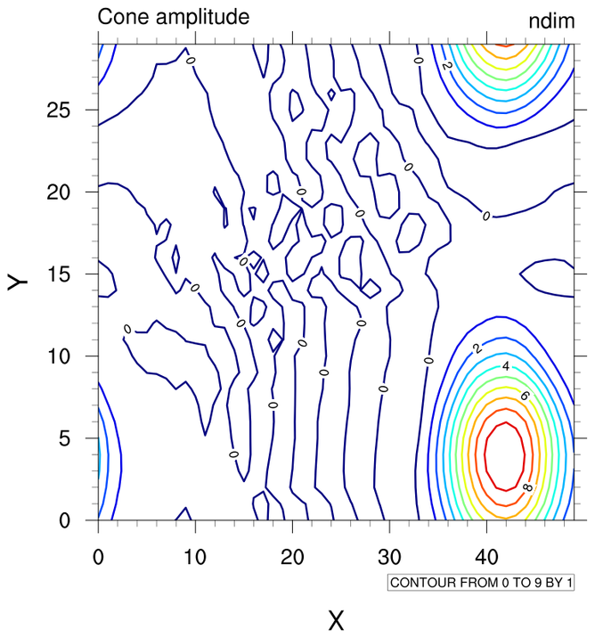
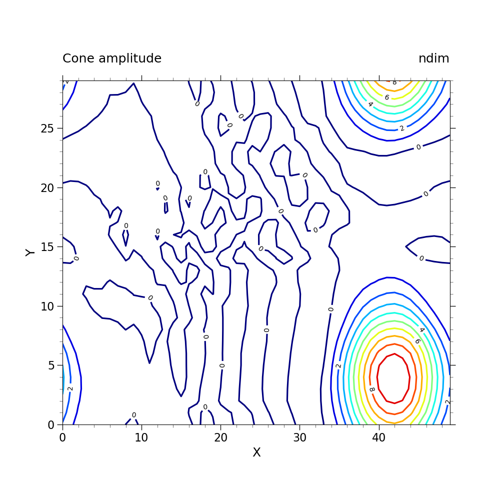
Plot With Enhancements:
# Make this figure the thumbnail image on the HTML page.
# sphinx_gallery_thumbnail_number = 2

# create figure
plt.figure(figsize=(10, 10))

# create axes
ax = plt.axes()
ax.set_aspect(1.5)

# import colormap
newcmp = cmaps.NCV_jet

# contour plot data
p = u.plot.contour(
    ax=ax, vmin=0, vmax=10, levels=11, cmap=newcmp, add_labels=False, linewidths=2.3
)

# label contours
ax.clabel(p, np.arange(0, 9, 2), colors='black', fmt="%.0f")

# Use geocat.viz.util convenience function to set axes limits & tick values without calling several matplotlib functions
gv.set_axes_limits_and_ticks(
    ax,
    xlim=(0, 49),
    ylim=(0, 29),
    xticks=np.linspace(0, 40, 5),
    yticks=np.linspace(0, 25, 6),
)

# Use geocat.viz.util convenience function to add minor and major tick lines
gv.add_major_minor_ticks(ax, x_minor_per_major=5, y_minor_per_major=5, labelsize=16)

# Use geocat.viz.util convenience function to add titles to left and right of the plot axis.
gv.set_titles_and_labels(
    ax,
    lefttitle="Cone amplitude",
    lefttitlefontsize=18,
    righttitle="ndim",
    righttitlefontsize=18,
    xlabel="X",
    ylabel="Y",
    labelfontsize=18,
)

plt.show()
Total running time of the script: (0 minutes 0.526 seconds)