

Note
Go to the end to download the full example code.
NCL_station_2.py#
- This script illustrates the following concepts:
Drawing markers on a map indicating the locations of station data
Generating dummy data using “random_uniform”
Drawing markers of different sizes and colors on a map
Drawing a custom legend outside of a map plot
Attaching a custom colorbar to a plot
- See following URLs to see the reproduced NCL plot & script:
Import packages:
import numpy as np
import matplotlib as mpl
from matplotlib import pyplot as plt
import cartopy
import cartopy.crs as ccrs

import geocat.viz as gv
Generate random data:#
# Set up random values
npts = 100
np.random.seed(20200127)

# Lat between 25 N and 50 N, lon between 125 W and 70 W
lat = np.random.uniform(25, 50, npts)
lon = np.random.uniform(235, 290, npts) - 360

dummy_data = np.random.uniform(-1.2, 35, npts)
Define colormap for plotting:#
# Set up colormap:
# Need to define boundaries for each color map as well as colors for each bin

# Note that len(colors) = len(bin_bounds) + 1
# color[0] => dummy_data < bin_bounds[0]
# color[-1] => dummy_data => bin_bounds[-1]
# color[j] => bin_bounds[j-1] <= dummy_data < bin_bounds[j]

bin_bounds = [0.0, 5.0, 10.0, 15.0, 20.0, 23.0, 26.0]
colors = ['purple', 'darkblue', 'blue', 'lightblue', 'yellow', 'orange', 'red', 'pink']

nbins = len(colors)  # One bin for each color

# Define colormap and norm for plotting based on these colors
cmap = mpl.colors.ListedColormap(colors)
norm = mpl.colors.BoundaryNorm([-1.2] + bin_bounds + [35], len(colors))
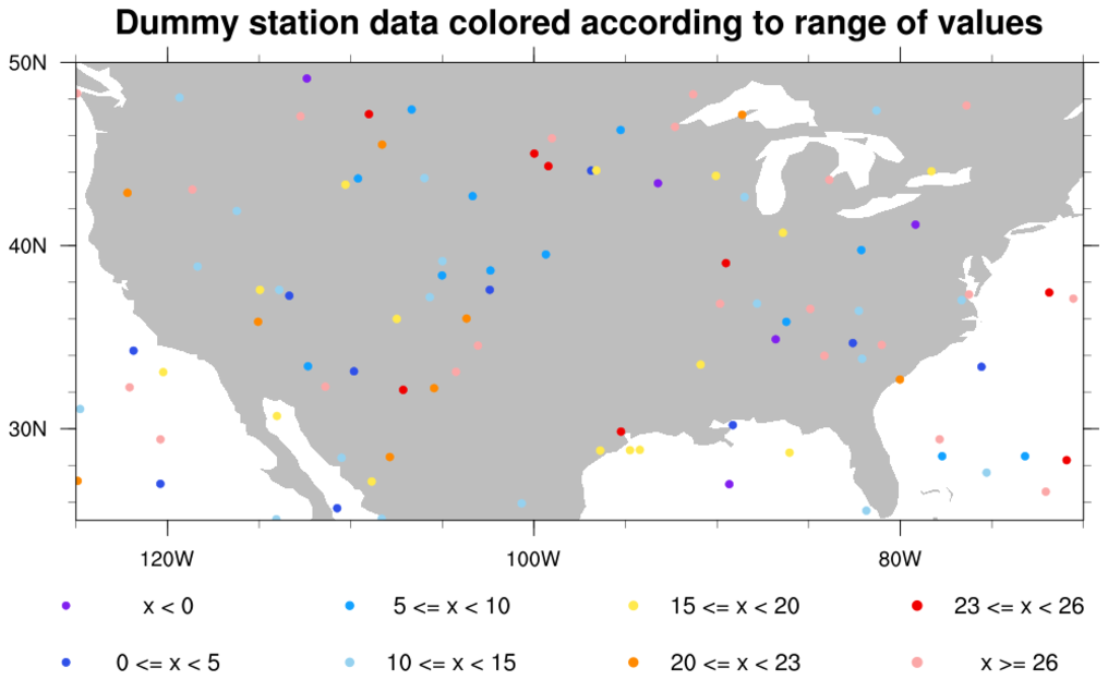
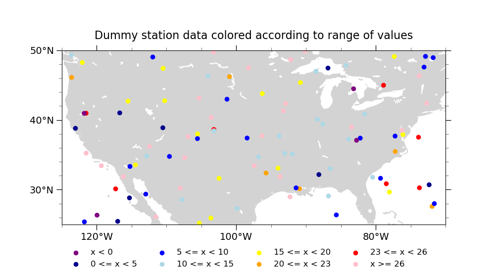
Plot 1 (with a legend outside, i.e. station_2_1.png)#
# Draw the base plot
scatter1, ax = make_shared_plot(
    "Dummy station data colored according to range of values"
)

# Add a legend to the bottom outside of the plot
# Given how we generated the plot, adding a legend is a little kludgy. Basically, we draw a second plot where no data
# is in frame but the legend for that plot is drawn where we want it
lax = plt.axes((0, 0, 1, 0.1), frameon=False)

# Plotting window is [0,1] x [0,1]
plt.xlim(0, 1)
plt.ylim(0, 1)
plt.axis('off')

for n, color in enumerate(colors):
    if n == 0:
        label = f'x < {bin_bounds[0]:.0f}'
    elif n == nbins - 1:
        label = f'x >= {bin_bounds[-1]:.0f}'
    else:
        label = f'{bin_bounds[n - 1]:.0f} <= x < {bin_bounds[n]:.0f}'

    # Plotting data at (-10, -10) which is not in the plotting window
    scatter = plt.scatter(-10, -10, color=color, label=label)

# The legend for this second plot is what we are actually interested in
# We want large font, no frame around the legend, and 4 columns of labels
lax.legend(loc='center', fontsize='large', frameon=False, ncol=4)

plt.show()
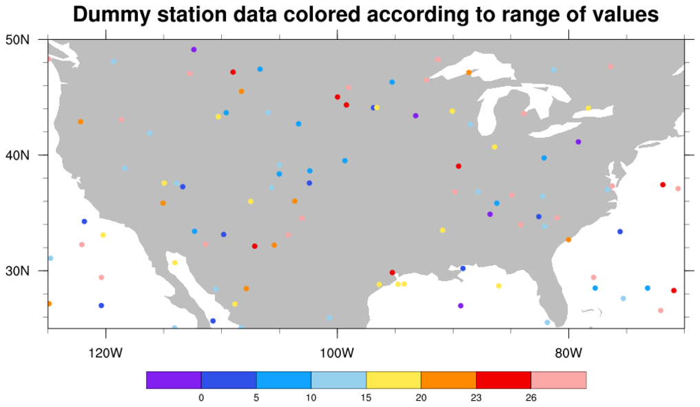
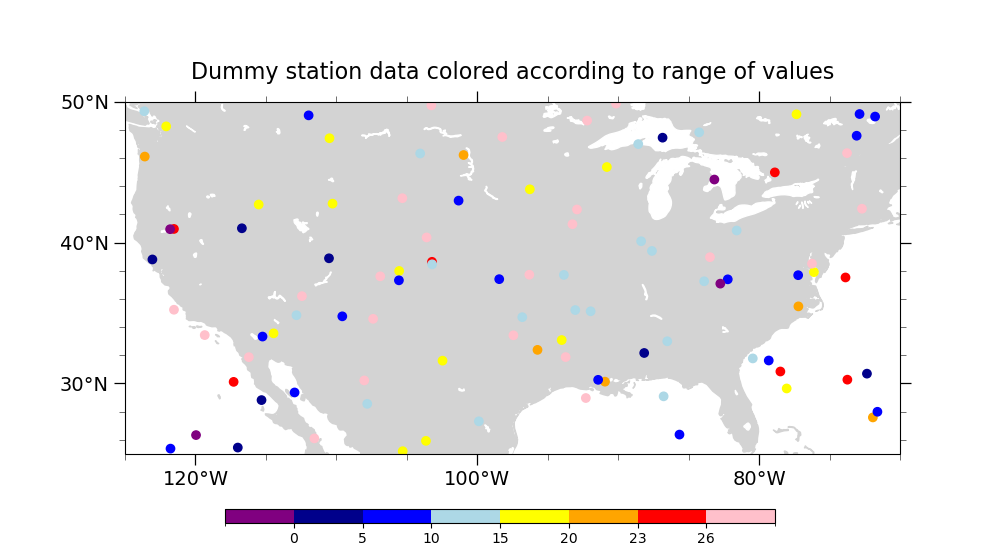
Plot 2 (with a colorbar, i.e. station_2_2.png)#
# Draw the base plot
scatter2 = make_shared_plot("Dummy station data colored according to range of values")

# Add a horizontal colorbar
cax = plt.axes((0.225, 0.05, 0.55, 0.025))
mpl.colorbar.ColorbarBase(
    cax,
    cmap=cmap,
    orientation='horizontal',
    norm=norm,
    boundaries=[-1.2] + bin_bounds + [35],
    ticks=bin_bounds,
)

# Show the plot
plt.show()
Total running time of the script: (0 minutes 0.238 seconds)