

Note
Go to the end to download the full example code.
NCL_panel_15.py#
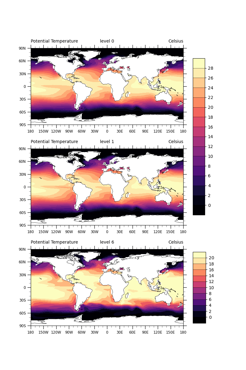
- This script illustrates the following concepts:
Paneling three plots vertically
Making a color bar span over two axes
Selecting a different colormap to abide by best practices. See the color examples for more information.
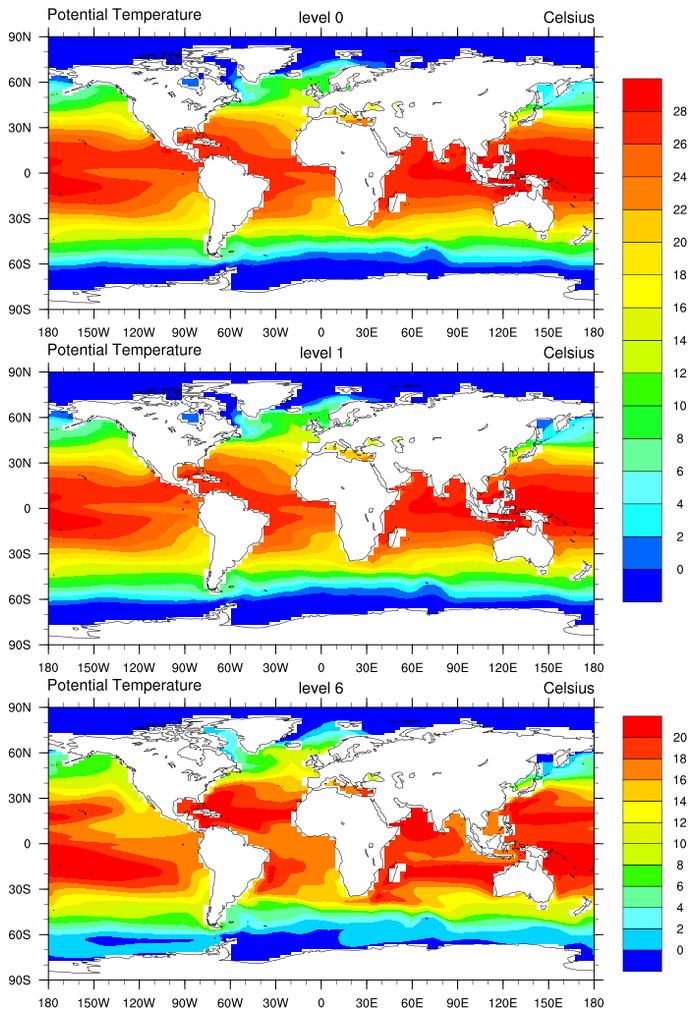
- See following URLs to see the reproduced NCL plot & script:
Original NCL script: http://www.ncl.ucar.edu/Applications/Scripts/panel_15.ncl
Original NCL plot: http://www.ncl.ucar.edu/Applications/Images/panel_15_lg.png
Import packages:
import cartopy.crs as ccrs
from cartopy.mpl.gridliner import LongitudeFormatter, LatitudeFormatter
import matplotlib.pyplot as plt
import matplotlib.gridspec as gridspec
import numpy as np
import xarray as xr

import geocat.datafiles as gdf
import geocat.viz as gv
Read in data:
# Open a netCDF data file using xarray default engine and load the data into
# xarrays
ds = xr.open_dataset(gdf.get("netcdf_files/h_avg_Y0191_D000.00.nc"), decode_times=False)

# Ensure longitudes range from 0 to 360 degrees
t = gv.xr_add_cyclic_longitudes(ds.T, "lon_t")

# Selecting the first time step and then the three levels of interest
t = t.isel(time=0)
t_1 = t.isel(z_t=0)
t_2 = t.isel(z_t=1)
t_6 = t.isel(z_t=5)
Plot:
fig = plt.figure(figsize=(8, 12))

grid = gridspec.GridSpec(nrows=3, ncols=1, figure=fig)

# Choose the map projection
proj = ccrs.PlateCarree()

# Add the subplots
ax1 = fig.add_subplot(grid[0], projection=proj)  # upper cell of grid
ax2 = fig.add_subplot(grid[1], projection=proj)  # middle cell of grid
ax3 = fig.add_subplot(grid[2], projection=proj)  # lower cell of grid

for ax, title in [(ax1, 'level 0'), (ax2, 'level 1'), (ax3, 'level 6')]:
    # Use geocat.viz.util convenience function to set axes tick values
    gv.set_axes_limits_and_ticks(
        ax=ax,
        xlim=(-180, 180),
        ylim=(-90, 90),
        xticks=np.linspace(-180, 180, 13),
        yticks=np.linspace(-90, 90, 7),
    )

    # Use geocat.viz.util convenience function to make plots look like NCL
    # plots by using latitude, longitude tick labels
    gv.add_lat_lon_ticklabels(ax)

    # Remove the degree symbol from tick labels
    ax.yaxis.set_major_formatter(LatitudeFormatter(degree_symbol=''))
    ax.xaxis.set_major_formatter(LongitudeFormatter(degree_symbol=''))

    # Use geocat.viz.util convenience function to add minor and major ticks
    gv.add_major_minor_ticks(ax)

    # Draw coastlines
    ax.coastlines(linewidth=0.5)

    # Use geocat.viz.util convenience function to set titles
    gv.set_titles_and_labels(
        ax,
        lefttitle=t_1.long_name,
        righttitle=t_1.units,
        lefttitlefontsize=10,
        righttitlefontsize=10,
    )
    # Add center title
    ax.set_title(title, loc='center', y=1.04, fontsize=10)

# Select an appropriate colormap
cmap = 'magma'

# Plot data
C = ax1.contourf(
    t_1['lon_t'],
    t_1['lat_t'],
    t_1.data,
    levels=np.arange(0, 30, 2),
    cmap=cmap,
    extend='both',
)
ax2.contourf(
    t_2['lon_t'],
    t_2['lat_t'],
    t_2.data,
    levels=np.arange(0, 30, 2),
    cmap=cmap,
    extend='both',
)
C_2 = ax3.contourf(
    t_6['lon_t'],
    t_6['lat_t'],
    t_6.data,
    levels=np.arange(0, 22, 2),
    cmap=cmap,
    extend='both',
)

# Add colorbars
# By specifying two axes for `ax` the colorbar will span both of them
plt.colorbar(
    C,
    ax=[ax1, ax2],
    ticks=range(0, 30, 2),
    extendrect=True,
    extendfrac='auto',
    shrink=0.85,
    aspect=13,
    drawedges=True,
)
plt.colorbar(
    C_2,
    ax=ax3,
    ticks=range(0, 22, 2),
    extendrect=True,
    extendfrac='auto',
    shrink=0.85,
    aspect=5.5,
    drawedges=True,
)

plt.show()
Total running time of the script: (0 minutes 0.913 seconds)