

Note
Go to the end to download the full example code.
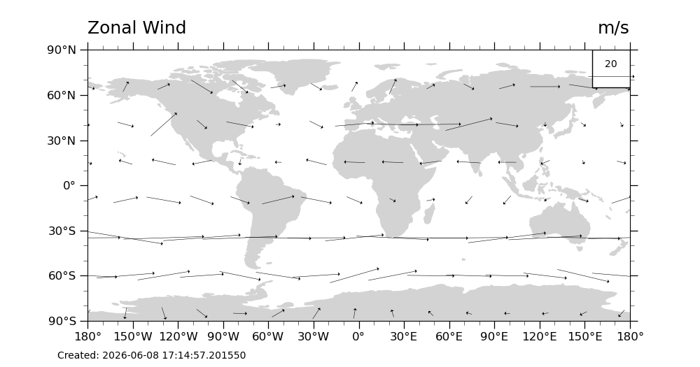
NCL_vector_3.py#
Plot U & V vectors globally
- This script illustrates the following concepts:
Drawing a black-and-white vector plot over a PlateCarree map
Adding a time stamp to a plot
Moving the vector reference annotation to the top right of the plot
- See following URLs to see the reproduced NCL plot & script:
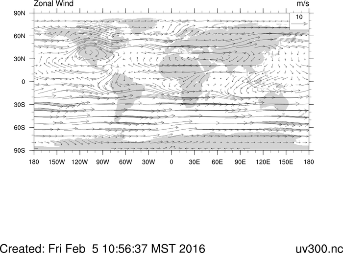
Original NCL script: https://www.ncl.ucar.edu/Applications/Scripts/vector_3.ncl
Original NCL plot: https://www.ncl.ucar.edu/Applications/Images/vector_3_lg.png
Import packages:
import xarray as xr
from matplotlib import pyplot as plt
import cartopy
import cartopy.crs as ccrs
from datetime import datetime

import geocat.datafiles as gdf
import geocat.viz as gv
Read in data:
# Open a netCDF data file using xarray default engine and load the data into xarrays
file_in = xr.open_dataset(gdf.get("netcdf_files/uv300.nc"))

# Extract slices of lon and lat
# Read in data from netCDF file.
# Note that when we extract ``u`` and ``v`` from the file,
# we only read every third latitude and longitude.

ds = file_in.isel(time=1, lon=slice(0, -1, 3), lat=slice(1, -1, 3))
Plot:
# Generate figure (set its size (width, height) in inches)
plt.figure(figsize=(10, 5.25))

# Generate axes using Cartopy projection
ax = plt.axes(projection=ccrs.PlateCarree())
z = gv.set_vector_density(ds, 10)

# Draw vector plot
# Notes

# 1. We are using the geocat-viz `set_vector_density` on line 47 as a replacement for NCL's vcMinDistanceF.
#    Note that it uses a minimum distance threshold specified as a integer in degrees rather than the NCL normalized device coordinates.
#
# 2. There is no matplotlib equivalent to "CurlyVector"
Q = plt.quiver(
    z['lon'],
    z['lat'],
    z['U'].data,
    z['V'].data,
    color='black',
    zorder=1,
    pivot="middle",
    width=0.0007,
    headwidth=10,
)

# Draw legend for vector plot
qk = ax.quiverkey(
    Q, 167.5, 72.5, 20, r'20', labelpos='N', coordinates='data', color='black', zorder=2
)

# Turn on continent shading
ax.add_feature(
    cartopy.feature.LAND, edgecolor='lightgray', facecolor='lightgray', zorder=0
)

# Draw the key for the quiver plot as a rectangle patch
ax.add_patch(
    plt.Rectangle((155, 65), 25, 25, facecolor='white', edgecolor='black', zorder=1)
)

# Use geocat.viz.util convenience function to set axes tick values
gv.set_axes_limits_and_ticks(ax, xticks=range(-180, 181, 30), yticks=range(-90, 91, 30))

# Use geocat.viz.util convenience function to add minor and major tick lines
gv.add_major_minor_ticks(ax, labelsize=12)

# Use geocat.viz.util convenience function to make plots look like NCL plots by using latitude, longitude tick labels
gv.add_lat_lon_ticklabels(ax)

# Use geocat.viz.util convenience function to add titles to left and right of the plot axis.
gv.set_titles_and_labels(ax, lefttitle=ds['U'].long_name, righttitle=ds['U'].units)

# Add timestamp
ax.text(-200, -115, f'Created: {datetime.now()}')

# Show the plot
plt.show()
Total running time of the script: (0 minutes 0.133 seconds)