

Note
Go to the end to download the full example code.
NCL_panel_14.py#
- This script illustrates the following concepts:
Combining two sets of paneled plots on one page
Adding a common color bar to paneled plots
Reversing the Y axis
Setting custom scales for axes
- See following URLs to see the reproduced NCL plot & script:
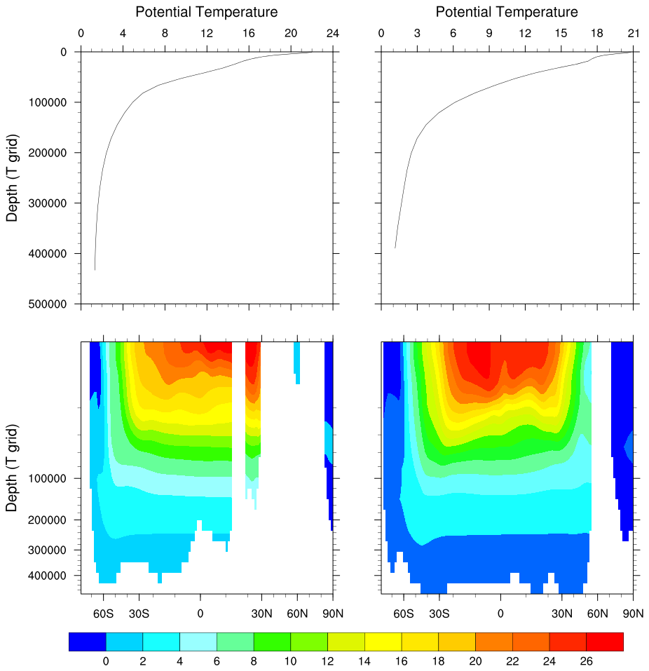
Original NCL script: http://www.ncl.ucar.edu/Applications/Scripts/panel_14.ncl
Original NCL plot: http://www.ncl.ucar.edu/Applications/Images/panel_14_lg.png
Import packages:
from matplotlib.ticker import FixedLocator
import matplotlib.gridspec as gridspec
import matplotlib.pyplot as plt
import xarray as xr
import numpy as np
import cmaps

import geocat.datafiles as gdf
import geocat.viz as gv
Read in data:
# Open a netCDF data file using xarray default engine and load the data into xarrays
ds = xr.open_dataset(gdf.get("netcdf_files/h_avg_Y0191_D000.00.nc"), decode_times=False)
# Ensure longitudes range from 0 to 360 degrees
T = gv.xr_add_cyclic_longitudes(ds.T, "lon_t")
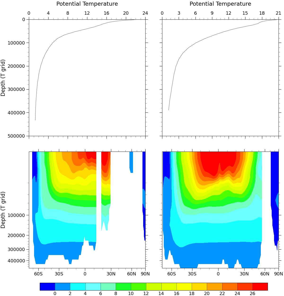
# Extract slices of data for each panel
T1 = T.isel(time=0).sel(lat_t=30, lon_t=180, method="nearest")
T2 = T.isel(time=0).sel(lat_t=-30, lon_t=180, method="nearest")
T3 = T.isel(time=0).sel(lon_t=270, method="nearest")
T4 = T.isel(time=0).sel(lon_t=200, method="nearest")
Plot:
fig = plt.figure(figsize=(12, 12.5), constrained_layout=True)
spec = gridspec.GridSpec(ncols=2, nrows=2, figure=fig)

# Set spacing between subplots, h/wsapce specified as a fraction of the size of the subplot group
fig.set_constrained_layout_pads(hspace=0.07, wspace=0.07)

# Add the subplots
ax1 = fig.add_subplot(spec[0, 0])  # upper left cell of grid
ax2 = fig.add_subplot(spec[0, 1])  # upper right cell of grid
ax3 = fig.add_subplot(spec[1, 0])  # lower left cell of grid
ax4 = fig.add_subplot(spec[1, 1])  # lower right cell of grid

# Make sure subplots are square
for axes in [ax1, ax2, ax3, ax4]:
    axes.set_box_aspect(1)

# Plot xy data at upper left and right plots
ax1.plot(T1, T.z_t, c='black', linewidth=0.5)
ax2.plot(T2, T.z_t, c='black', linewidth=0.5)

# Display X axis ticklabels at the top
ax1.xaxis.tick_top()
ax2.xaxis.tick_top()

# Use geocat.viz.util convenience function to add minor and major ticks
gv.add_major_minor_ticks(ax1, x_minor_per_major=4, y_minor_per_major=5, labelsize=14)
gv.add_major_minor_ticks(ax2, x_minor_per_major=4, y_minor_per_major=5, labelsize=14)

# Use geocat.viz.util convenience function to set axes tick values
gv.set_axes_limits_and_ticks(
    ax=ax1,
    xlim=(0, 24),
    ylim=(500000, 0),
    xticks=np.arange(0, 28, 4),
    yticks=np.arange(0, 600000, 100000),
)
gv.set_axes_limits_and_ticks(
    ax=ax2,
    xlim=(0, 21),
    ylim=(500000, 0),
    xticks=np.arange(0, 24, 3),
    yticks=np.arange(0, 600000, 100000),
)

# Remove ticklabels on Y axis for panel 2 (ax2)
ax2.yaxis.set_ticklabels([])

# Use geocat.viz.util convenience function to set titles without calling
# several matplotlib functions
gv.set_titles_and_labels(ax1, ylabel=T.z_t.long_name, labelfontsize=16)

# Manually set set titles and their positions
ax1.set_title(T.long_name, y=1.1, fontsize=17)
ax2.set_title(T.long_name, y=1.1, fontsize=17)

# Specify which contour levels to draw for panel 3 and panel 4
levels = np.arange(0, 28, 2)

# Import an NCL colormap
newcmp = cmaps.BlAqGrYeOrRe

# Panel 3: Contourf-plot data
T3.plot.contourf(
    ax=ax3, levels=levels, cmap=newcmp, add_colorbar=False, add_labels=False
)

# Panel 4: Contourf-plot data
colors = T4.plot.contourf(
    ax=ax4, levels=levels, cmap=newcmp, add_colorbar=False, add_labels=False
)


# Define functions for axis scales
# Function x**(1/2) and its inverse
def yforward(x):
    return np.power(x, 1 / 3)


def yinverse(x):
    return np.power(x, 3 / 1)


# Function Mercator transform and its inverse
def xforward(a):
    a = np.deg2rad(a)
    return np.rad2deg(np.arctan(np.sinh(a)))


def xinverse(a):
    a = np.deg2rad(a)
    return np.rad2deg(np.log(np.abs(np.tan(a) + 1.0 / np.cos(a))))


for axes in [ax3, ax4]:
    # Set scales of X axis and Y axis
    axes.set_yscale('function', functions=(yforward, yinverse))
    axes.set_xscale('function', functions=(xforward, xinverse))

    # Manually set major and minor ticks of Y axis
    y_major = FixedLocator([100000, 200000, 300000, 400000])
    y_minor = FixedLocator(np.arange(0, 500001, 20000))
    axes.yaxis.set_major_locator(y_major)
    axes.yaxis.set_minor_locator(y_minor)

    # Manually set major and minor ticks of X axis
    x_major = FixedLocator(np.arange(-60, 91, 30))
    x_minor = FixedLocator(np.arange(-90, 91, 10))
    axes.xaxis.set_major_locator(x_major)
    axes.xaxis.set_minor_locator(x_minor)
    axes.xaxis.set_ticklabels(['60S', '30S', '0', '30N', '60N', '90N'])

    # Inverse Y axis
    axes.set_ylim(axes.get_ylim()[::-1])

    # Set ticks to match styles of the original NCL plot
    axes.tick_params(
        "both",
        length=8,
        width=0.9,
        which="major",
        bottom=True,
        top=True,
        left=True,
        right=True,
        labelsize=14,
    )
    axes.tick_params(
        "both",
        length=4,
        width=0.4,
        which="minor",
        bottom=True,
        top=True,
        left=True,
        right=True,
        labelsize=14,
    )

# Remove ticklabels on Y axis for panel 4
ax4.yaxis.set_ticklabels([])

# Use geocat.viz.util convenience function to set titles without calling
# several matplotlib functions
gv.set_titles_and_labels(ax3, ylabel=T.z_t.long_name, labelfontsize=16)

# Add colorbar
cb = fig.colorbar(
    colors,
    ax=[ax1, ax2, ax3, ax4],
    orientation='horizontal',
    drawedges=True,
    extendrect=True,
    aspect=30,
    shrink=0.9,
    extendfrac='auto',
    pad=0.02,
    ticks=levels,
)

# Set colorbar ticklabel fontsize and tick length
cb.ax.tick_params(labelsize=14, length=0)

# Show the plot
plt.show()
Total running time of the script: (0 minutes 0.584 seconds)