

Note
Go to the end to download the full example code.
NCL_vector_1.py#
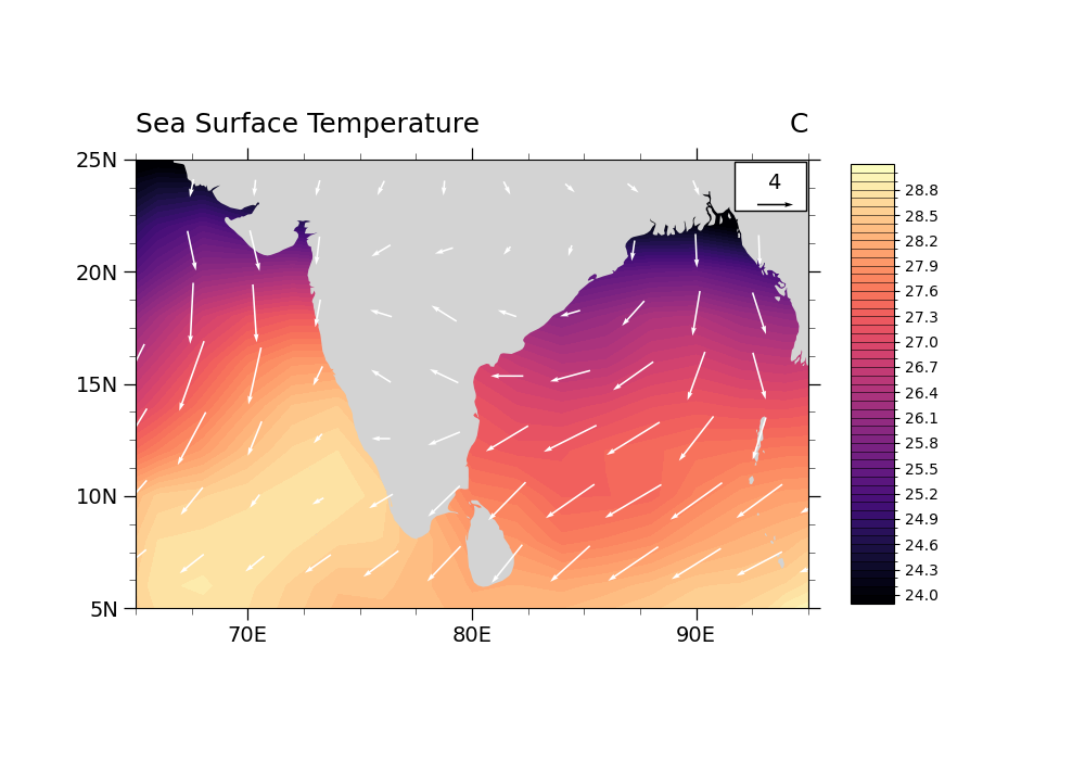
Plot U & V vector over SST
- Note: The colormap on this plot has been changed from the original NCL colormap
in order to follow best practices for colormaps. See other examples here: https://geocat-examples.readthedocs.io/en/latest/gallery/index.html#colors
- This script illustrates the following concepts:
Overlaying vectors and filled contours on a map
Changing the scale of the vectors on the plot
Moving the vector reference annotation to the top right of the plot
Setting the color for vectors
Increasing the thickness of vectors
- See following URLs to see the reproduced NCL plot & script:
Original NCL script: https://www.ncl.ucar.edu/Applications/Scripts/vector_1.ncl
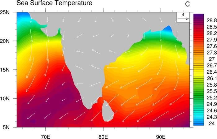
Original NCL plot: https://www.ncl.ucar.edu/Applications/Images/vector_1_lg.png
Import packages
import matplotlib.pyplot as plt
import matplotlib as mpl
import numpy as np
import xarray as xr
import cartopy.feature as cfeature
import cartopy.crs as ccrs
from cartopy.mpl.gridliner import LongitudeFormatter, LatitudeFormatter

import geocat.datafiles as gdf
import geocat.viz as gv
Read in data:
# Open a netCDF data file using xarray default engine and load the data into xarrays
sst_in = xr.open_dataset(gdf.get("netcdf_files/sst8292.nc"))
uv_in = xr.open_dataset(gdf.get("netcdf_files/uvt.nc"))

# Use date as the dimension rather than time
sst_in = sst_in.set_coords("date").swap_dims({"time": "date"}).drop_vars('time')
uv_in = uv_in.set_coords("date").swap_dims({"time": "date"}).drop_vars('time')

# Extract required variables
# Read SST and U, V for Jan 1988 (at 1000 mb for U, V)
# Note that we could use .isel() if we know the indices of date and lev
sst = sst_in['SST'].sel(date=198801)
u = uv_in['U'].sel(date=198801, lev=1000)
v = uv_in['V'].sel(date=198801, lev=1000)

# Read in grid information
lat_uv = u['lat']
lon_uv = u['lon']
Plot:
# Define map projection to use
proj = ccrs.PlateCarree()

# Generate figure (set its size (width, height) in inches)
plt.figure(figsize=(10, 7))

# Define axis using Cartopy and zoom in on the region of interest
ax = plt.axes(projection=proj)
ax.set_extent((66, 96, 5, 25), crs=ccrs.PlateCarree())

# Create the filled contour plot
sst_plot = sst.plot.contourf(
    ax=ax,
    transform=proj,
    levels=51,
    vmin=24,
    vmax=29,
    cmap="magma",
    add_colorbar=False,
)

# Remove default x and y labels from plot
plt.xlabel("")
plt.ylabel("")

# add land feature
ax.add_feature(cfeature.LAND, facecolor="lightgrey", zorder=1)

# Add vectors onto the plot
Q = plt.quiver(
    lon_uv,
    lat_uv,
    u,
    v,
    color='white',
    pivot='middle',
    width=0.0025,
    scale=75,
)

# Use geocat-viz utility function to format title
gv.set_titles_and_labels(
    ax,
    maintitle='',
    maintitlefontsize=18,
    lefttitle="Sea Surface Temperature",
    lefttitlefontsize=18,
    righttitle="C",
    righttitlefontsize=18,
    xlabel=None,
    ylabel=None,
    labelfontsize=16,
)

# Format tick labels as latitude and longitudes
gv.add_lat_lon_ticklabels(ax=ax)

# Use geocat-viz utility function to customize tick marks
gv.set_axes_limits_and_ticks(
    ax, xlim=(65, 95), ylim=(5, 25), xticks=range(70, 95, 10), yticks=range(5, 27, 5)
)

# Remove degree symbol from tick labels
ax.yaxis.set_major_formatter(LatitudeFormatter(degree_symbol=''))
ax.xaxis.set_major_formatter(LongitudeFormatter(degree_symbol=''))

# Add minor tick marks
gv.add_major_minor_ticks(ax, x_minor_per_major=4, y_minor_per_major=4, labelsize=14)

# Draw the key for the quiver plot as a rectangle patch
rect = mpl.patches.Rectangle(
    (91.7, 22.7),  # (x, y)
    3.2,  # width
    2.2,  # height
    facecolor='white',
    edgecolor='k',
)
ax.add_patch(rect)

qk = ax.quiverkey(
    Q,  # the quiver instance
    0.95,  # x position of the key
    0.9,  # y position of the key
    4,  # length of the key
    '4',  # label for the key
    labelpos='N',  # position the label to the 'north' of the arrow
    color='black',
    coordinates='axes',
    fontproperties={'size': 14},
    labelsep=0.1,  # Distance between arrow and label
)

# Add and customize colorbar
cbar_ticks = np.arange(24, 28.8, 0.3)
plt.colorbar(
    ax=ax,
    mappable=sst_plot,
    extendrect=True,
    extendfrac='auto',
    shrink=0.75,
    aspect=10,
    ticks=cbar_ticks,
    drawedges=True,
)

# Show the plot
plt.show()
Total running time of the script: (0 minutes 2.057 seconds)