

Note
Go to the end to download the full example code.
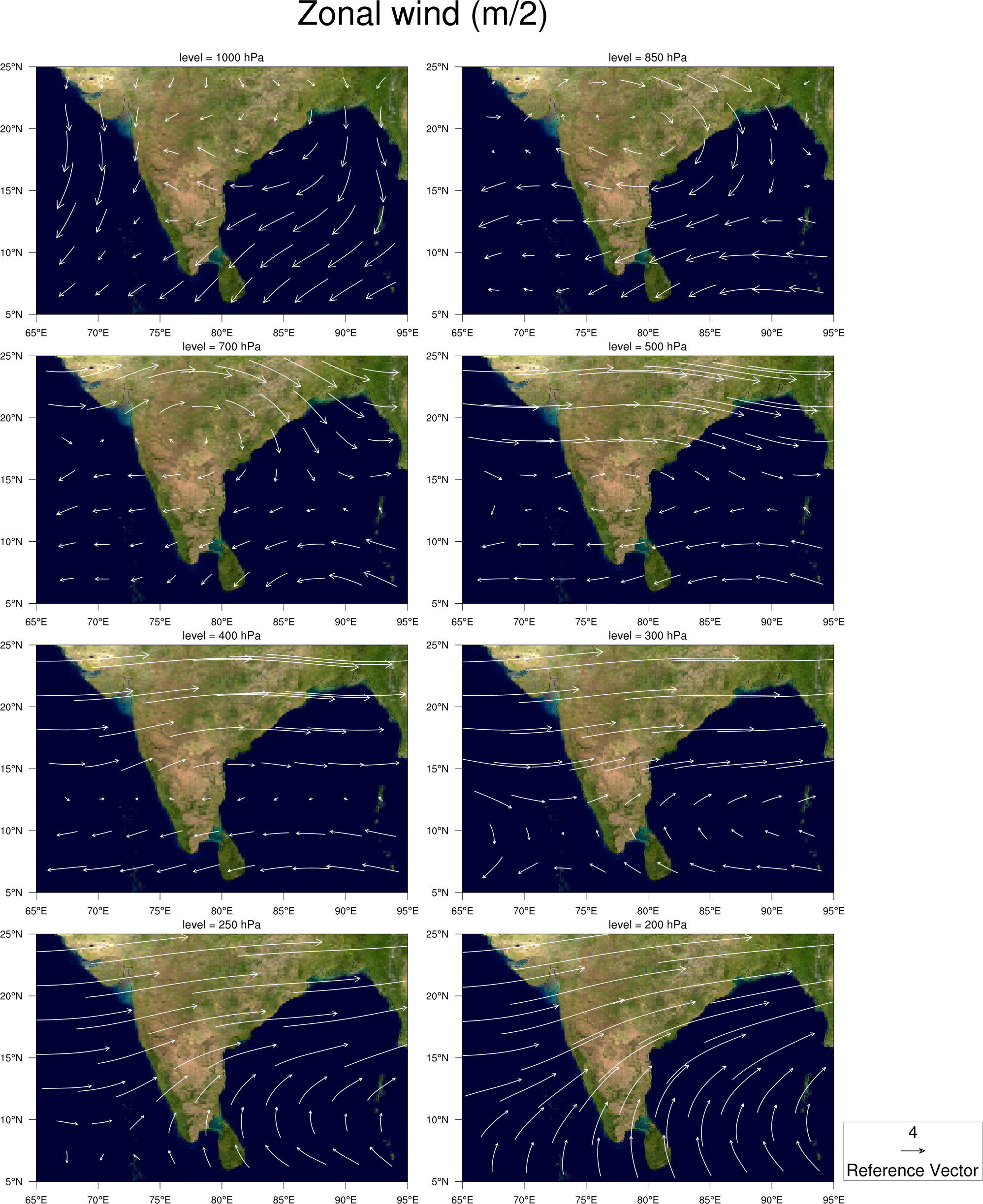
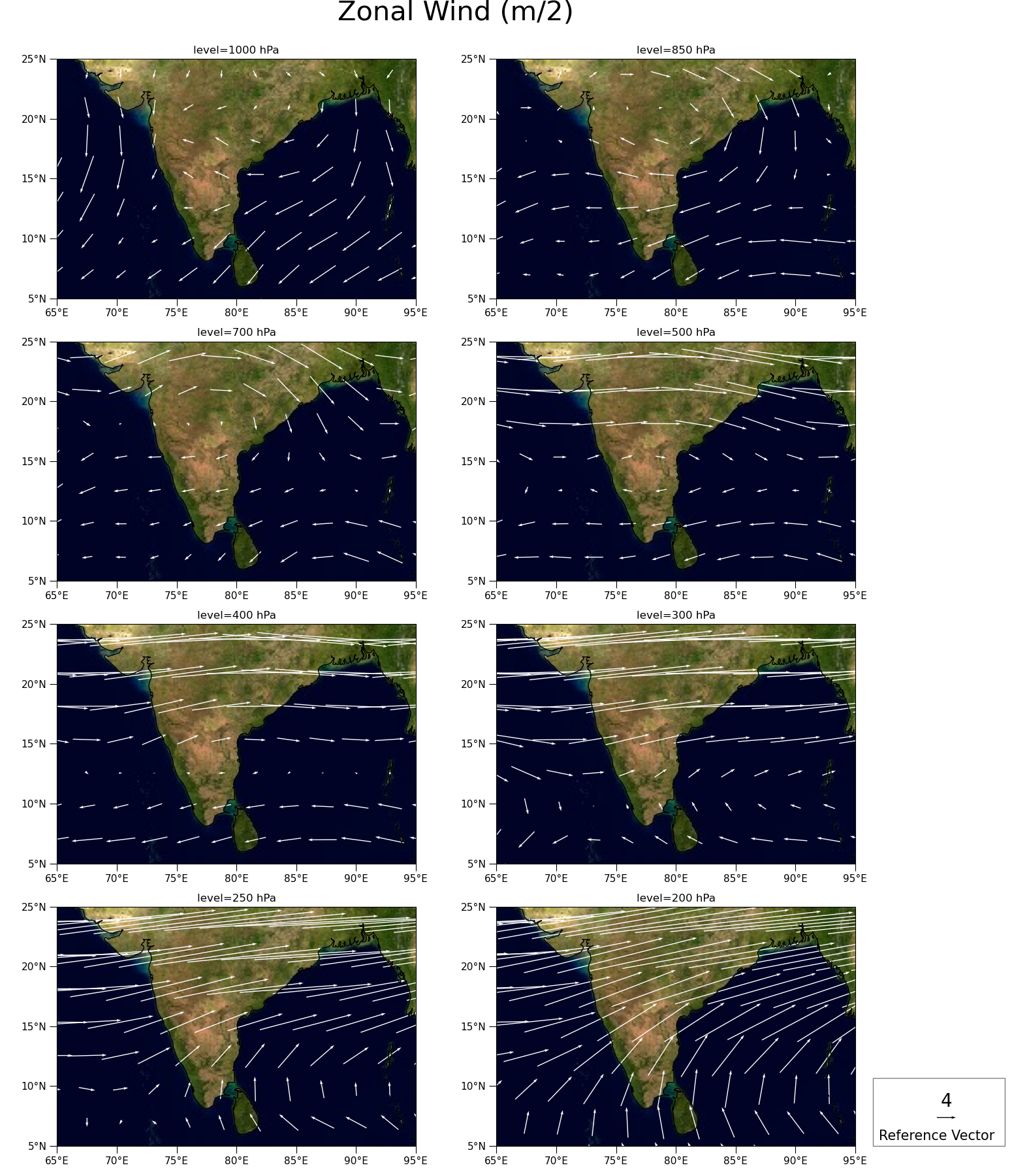
NCL_panel_31.py#
- This script illustrates the following concepts:
Paneling 8 plots on a page
Adding a common title to paneled plots
Overlaying an image onto a map
Adding a vector field to a map
- See following URLs to see the reproduced NCL plot & script:
Original NCL script: https://www.ncl.ucar.edu/Applications/Scripts/panel_31.ncl
Original NCL plot: https://www.ncl.ucar.edu/Applications/Images/panel_31_lg.png
Import packages:
import numpy as np
import matplotlib.pyplot as plt
import cartopy.crs as ccrs
import xarray as xr

import geocat.viz as gv
import geocat.datafiles as gdf
Read in Data:
# Read in the image file
fname = gdf.get('image_files/EarthMap.jpg')
img = plt.imread(fname)

# Read in the vector data using xarray
ds = xr.open_dataset(gdf.get("netcdf_files/uvt.nc")).isel(time=0)

# Select zonal and meridional wind
U = ds.U
V = ds.V

# Select latitude and longitudes
lat = ds.lat
lon = ds.lon
Plot:
# Create a figure and axes
fig, axs = plt.subplots(
    ncols=2, nrows=4, figsize=(15.5, 18), subplot_kw={'projection': ccrs.PlateCarree()}
)

# Define pressures and reshape to match subplot layout (4 rows, 2 columns)
levs = np.array([1000, 850, 700, 500, 400, 300, 250, 200])
pressure = np.reshape(levs, (4, 2))

# Define image extent. This image is of the entire globe, so extent covers all latitudes and longitudes
img_extent = (-180, 180, -90, 90)

# Loop through each axes and plot
# Loop through each row
for i in range(4):
    # Loop through each column
    for j in range(2):
        # Set axes
        ax = axs[i][j]

        # Set extent of the map
        ax.set_extent([65, 95, 5, 25])

        # add the image. The "origin" of the image is in the upper left corner
        ax.imshow(img, origin='upper', extent=img_extent, transform=ccrs.PlateCarree())
        ax.coastlines(resolution='50m', color='black', linewidth=1)

        # Add vectors onto the plot
        Q = ax.quiver(
            lon,
            lat,
            U.sel(lev=pressure[i][j]),
            V.sel(lev=pressure[i][j]),
            color='white',
            pivot='middle',
            width=0.0025,
            scale=75,
        )

        # Use geocat-viz utility function to format lat/lon tick labels
        gv.add_lat_lon_ticklabels(ax=ax)

        # Use geocat-viz utility function to customize tick marks
        gv.set_axes_limits_and_ticks(
            ax,
            xlim=(65, 95),
            ylim=(5, 25),
            xticks=range(65, 100, 5),
            yticks=range(5, 27, 5),
        )

        # Customize ticks and labels
        ax.tick_params(labelsize=11, length=8)

        # Add title to the axes
        ax.set_title(f'level={pressure[i][j]} hPa')

# Add title to the figure
plt.suptitle("Zonal Wind (m/2)", fontsize=30, y=1, x=0.45)

# Draw legend for vector plot
ax.add_patch(
    plt.Rectangle(
        (96.5, 5),  # xy location of rectangle
        11,  # width
        5.7,  # height
        facecolor='white',
        edgecolor='grey',
        clip_on=False,
    )  # allow rectangle to be visible beyond axes
)

ax.quiverkey(
    Q,  # the quiver instance
    0.935,  # x position of the key
    0.05,  # y position of the key
    4,  # length of the key
    '4',  # label for the key
    labelpos='N',  # position the label to the 'north' of the arrow
    color='black',  # arrow color
    coordinates='figure',
    fontproperties={'size': 20},
    labelsep=0.1,  # Distance between arrow and label
)

# Add text to key
plt.text(97, 5.5, "Reference Vector", fontsize=15)

# Show the plot
plt.tight_layout()  # Auto adjusts padding on edge of figure
plt.show()
Total running time of the script: (0 minutes 3.702 seconds)