

Note
Go to the end to download the full example code.
NCL_proj_1.py#
- This script illustrates the following concepts:
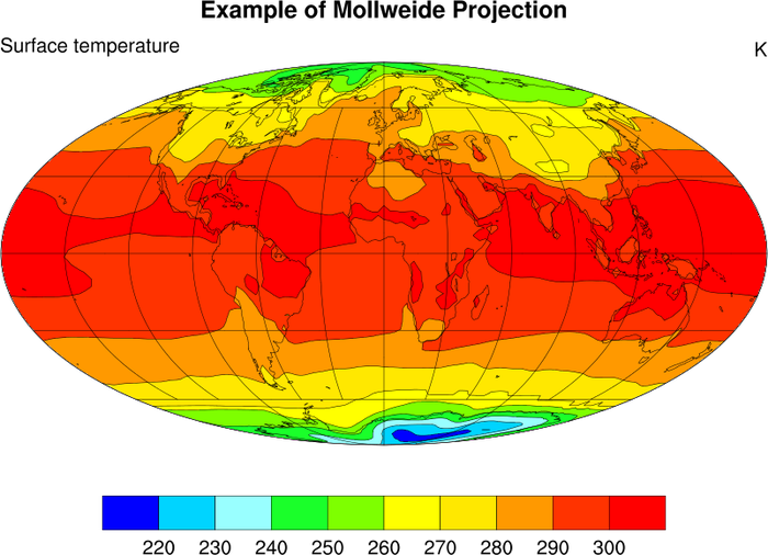
Drawing filled contours over a Mollweide map
Setting the spacing for latitude/longitude grid lines
Changing the font size of the colorbar’s labels
Spanning part of a color map for contour fill
Turning off the map perimeter (boundary)
- See following URLs to see the reproduced NCL plot & script:
Original NCL script: https://www.ncl.ucar.edu/Applications/Scripts/proj_1.ncl
Original NCL plot: https://www.ncl.ucar.edu/Applications/Images/proj_1_lg.png
Import packages:
import numpy as np
import xarray as xr
import cartopy.crs as ccrs
import matplotlib.pyplot as plt
import cmaps

import geocat.datafiles as gdf
import geocat.viz as gv
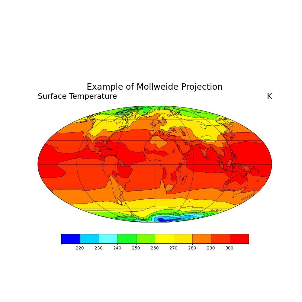
Read in data:
# Open a netCDF data file using xarray default engine and load the data into xarrays
ds = xr.open_dataset(gdf.get("netcdf_files/atmos.nc"), decode_times=False)
t = ds.TS.isel(time=0)

# Fix the artifact of not-shown-data around 0 and 360-degree longitudes
wrap_t = gv.xr_add_cyclic_longitudes(t, "lon")
Plot:
# Generate figure (set its size (width, height) in inches)
fig = plt.figure(figsize=(10, 10))

# Generate axes using Cartopy and draw coastlines
ax = plt.axes(projection=ccrs.Mollweide())
ax.coastlines(linewidths=0.5)

# Draw gridlines
gl = ax.gridlines(crs=ccrs.PlateCarree(), linewidth=1, color='black', alpha=0.5)

# Import an NCL colormap
newcmp = cmaps.gui_default

# Contourf-plot data (for filled contours)
temp = wrap_t.plot.contourf(
    ax=ax, transform=ccrs.PlateCarree(), levels=11, cmap=newcmp, add_colorbar=False
)

# Add color bar
cbar_ticks = np.arange(220, 310, 10)
cbar = plt.colorbar(
    temp,
    orientation='horizontal',
    shrink=0.8,
    pad=0.05,
    extendrect=True,
    ticks=cbar_ticks,
    drawedges=True,
)

cbar.ax.tick_params(labelsize=10)

# Contour-plot data (for borderlines)
wrap_t.plot.contour(
    ax=ax, transform=ccrs.PlateCarree(), levels=11, linewidths=0.5, cmap='black'
)

# Use geocat.viz.util convenience function to add titles to left and right of the plot axis.
gv.set_titles_and_labels(
    ax,
    maintitle="Example of Mollweide Projection",
    lefttitle="Surface Temperature",
    righttitle="K",
)

# Show the plot
plt.show()
Total running time of the script: (0 minutes 0.850 seconds)