

Note
Go to the end to download the full example code.
NCL_xy_19.py#
- This script illustrates the following concepts:
Drawing an XY plot with three different Y axes
Drawing a custom legend inside an XY plot
- See following URLs to see the reproduced NCL plot & script:
Import packages:
import matplotlib.pyplot as plt
import numpy as np

import geocat.datafiles as gdf
import geocat.viz as gv
Read in data:
# Use numpy loadtext function to unpack data from ascii file
lon, u, v, t = np.loadtxt(gdf.get("ascii_files/xy.asc"), unpack=True)

# Do some unit conversions
lon = lon * 360 / 128
t = (t - 273.15) * 9 / 5 * 32
Helper function to format the axes
def make_axes(plot_size):
    fig, ax1 = plt.subplots(figsize=plot_size)
    ax2 = ax1.twinx()
    ax3 = ax1.twinx()

    # Offset the 3rd axes
    ax3.spines['right'].set_position(('axes', 1.15))

    # Use geocat.viz.util convenience function to add minor and major tick lines
    gv.add_major_minor_ticks(ax1, y_minor_per_major=5, labelsize=14)
    gv.add_major_minor_ticks(ax2, y_minor_per_major=5, labelsize=14)
    gv.add_major_minor_ticks(
        ax3, x_minor_per_major=5, y_minor_per_major=4, labelsize=14
    )

    # Use geocat.viz.util convenience function to set axes tick values
    gv.set_axes_limits_and_ticks(ax1, ylim=(-3500, -2900))
    gv.set_axes_limits_and_ticks(ax2, ylim=(10, 60))
    gv.set_axes_limits_and_ticks(
        ax3,
        xlim=(0, 360),
        ylim=(-16, 12),
        xticks=[0, 100, 200, 300],
        yticks=np.arange(-16, 13, 4),
    )

    # Adjust which sides of the plot the tick marks are drawn for each axes
    ax1.tick_params('both', which='both', right=False)
    ax2.tick_params('both', which='both', bottom=False, top=False, left=False)
    ax3.tick_params('both', which='both', bottom=False, top=False, left=False)
    return ax1, ax2, ax3
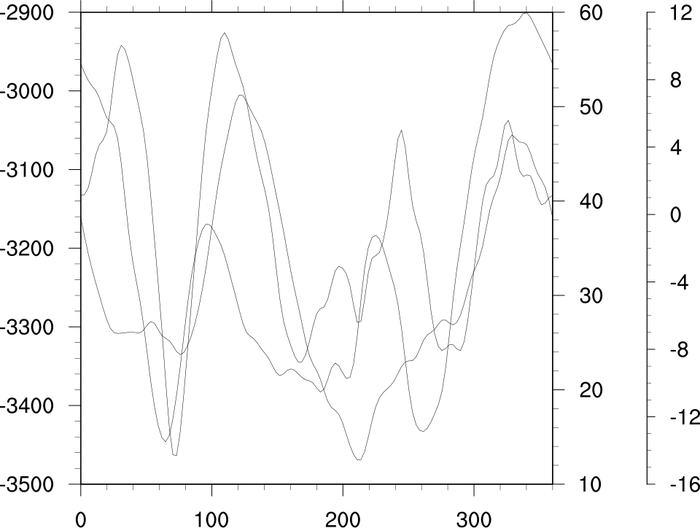
Plot the basic figure:
ax1, ax2, ax3 = make_axes((8, 7))

# Plot the data
ax1.plot(lon, t, linewidth=0.5, c='black')
ax2.plot(lon, u, linewidth=0.5, c='black')
ax3.plot(lon, v, linewidth=0.5, c='black')

plt.tight_layout()
plt.show()
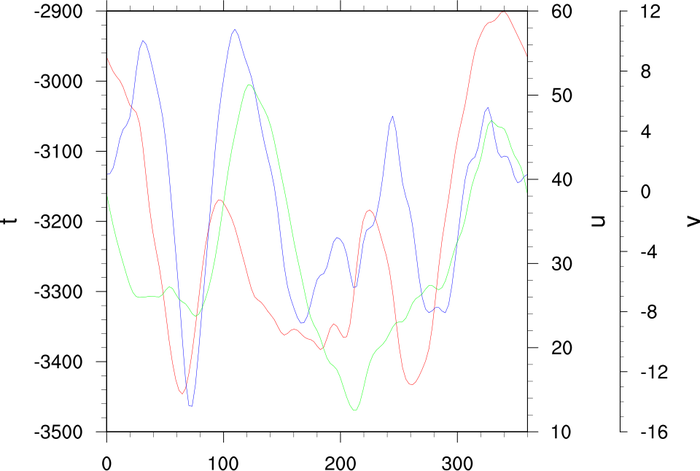
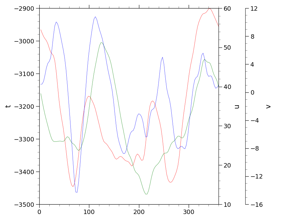
Plot the figure with colored lines and add axes labels
ax1, ax2, ax3 = make_axes((9, 7))

# Use geocat-viz.util convenience function to set y axes labels
gv.set_titles_and_labels(ax1, ylabel='t')
gv.set_titles_and_labels(ax2, ylabel='u')
gv.set_titles_and_labels(ax3, ylabel='v')

# Plot the data
ax1.plot(lon, t, linewidth=0.5, c='r')
ax2.plot(lon, u, linewidth=0.5, c='g')
ax3.plot(lon, v, linewidth=0.5, c='b')

plt.tight_layout()
plt.show()
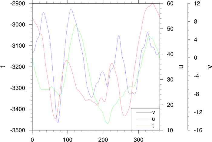
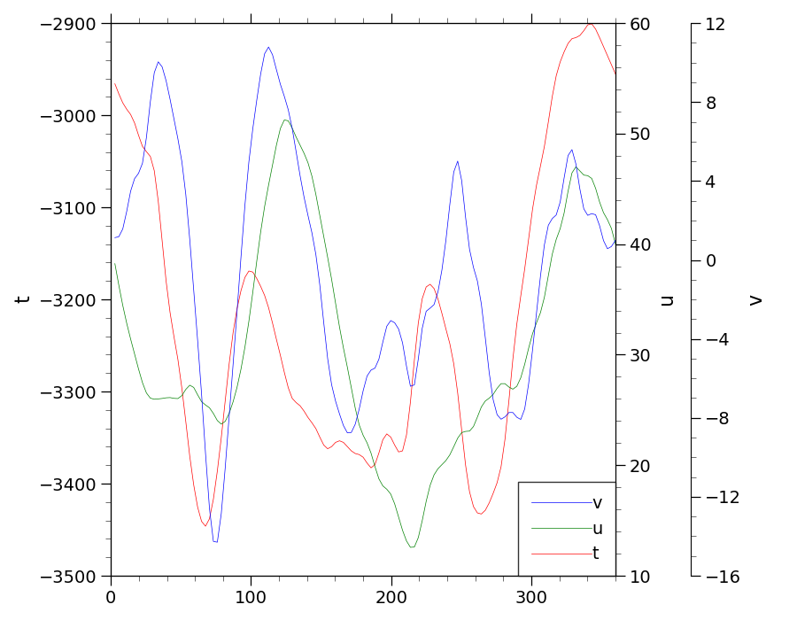
Plot the figure with colored lines, axes labels, and a legend
ax1, ax2, ax3 = make_axes((9, 7))

# Use geocat-viz.util convenience function to set y axes labels
gv.set_titles_and_labels(ax1, ylabel='t')
gv.set_titles_and_labels(ax2, ylabel='u')
gv.set_titles_and_labels(ax3, ylabel='v')

# Plot the data
# axes.plot() returns a list of Line2D object. The line objects can be used as
# the `handles` for the legend. Since we only want the line objects, a comma is
# added after t_plot to extract the first item of the list returned by
# axes.plot()
(t_plot,) = ax1.plot(lon, t, linewidth=0.5, c='r', label='t')
(u_plot,) = ax2.plot(lon, u, linewidth=0.5, c='g', label='u')
(v_plot,) = ax3.plot(lon, v, linewidth=0.5, c='b', label='v')

# Add a legend using the Line2D objects from before as the handles
plt.legend(
    loc='lower right',
    fancybox=False,
    edgecolor='black',
    borderaxespad=0,
    borderpad=0.75,
    handlelength=3.5,
    handletextpad=0,
    fontsize=14,
    handles=[v_plot, u_plot, t_plot],
)

plt.tight_layout()
plt.show()
Total running time of the script: (0 minutes 0.858 seconds)