

Note
Go to the end to download the full example code.
NCL_proj_2.py#
- This script illustrates the following concepts:
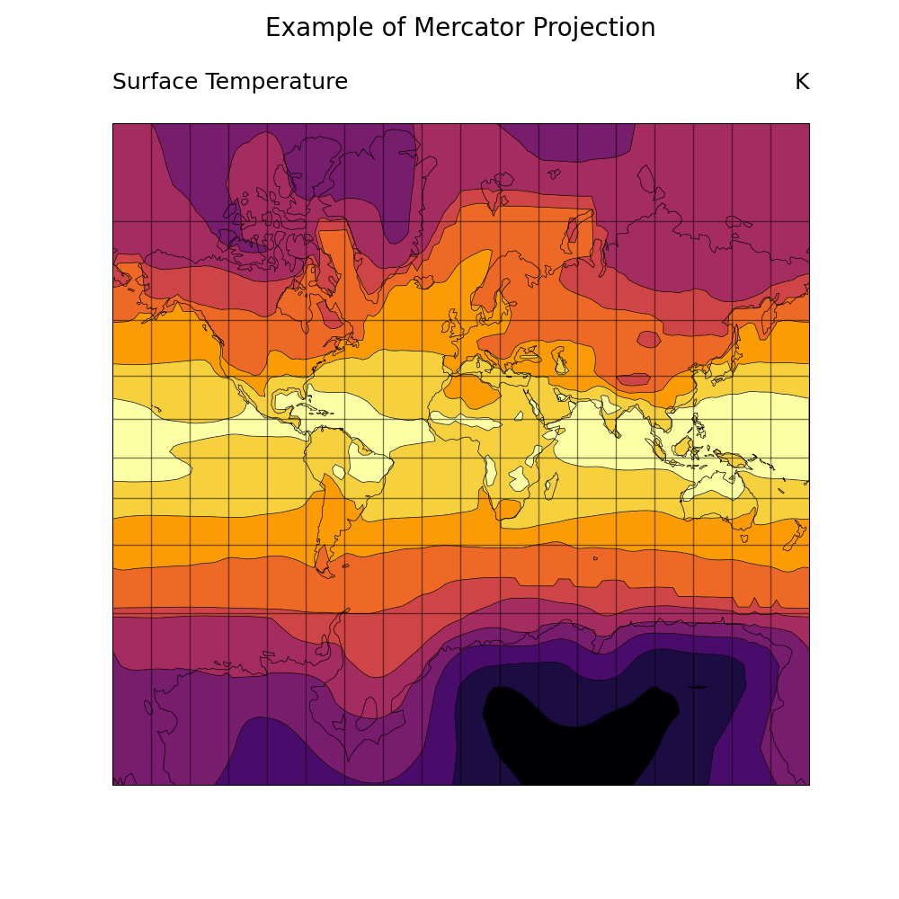
Drawing filled contours over a Mercator map
Setting the spacing for latitude/longitude grid lines
Turning off the map perimeter (boundary)
Making the plot larger using viewport resources
Turning off map fill
Spanning part of a color map for contour fill
Using ‘inferno’ color scheme instead of ‘rainbow’ to follow best practices for visualizations
- See following URLs to see the reproduced NCL plot & script:
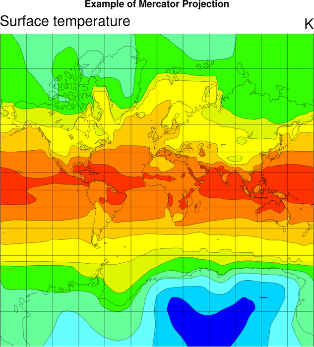
Original NCL script: https://www.ncl.ucar.edu/Applications/Scripts/proj_2.ncl
Original NCL plot: https://www.ncl.ucar.edu/Applications/Images/proj_2_lg.png
Import packages:
import numpy as np
import xarray as xr
import cartopy.crs as ccrs
import matplotlib.pyplot as plt
import matplotlib.ticker as mticker

import geocat.datafiles as gdf
import geocat.viz as gv
Read in data:
# Open a netCDF data file using xarray default engine and load the data into xarrays
ds = xr.open_dataset(gdf.get("netcdf_files/atmos.nc"), decode_times=False)
t = ds.TS.isel(time=0)
Fix the artifact of not-shown-data around 0 and 360-degree longitudes
wrap_t = gv.xr_add_cyclic_longitudes(t, "lon")
Plot:
# Generate figure (set its size (width, height) in inches)
fig = plt.figure(figsize=(10, 10))

# Generate axes using Cartopy and draw coastlines
ax = plt.axes(projection=ccrs.Mercator(central_longitude=0, min_latitude=-87.8638))

# Add coastlines
ax.coastlines(linewidths=0.5)

# Set extent of the projection
ax.set_extent([0, 359, -84.5, 89], crs=ccrs.PlateCarree())

# Draw gridlines
gl = ax.gridlines(crs=ccrs.PlateCarree(), linewidth=1, color='black', alpha=0.5)

# Manipulate latitude and longitude gridline numbers and spacing
gl.ylocator = mticker.FixedLocator(np.arange(-84.5, 91, 20))
gl.xlocator = mticker.FixedLocator(np.arange(-180, 181, 20))

# Contourf-plot data (for filled contours)
wrap_t.plot.contourf(
    ax=ax, transform=ccrs.PlateCarree(), levels=12, cmap='inferno', add_colorbar=False
)

# Contour-plot data (for borderlines)
wrap_t.plot.contour(
    ax=ax, transform=ccrs.PlateCarree(), levels=12, linewidths=0.5, cmap='black'
)

# Use geocat.viz.util convenience function to add titles to left and right
# of the plot axis.
gv.set_titles_and_labels(
    ax,
    maintitle="Example of Mercator Projection",
    lefttitle="Surface Temperature",
    righttitle="K",
)

# Show the plot
plt.show()
Total running time of the script: (0 minutes 0.721 seconds)