

Note
Go to the end to download the full example code.
NCL_lb_5.py#
- This script illustrates the following concepts:
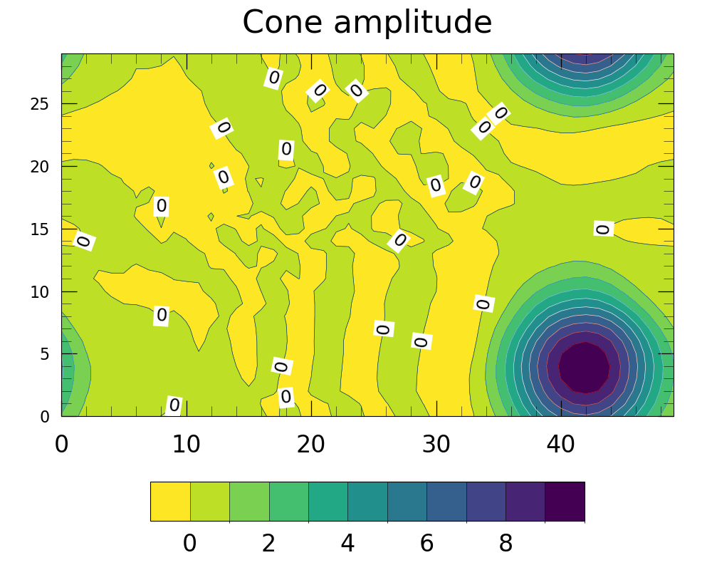
Customizing a colorbar for a contour plot
Making the colorbar be horizontal
Setting the fontsize of colorbar labels
Changing the levels of the colorbar labels
Changing the aspect ratio and size of a colorbar
Changing the spaces (padding) between ticklabels and axes
Using a different color scheme to follow best practices for visualizations
- See following URLs to see the reproduced NCL plot & script:
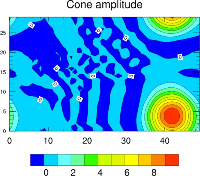
Original NCL script: https://www.ncl.ucar.edu/Applications/Scripts/lb_5.ncl
Original NCL plot: https://www.ncl.ucar.edu/Applications/Images/lb_5_lg.png
Import packages:
import numpy as np
import xarray as xr
import cartopy.crs as ccrs
import matplotlib.pyplot as plt

import geocat.datafiles as gdf
import geocat.viz as gv
Read in data:
# Open a netCDF data file using xarray default engine and load the data into xarrays
ds = xr.open_dataset(gdf.get("netcdf_files/cone.nc"))
u = ds.u.isel(time=4)
Plot:
# Generate figure (set its size (width, height) in inches)
plt.figure(figsize=(10, 8))

# Generate with Cartopy projection
ax = plt.axes(projection=ccrs.PlateCarree())

# Set contour levels
levels = np.arange(0, 11, 1)

# Plot contour lines
lines = u.plot.contour(ax=ax, levels=levels, linewidths=0.5, add_labels=False)

# Draw contour labels and set bounding boxes for the labels
ax.clabel(lines, np.array([0]), colors='black', fmt="%.0f", fontsize=18)
[
    txt.set_bbox(dict(mutation_aspect=0.8, facecolor='white', edgecolor='none', pad=2))
    for txt in lines.labelTexts
]

# Plot filled contour
colors = u.plot.contourf(
    ax=ax,
    cmap='viridis_r',
    levels=levels,
    transform=ccrs.PlateCarree(),
    add_colorbar=False,
    add_labels=False,
)

# Add colorbar
cbar = plt.colorbar(
    colors,
    ax=ax,
    orientation='horizontal',
    shrink=0.65,  # fraction of the size of the colorbar
    pad=0.13,  # fraction of original axes between colorbar and new image axes
    extendrect=True,  # set colorbar shape to be rectangular
    extendfrac='auto',
    aspect=11,  # aspect ratio
    drawedges=True,
    ticks=levels[:-1:2],
)  # set colorbar levels

# Set colorbar label size
cbar.ax.xaxis.set_tick_params(length=0, labelsize=24, pad=12)

# Use geocat.viz.util convenience function to set axes limits & tick values without calling several matplotlib functions
gv.set_axes_limits_and_ticks(
    ax,
    xlim=(0, 49),
    ylim=(0, 29),
    xticks=np.linspace(0, 40, 5),
    yticks=np.linspace(0, 25, 6),
)

# Use geocat.viz.util convenience function to add minor and major tick lines
gv.add_major_minor_ticks(ax, x_minor_per_major=5, y_minor_per_major=5)

# Use geocat.viz.util convenience function to add titles to left and right of the plot axis.
gv.set_titles_and_labels(ax, maintitle='Cone amplitude', maintitlefontsize=32)

# Set both major and minor ticks to point inwards
ax.tick_params(which='both', direction='in')

# Set different tick font sizes and padding for X and Y axis
ax.tick_params(axis='x', labelsize=24, pad=18)
ax.tick_params(axis='y', labelsize=16, pad=12)

# Set major and minor tick length
ax.tick_params(which='major', length=16)
ax.tick_params(which='minor', length=10)

# Show plot
plt.tight_layout()
plt.show()
Total running time of the script: (0 minutes 0.207 seconds)