

Note
Go to the end to download the full example code.
NCL_scatter_10.py#
- This script illustrates the following concepts:
Drawing a scatter plot over a map
Customizing markers in a scatter plot
Using numpy.random to generate random plot
- See following URLs to see the reproduced NCL plot & script:
Original NCL script: https://www.ncl.ucar.edu/Applications/Scripts/scatter_10.ncl
Original NCL plot: https://www.ncl.ucar.edu/Applications/Images/scatter_10_lg.png
Import packages:
import numpy as np
import matplotlib.pyplot as plt
import cartopy.crs as ccrs
from cartopy.mpl.gridliner import LongitudeFormatter, LatitudeFormatter

import geocat.viz as gv
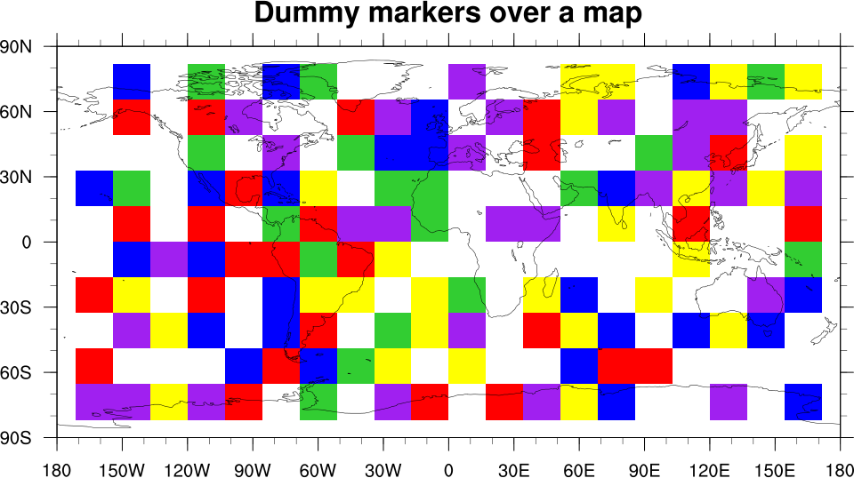
Plot
# Generate a figure and axes
plt.figure(figsize=(12, 10))

# Define axis using Cartopy
projection = ccrs.PlateCarree()
ax = plt.axes(projection=projection)

# Add coastlines to plot
ax.coastlines()

# Define latitude and longitudes for the markers
lat = np.arange(-70, 85, 20)
lon = np.arange(-160, 170, 20)

# Make a meshgrid of the latitudes and longitudes
lons, lats = np.meshgrid(lon, lat)

# Randomly remove some of the points from the meshgrid
mask = np.random.rand(lats.shape[0], lats.shape[1]) < 0.35
lats = lats[~mask]
lons = lons[~mask]

# Create an array of colors to choose from
colors = ['blue', 'green', 'red', 'yellow', 'purple']

# Create a scatter plot of the latitudes and longitudes with a random color
# from the colors array and a square marker to imitate a grid of colors
ax.scatter(
    lons,
    lats,
    c=[colors[i] for i in np.random.randint(0, len(colors), size=lats.size)],
    edgecolors='face',
    s=1350,
    alpha=0.75,
    zorder=2,
    marker='s',
)

# Use geocat-viz utility function to format latitude/longitude labels
gv.add_lat_lon_ticklabels(ax)

# Remove degree symbol from tick labels
ax.yaxis.set_major_formatter(LatitudeFormatter(degree_symbol=''))
ax.xaxis.set_major_formatter(LongitudeFormatter(degree_symbol=''))

# Use geocat-viz utility function to format major and minor tick marks
gv.add_major_minor_ticks(ax, labelsize=14)

# Use geocat-viz utility function to format tick labels
gv.set_axes_limits_and_ticks(
    ax=ax,
    xlim=(-180, 181),
    ylim=(-90, 91),
    xticks=np.arange(-180, 190, 30),
    yticks=np.arange(-90, 100, 30),
)

# Add title
plt.title('Dummy markers over a map', fontweight='bold', fontsize=20, pad=20)

# Show the plot
plt.show()
Total running time of the script: (0 minutes 0.133 seconds)