

Note
Go to the end to download the full example code.
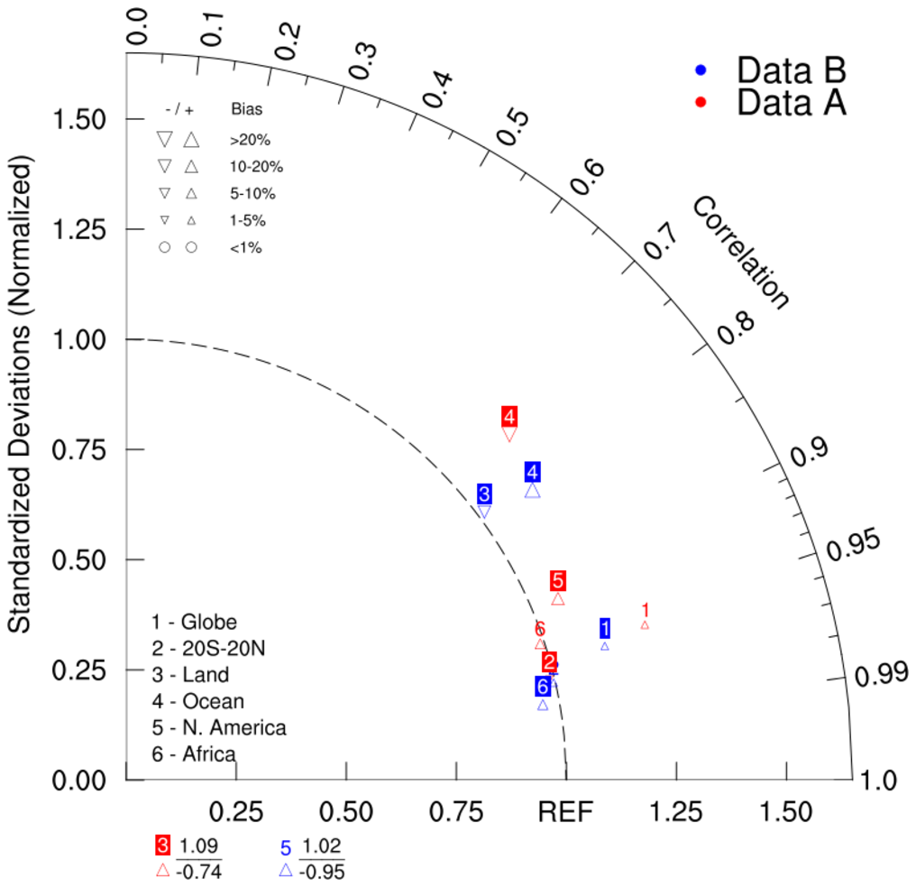
NCL_taylor_8.py#
- This script illustrates the following concepts:
Creating a taylor diagram
Plotting percent bias of each case for each variable in a taylor diagram
Handling negative pattern correlation coefficients by adding text information
- See following URLs to see the reproduced NCL plot & script:
Original NCL script: https://www.ncl.ucar.edu/Applications/Scripts/taylor_8.ncl
Original NCL plot: https://www.ncl.ucar.edu/Applications/Images/taylor_8_lg.png
- Note: Due to limitations of matplotlib’s axisartist toolkit, we cannot include minor tick marks
between 0.9 and 0.99, as seen in the original NCL plot.
Import packages:
import matplotlib.pyplot as plt

import geocat.viz as gv
Create dummy data:
# Case A
CA_std = [1.230, 0.988, 1.092, 1.172, 1.064, 0.990]  # standard deviation
CA_corr = [0.958, 0.973, -0.740, 0.743, 0.922, 0.950]  # correlation coefficient
BA = [2.7, -1.5, 17.31, -20.11, 12.5, 8.341]  # bias (%)

# Case B
CB_std = [1.129, 0.996, 1.016, 1.134, 1.023, 0.962]
CB_corr = [0.963, 0.975, 0.801, 0.814, -0.946, 0.984]
BB = [1.7, 2.5, -17.31, 20.11, 19.5, 7.341]
Plot:
# Create a list of model names
namearr = ["Globe", "20S-20N", "Land", "Ocean", "N. America", "Africa"]

# Create figure and TaylorDiagram instance
dia = gv.TaylorDiagram()

# Add model sets
modelTextsA, _ = dia.add_model_set(
    CA_std,
    CA_corr,
    fontsize=13,
    xytext=(-5, 13),  # marker label position
    model_outlier_on=True,  # plots models with negative correlations and/or standard deviations at bottom of diagram
    percent_bias_on=True,  # model marker and size plotted based on bias array
    bias_array=BA,
    edgecolors='red',
    facecolors='none',
    linewidths=0.5,
    label='Data A',
)

modelTextsB, _ = dia.add_model_set(
    CB_std,
    CB_corr,
    fontsize=13,
    xytext=(-5, 13),
    model_outlier_on=True,
    percent_bias_on=True,
    bias_array=BB,
    edgecolors='blue',
    facecolors='none',
    linewidths=0.5,
    label='Data B',
)

# Customize model labels: add background color
for txt in modelTextsA:
    txt.set_bbox(dict(facecolor='red', edgecolor='none', pad=0.05, boxstyle='square'))
    txt.set_color('white')

for txt in modelTextsB:
    txt.set_bbox(dict(facecolor='blue', edgecolor='none', pad=0.05, boxstyle='square'))
    txt.set_color('white')

# Add legend
dia.add_legend()

# Add model name text
dia.add_model_name(namearr, 0.06, 0.24, fontsize=12)

# Add bias legend
dia.add_bias_legend()

# Show the plot
plt.show()
Total running time of the script: (0 minutes 0.175 seconds)