

Note
Go to the end to download the full example code.
NCL_dev_1.py#
- This script illustrates the following concepts:
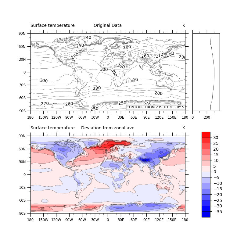
Calculating deviation from zonal mean
Drawing zonal average plots
Moving the contour informational label into the plot
Changing the background color of the contour line labels
Spanning part of a color map for contour fill
Making the colorbar be vertical
Paneling four subplots in a two by two grid using gridspec
Changing the aspect ratio of a subplot
Drawing color-filled contours over a cylindrical equidistant map
Using a blue-white-red color map
- See following URLs to see the reproduced NCL plot & script:
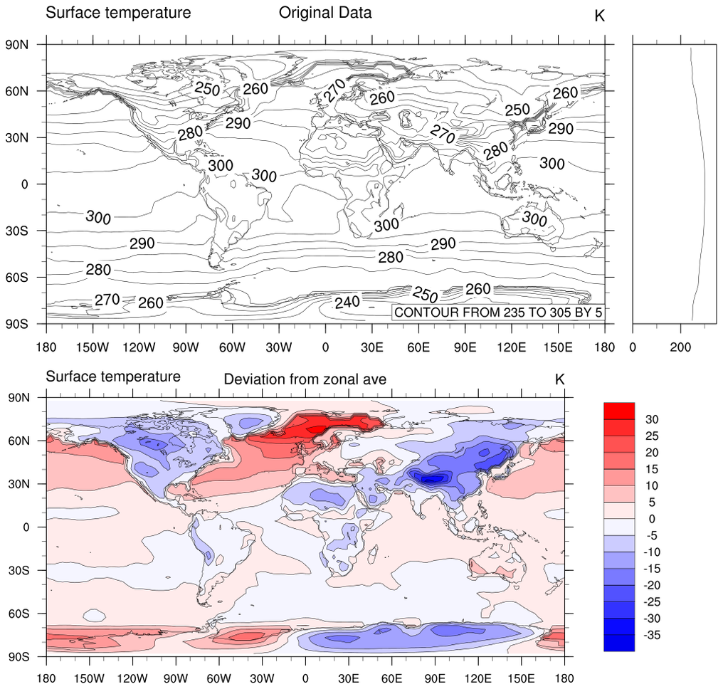
Original NCL script: https://www.ncl.ucar.edu/Applications/Scripts/dev_1.ncl
Original NCL plot: https://www.ncl.ucar.edu/Applications/Images/dev_1_lg.png
Import packages:
import cartopy.crs as ccrs
from cartopy.mpl.gridliner import LongitudeFormatter, LatitudeFormatter
import matplotlib.pyplot as plt
import numpy as np
import xarray as xr
import cmaps

import geocat.datafiles as gdf
import geocat.viz as gv
Read in data:
# Open a netCDF data file using xarray default engine and load the data into xarrays
ds = xr.open_dataset(gdf.get("netcdf_files/83.nc"))

# Extract slice of data
TS = ds.TS.isel(time=0, drop=True)

# Fix the artifact of not-shown-data around 0 and 360-degree longitudes
TS = gv.xr_add_cyclic_longitudes(TS, "lon")

# Calculate zonal mean
mean = TS.mean(dim='lon')

# Using meshgrid, a 2-D array can be created with the same shape as the
# temperature data with the zonal mean for each latitude filling each row.
# This way we can subtract each element of the mean 2-D array from the
# corresponding element in the data array.
waste, mean_grid = np.meshgrid(TS['lon'], mean)

# Calculate deviations from zonal mean
dev = TS.data - mean_grid
Plot:
# Specify projection for maps
proj = ccrs.PlateCarree()

# Generate figure (set its size (width, height) in inches)
fig = plt.figure(figsize=(8, 8))
grid = fig.add_gridspec(ncols=2, nrows=2, width_ratios=[0.85, 0.15], wspace=0.08)

# Create axis for original data plot
ax1 = fig.add_subplot(grid[0, 0], projection=ccrs.PlateCarree())
ax1.coastlines(linewidths=0.25)

# Create axis for zonal mean plot
ax2 = fig.add_subplot(grid[0, 1], aspect=5.9)

# Create axis for deviation data plot
ax3 = fig.add_subplot(grid[1, 0], projection=ccrs.PlateCarree())
ax3.coastlines(linewidths=0.25)

# Create axis for colorbar
ax4 = fig.add_subplot(grid[1, 1], aspect=10)

# Format ticks and ticklabels for the map axes
for ax in [ax1, ax3]:
    # Use the geocat.viz function to set axes limits and ticks
    gv.set_axes_limits_and_ticks(
        ax,
        xlim=[-180, 180],
        ylim=[-90, 90],
        xticks=np.arange(-180, 181, 30),
        yticks=np.arange(-90, 91, 30),
    )

    # Use the geocat.viz function to add minor ticks
    gv.add_major_minor_ticks(ax)

    # Use geocat.viz.util convenience function to make plots look like NCL
    # plots by using latitude, longitude tick labels
    gv.add_lat_lon_ticklabels(ax)

    # Removing degree symbol from tick labels to resemble NCL example
    ax.yaxis.set_major_formatter(LatitudeFormatter(degree_symbol=''))
    ax.xaxis.set_major_formatter(LongitudeFormatter(degree_symbol=''))

# Use the geocat.viz function to set axes limits and ticks for zonal average plot
gv.set_axes_limits_and_ticks(
    ax2, xlim=[0, 375], ylim=[-90, 90], xticks=[0, 200], yticks=[]
)

# Use the geocat.viz function to add minor ticks to zonal average plot
gv.add_major_minor_ticks(ax2, x_minor_per_major=2)

# Plot original data contour lines
contour = TS.plot.contour(
    ax=ax1,
    transform=proj,
    vmin=235,
    vmax=305,
    levels=np.arange(235, 305, 5),
    colors='black',
    linewidths=0.25,
    add_labels=False,
)

# Label contours lines
ax1.clabel(contour, np.arange(240, 301, 10), fmt='%d', inline=True, fontsize=10)

# Set label backgrounds white
for txt in contour.labelTexts:
    txt.set_bbox(dict(facecolor='white', edgecolor='none', pad=0))

# Add lower text box
ax1.text(
    0.995,
    0.03,
    "CONTOUR FROM 235 TO 305 BY 5",
    horizontalalignment='right',
    transform=ax1.transAxes,
    fontsize=8,
    bbox=dict(boxstyle='square, pad=0.25', facecolor='white', edgecolor='black'),
    zorder=5,
)

# Add titles to top plot
size = 10
y = 1.05
ax1.set_title('Original Data', fontsize=size, y=y)
ax1.set_title(TS.long_name, fontsize=size, loc='left', y=y)
ax1.set_title(TS.units, fontsize=size, loc='right', y=y)

# Plot zonal mean
ax2.plot(mean.data, mean.lat, color='black', linewidth=0.5)

# Import color map
cmap = cmaps.BlWhRe

# Truncate colormap to only use paler colors in the center of the colormap
cmap = gv.truncate_colormap(cmap, minval=0.22, maxval=0.74, n=15)

# Plot deviations from zonal mean
deviations = ax3.contourf(
    TS['lon'],
    TS['lat'],
    dev,
    levels=np.linspace(-40, 35, 16),
    cmap=cmap,
    vmin=-40,
    vmax=35,
)
ax3.contour(
    TS['lon'],
    TS['lat'],
    dev,
    levels=np.linspace(-40, 35, 16),
    colors='black',
    linewidths=0.25,
    linestyles='solid',
)

# Add titles to bottom plot
ax3.set_title('Deviation from zonal ave', fontsize=size, y=y)
ax3.set_title(TS.long_name, fontsize=size, loc='left', y=y)
ax3.set_title(TS.units, fontsize=size, loc='right', y=y)

# Add colorbar
plt.colorbar(
    deviations, cax=ax4, shrink=0.9, ticks=np.linspace(-35, 30, 14), drawedges=True
)

plt.show()
Total running time of the script: (0 minutes 1.467 seconds)