

Note
Go to the end to download the full example code.
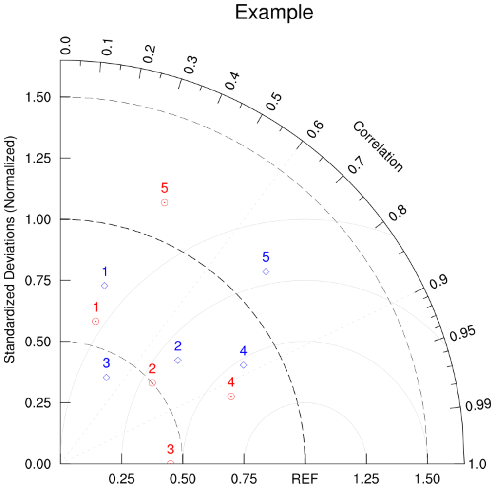
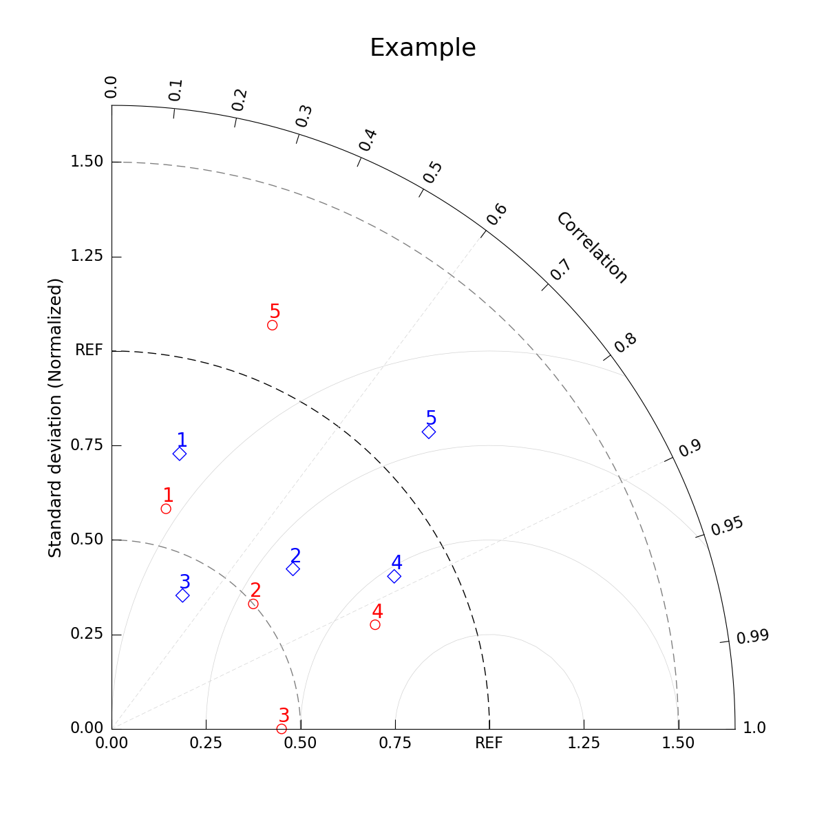
NCL_taylor_2.py#
- Concepts illustrated:
Creating a simple Taylor Diagram
Adding background options for the diagram
- See following URLs to see the reproduced NCL plot & script:
Original NCL script: https://www.ncl.ucar.edu/Applications/Scripts/taylor_2.ncl
Original NCL plot: https://www.ncl.ucar.edu/Applications/Images/taylor_2_lg.png
- Note: Due to to limitations of matplotlib’s axisartist toolkit, we cannot include minor tick marks
between 0.9 and 0.99, as seen in the original NCL plot.
Import packages:
import matplotlib.pyplot as plt
import numpy as np

import geocat.viz as gv
Create dummy data:
# p dataset
pstddev = [0.6, 0.5, 0.45, 0.75, 1.15]  # standard deviation
pcorrcoef = [0.24, 0.75, 1, 0.93, 0.37]  # correlation coefficient

# t dataset
tstddev = [0.75, 0.64, 0.4, 0.85, 1.15]
tcorrcoef = [0.24, 0.75, 0.47, 0.88, 0.73]
Plot
# Create figure and Taylor Diagram instance
fig = plt.figure(figsize=(12, 12))
dia = gv.TaylorDiagram(fig=fig, label='REF')
ax = plt.gca()

# Add model sets for p and t datasets
dia.add_model_set(
    pstddev,
    pcorrcoef,
    fontsize=20,
    xytext=(-5, 10),  # marker label location, in pixels
    color='red',
    marker='o',
    facecolors='none',
    s=100,
)  # marker size
dia.add_model_set(
    tstddev,
    tcorrcoef,
    fontsize=20,
    xytext=(-5, 10),  # marker label location, in pixels
    color='blue',
    marker='D',
    facecolors='none',
    s=100,
)

# Add RMS contours, and label them
dia.add_contours(levels=np.arange(0, 1.1, 0.25), colors='lightgrey', linewidths=0.5)

# Add standard deviation axis grid
dia.add_std_grid(np.array([0.5, 1.5]), color='grey')

# Add correlation axis grid
dia.add_corr_grid(np.array([0.6, 0.9]))

# Add figure title
plt.title("Example", size=26, pad=45)

# Show the plot
plt.show()
Total running time of the script: (0 minutes 0.126 seconds)