

Note
Go to the end to download the full example code.
NCL_radar_1.py#
- This script illustrates the following concepts:
Fitting radial data to a cartesian grid
Creating a horizontal colorbar
Adding a background behind plotted data
Creating a square aspect ratio
- See following URLs to see the reproduced NCL plot & script:
Import packages:
import numpy as np
import xarray as xr
import matplotlib.pyplot as plt
import cmaps

import geocat.datafiles as gdf
import geocat.viz as gv
Read in data:
ds = xr.open_dataset(gdf.get("netcdf_files/dz.nc"), decode_times=False)
Convert data to radial form:
# Designate center of radial data
xcenter = 0.0
ycenter = 0.0

# construct radial array from netcdf metadata
km_between_cells = 0.25
radius = ds.DZ.data.shape[1] * km_between_cells
r = np.arange(0, radius, 0.25)

# Convert reflectivity factor
values = ds.DZ.data
values = values * 100

# Make angles monotonic
theta = ds.Azimuth.data
theta[0:63] = theta[0:63] - 360

# Make a cartesian mesh grid
radius_matrix, theta_matrix = np.meshgrid(r, theta)
X = radius_matrix * np.cos(np.deg2rad(theta_matrix))
Y = radius_matrix * np.sin(np.deg2rad(theta_matrix))
Plotting helper function
def radar_plot(X, Y, values, bg_color=None):
    # Create a figure and axes using subplots
    fig, ax = plt.subplots(figsize=(6, 8))

    # Choose default colormap
    cmap = cmaps.gui_default

    # Plot using contourf
    p = plt.contourf(
        X, Y, values, cmap=cmap, levels=np.arange(-20, 70, 5) * 100, zorder=3
    )

    # Change orientation and tick marks of colorbar
    plt.colorbar(
        p,
        orientation="horizontal",
        ticks=np.arange(-15, 65, 15) * 100,
        drawedges=True,
        aspect=12,
    )

    # Use geocat.viz.util convenience function to add minor and major tick lines
    gv.add_major_minor_ticks(ax, labelsize=12)

    # Use geocat.viz.util convenience function to add titles to left and right of the plot axis.
    gv.set_titles_and_labels(
        ax,
        lefttitle=ds.DZ.long_name,
        lefttitlefontsize=16,
        righttitle=ds.DZ.units,
        righttitlefontsize=16,
        xlabel="",
        ylabel="",
    )

    # Use geocat.viz.util convenience function to set axes limits & tick values
    gv.set_axes_limits_and_ticks(
        ax,
        xlim=(-240, 240),
        ylim=(-240, 240),
        xticks=np.arange(-200, 201, 100),
        yticks=np.arange(-200, 201, 100),
    )

    # Use geocat.viz.util convenience function to set tick placements
    gv.add_major_minor_ticks(ax, x_minor_per_major=5, y_minor_per_major=5, labelsize=14)

    # Set aspect ratio
    ax.set_aspect('equal')

    # Allow optional background circle to be set
    if bg_color is not None:
        circle_bg = plt.Circle((0, 0), 240, color=bg_color, zorder=1)
        ax.add_artist(circle_bg)

    # Show plot
    plt.show()
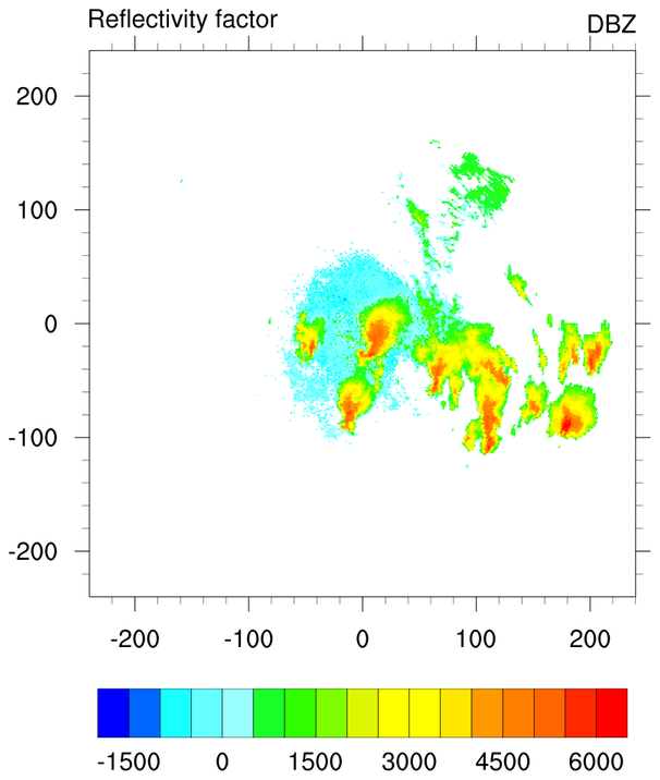
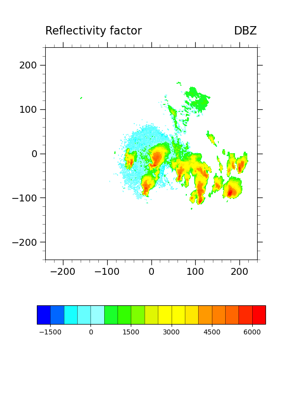
Plot:
# Generate first plot without a background using the helper function
radar_plot(X, Y, values)
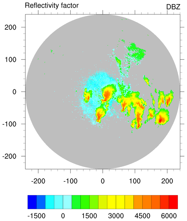
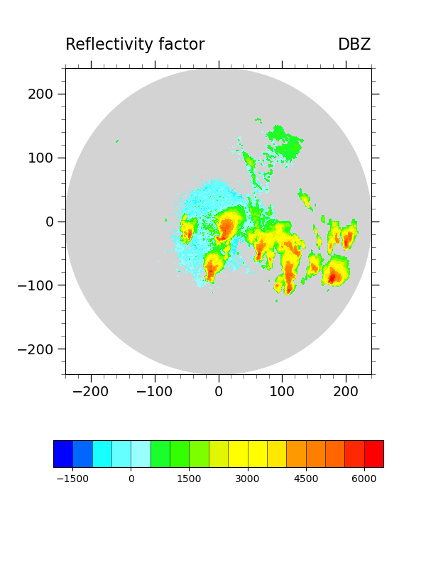
Alternative plot:
# Generate alternative plot with a background
radar_plot(X, Y, values, bg_color="lightgrey")
Total running time of the script: (0 minutes 0.609 seconds)