

Note
Go to the end to download the full example code.
NCL_unique_5.py#
- Concepts illustrated:
Drawing multiple bar charts on a page
Drawing three custom legends outside a bar chart
Using bar charts to draw standard deviations for four time series
Drawing a time series plot
- See following URLs to see the reproduced NCL plot & script:
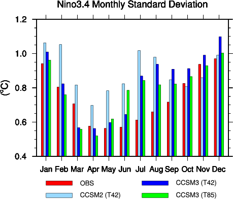
Original NCL script: https://www.ncl.ucar.edu/Applications/Scripts/unique_5.ncl
Original NCL plot: https://www.ncl.ucar.edu/Applications/Images/unique_5_lg.png
Import packages:
import numpy as np
import random
import matplotlib.pyplot as plt

import geocat.viz as gv
Generate labels:
x = np.arange(1, 13)
labels = [
    'Jan',
    'Feb',
    'Mar',
    'Apr',
    'May',
    'Jun',
    'Jul',
    'Aug',
    'Sep',
    'Oct',
    'Nov',
    'Dec',
]

# Generate random data:
obs = []
ccsm2_t42 = []
ccsm3_t42 = []
ccsm3_t85 = []

for i in range(12):
    obs.append(random.uniform(0.4, 1.2))
    ccsm2_t42.append(random.uniform(0.4, 1.2))
    ccsm3_t42.append(random.uniform(0.4, 1.2))
    ccsm3_t85.append(random.uniform(0.4, 1.2))
Create the custom color list.
color_list = ['red', 'lightsteelblue', 'blue', 'lime']
Plot bar chart with a legend
# Axis Settings
plot_y_max = 1.2

# Generate figure
plt.figure(2, figsize=(6, 5))
ax = plt.gca()

# Set width of each column
w = 0.15

# Create subplots for each category
sub = plt.subplot(111)
sub.bar(
    x + w,
    obs,
    width=0.15,
    color=color_list[0],
    edgecolor='black',
    linewidth=0.25,
    align='center',
)
sub.bar(
    (x + (2 * w)),
    ccsm2_t42,
    width=0.15,
    color=color_list[1],
    edgecolor='black',
    linewidth=0.25,
    align='center',
)
sub.bar(
    x + 3 * w,
    ccsm3_t42,
    width=0.15,
    color=color_list[2],
    edgecolor='black',
    linewidth=0.25,
    align='center',
)
sub.bar(
    x + 4 * w,
    ccsm3_t85,
    width=0.15,
    color=color_list[3],
    edgecolor='black',
    linewidth=0.25,
    align='center',
)

# Add the legend
plt.legend(
    ['OBS', 'CCSM2 (T42)', 'CCSM3 (T42)', 'CCSM3 (T85)'],
    loc='lower center',
    bbox_to_anchor=(0.5, -0.30),
    ncol=2,
)

# Use geocat.viz.util convenience function to set axes limits & tick values without calling several matplotlib functions
gv.set_axes_limits_and_ticks(
    ax,
    ylim=(0.4, plot_y_max),
    xticks=x,
    xticklabels=labels,
    yticks=np.linspace(0.4, plot_y_max, 5),
)

# Use geocat.viz.util convenience function to add minor and major tick lines
gv.add_major_minor_ticks(ax, x_minor_per_major=1, y_minor_per_major=4, labelsize=12)

# Use geocat.viz.util convenience function to set titles and labels
gv.set_titles_and_labels(
    ax,
    maintitle='Nino3.4 Monthly Standard Deviation',
    maintitlefontsize=16,
    ylabel="(" + '\N{DEGREE SIGN}' + "C)",
)

# Show the plot
plt.tight_layout()
plt.show()
Total running time of the script: (0 minutes 0.144 seconds)