

Note
Go to the end to download the full example code.
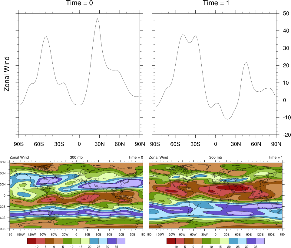
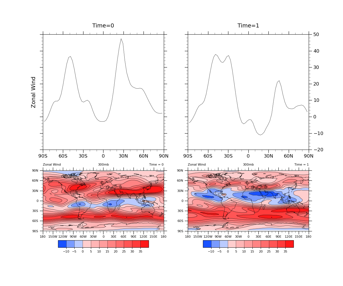
NCL_panel_20.py#
- This script illustrates the following concepts:
Drawing four different-sized plots on the same page using gridspec
- See following URLs to see the reproduced NCL plot & script:
Original NCL script: http://www.ncl.ucar.edu/Applications/Scripts/panel_20.ncl
Original NCL plot: http://www.ncl.ucar.edu/Applications/Images/panel_20_lg.png
Import packages:
import cartopy.crs as ccrs
from cartopy.mpl.gridliner import LongitudeFormatter, LatitudeFormatter
import matplotlib.pyplot as plt
import matplotlib.gridspec as gridspec
import matplotlib.colors as colors
import numpy as np
import xarray as xr
import cmaps

import geocat.datafiles as gdf
import geocat.viz as gv
Read in data:
# Open a netCDF data file using xarray default engine and load the data into xarrays
ds = xr.open_dataset(gdf.get("netcdf_files/uv300.nc"))

# Extract data from second timestep
time_0 = ds.isel(time=0, drop=True)
time_1 = ds.isel(time=1, drop=True)

# Ensure longitudes range from 0 to 360 degrees
U_0 = gv.xr_add_cyclic_longitudes(time_0.U, "lon")
U_1 = gv.xr_add_cyclic_longitudes(time_1.U, "lon")
Create helper functions:
def format_linegraph_axes(ax):
    """Format the axes limits, tick marks, and tick labels for the line graphs.

    Args:
        ax (:class: 'matplotlib.Axes'):
            The set of axes to be manipulated
    """
    # Use geocat.viz.util convenience function to set axes tick values
    gv.set_axes_limits_and_ticks(
        ax=ax,
        xlim=(-90, 90),
        ylim=(-20, 50),
        xticks=np.arange(-90, 91, 30),
        yticks=np.arange(-20, 51, 10),
        xticklabels=['90S', '60S', '30S', '0', '30N', '60N', '90N'],
    )

    # Use geocat.viz.util convenience function to add minor and major ticks
    gv.add_major_minor_ticks(ax, x_minor_per_major=3, y_minor_per_major=5, labelsize=12)


def format_contour_axes(ax):
    """Format the axes limits, tick marks, and tick labels for the contour
    plots.

    Args:
        ax (:class: 'matplotlib.Axes'):
            The set of axes to be manipulated
    """
    # Use geocat.viz.util convenience function to set axes tick values
    gv.set_axes_limits_and_ticks(
        ax=ax,
        xlim=(-180, 180),
        ylim=(-90, 90),
        xticks=np.arange(-180, 181, 30),
        yticks=np.arange(-90, 91, 30),
    )

    # Use geocat.viz.util convenience function to add minor and major ticks
    gv.add_major_minor_ticks(ax, labelsize=8)

    # Use geocat.viz.util convenience function to make plots look like NCL
    # plots by using latitude, longitude tick labels
    gv.add_lat_lon_ticklabels(ax)

    # Remove the degree symbol from tick labels
    ax.yaxis.set_major_formatter(LatitudeFormatter(degree_symbol=''))
    ax.xaxis.set_major_formatter(LongitudeFormatter(degree_symbol=''))

    # Use geocat.viz.util convenience function to set titles and labels
    gv.set_titles_and_labels(ax, maintitle='300mb', maintitlefontsize=8)
Plot:
fig = plt.figure(figsize=(12, 10))

# Create grid with two rows and two columns
# Use `height_ratios` to adjust the relative heights of the rows
grid = gridspec.GridSpec(
    nrows=2, ncols=2, height_ratios=[0.55, 0.45], hspace=0.1, figure=fig
)

# Choose the map projection
proj = ccrs.PlateCarree()

# Add the subplots
ax1 = fig.add_subplot(grid[0])  # upper left cell of grid
ax2 = fig.add_subplot(grid[1])  # upper right cell of grid
ax3 = fig.add_subplot(grid[2], projection=proj)  # lower left cell of grid
ax4 = fig.add_subplot(grid[3], projection=proj)  # lower right cell of grid

# Draw coastlines on maps
ax3.coastlines(linewidth=0.5)
ax4.coastlines(linewidth=0.5)

# Use geocat.viz.util convenience function to set titles without calling
# several matplotlib functions
gv.set_titles_and_labels(
    ax1,
    maintitle='Time=0',
    maintitlefontsize=14,
    ylabel=U_0.long_name,
    labelfontsize=14,
)
gv.set_titles_and_labels(ax2, maintitle='Time=1', maintitlefontsize=14)

# Draw tick labels on the right side of the top right plot
ax2.yaxis.tick_right()

# Use helper function to create linegraphs with identical axes parameters
format_linegraph_axes(ax1)
format_linegraph_axes(ax2)

# Remove tick labels for top left plot
ax1.set_yticklabels([])

# Use helper function to create contour plots with identical axes parameters
format_contour_axes(ax3)
format_contour_axes(ax4)

# Add left and right titles for both map plots
ax3.set_title(U_0.long_name, loc='left', y=1.04, fontsize=8)
ax3.set_title('Time = 0', loc='right', y=1.04, fontsize=8)
ax4.set_title(U_0.long_name, loc='left', y=1.04, fontsize=8)
ax4.set_title('Time = 1', loc='right', y=1.04, fontsize=8)

# Plot xy data at a particular longitude
ax1.plot(U_0['lat'], U_0.isel(lon=93, drop=True).data, c='black', linewidth=0.5)
ax2.plot(U_1['lat'], U_1.isel(lon=93, drop=True).data, c='black', linewidth=0.5)

# Choose colormap for contour plots
divnorm = colors.TwoSlopeNorm(vmin=-15, vcenter=0, vmax=40)
cmap = cmaps.BlueRed

# Specify levels for contours
levels = np.arange(-10, 36, 5)

# Add filled contour to maps
contour3 = ax3.contourf(
    U_0['lon'],
    U_0['lat'],
    U_0.data,
    cmap=cmap,
    norm=divnorm,
    levels=levels,
    extend='both',
)
contour4 = ax4.contourf(
    U_1['lon'],
    U_1['lat'],
    U_1.data,
    cmap=cmap,
    norm=divnorm,
    levels=levels,
    extend='both',
)

# Add contour line to maps
ax3.contour(
    U_0['lon'],
    U_0['lat'],
    U_0.data,
    colors='black',
    linewidths=0.5,
    linestyles='solid',
    levels=levels,
)
ax4.contour(
    U_1['lon'],
    U_1['lat'],
    U_1.data,
    colors='black',
    linewidths=0.5,
    linestyles='solid',
    levels=levels,
)

# Create colorbars
cbar3 = plt.colorbar(
    contour3,
    ax=ax3,
    orientation='horizontal',
    extendrect=True,
    extendfrac='auto',
    shrink=0.75,
    aspect=13,
    drawedges=True,
    pad=0.1,
)
cbar4 = plt.colorbar(
    contour4,
    ax=ax4,
    orientation='horizontal',
    extendrect=True,
    extendfrac='auto',
    shrink=0.75,
    aspect=13,
    drawedges=True,
    pad=0.1,
)

# Format colorbar ticks and labels
cbar3.ax.tick_params(labelsize=8)
cbar4.ax.tick_params(labelsize=8)

plt.show()
Total running time of the script: (0 minutes 0.420 seconds)