

Note
Go to the end to download the full example code.
NCL_table_2.py#
- This script illustrates the following concepts:
Drawing a table with headers
Filling table cells with a given color
Specifying the position of individual tables
- See following URLs to see the reproduced NCL plot & script:
Original NCL script: https://www.ncl.ucar.edu/Applications/Scripts/table_2.ncl
Original NCL plot: https://www.ncl.ucar.edu/Applications/Images/table_2_lg.png
Import packages:
import matplotlib.pyplot as plt
Generate data:
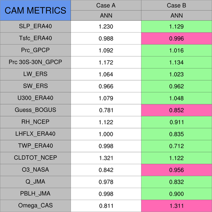
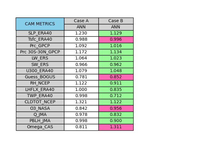
# Set row headers (first column)
row_text = [
    "",
    "",
    "SLP_ERA40",
    "Tsfc_ERA40",
    "Prc_GPCP",
    "Prc 30S-30N_GPCP",
    "LW_ERS",
    "SW_ERS",
    "U300_ERA40",
    "Guess_BOGUS",
    "RH_NCEP",
    "LHFLX_ERA40",
    "TWP_ERA40",
    "CLDTOT_NCEP",
    "O3_NASA",
    "Q_JMA",
    "PBLH_JMA",
    "Omega_CAS",
]

# Set colors of row headers (first column)
rowcolors = [
    'skyblue',
    'skyblue',
    'lightgray',
    'lightgray',
    'lightgray',
    'lightgray',
    'lightgray',
    'lightgray',
    'lightgray',
    'lightgray',
    'lightgray',
    'lightgray',
    'lightgray',
    'lightgray',
    'lightgray',
    'lightgray',
    'lightgray',
    'lightgray',
]

# Set cell values (second and third column)
cell_text = [
    ["Case A", "Case B"],
    ["ANN", "ANN"],
    ["1.230", "1.129"],
    ["0.988", "0.996"],
    ["1.092", "1.016"],
    ["1.172", "1.134"],
    ["1.064", "1.023"],
    ["0.966", "0.962"],
    ["1.079", "1.048"],
    ["0.781", "0.852"],
    ["1.122", "0.911"],
    ["1.000", "0.835"],
    ["0.998", "0.712"],
    ["1.321", "1.122"],
    ["0.842", "0.956"],
    ["0.978", "0.832"],
    ["0.998", "0.900"],
    ["0.811", "1.311"],
]

# Set colors of cells (second and third columns)
colors = [
    ['lightgray', 'lightgray'],
    ['lightgray', 'lightgray'],
    ["White", "palegreen"],
    ["White", "hotpink"],
    ["White", "palegreen"],
    ["White", "palegreen"],
    ["White", "palegreen"],
    ["White", "palegreen"],
    ["White", "palegreen"],
    ["White", "hotpink"],
    ["White", "palegreen"],
    ["White", "palegreen"],
    ["White", "palegreen"],
    ["White", "palegreen"],
    ["White", "hotpink"],
    ["White", "palegreen"],
    ["White", "palegreen"],
    ["White", "hotpink"],
]
Plot:
# Create figure and axis
fig, ax = plt.subplots()

# Set axis aspect ratio
ax.set_aspect(2)

# Make axis spines invisible
fig.patch.set_visible(False)
ax.axis('off')

# Plot first table
table = ax.table(
    rowLabels=row_text,
    rowColours=rowcolors,
    rowLoc='center',
    cellText=cell_text,
    cellColours=colors,
    cellLoc='center',
    loc='center',
)

# Plot single-cell table in upper left of first table
plt.table(
    cellText=[['CAM METRICS']],
    cellColours=[['skyblue']],
    cellLoc='center',
    bbox=[-0.694, 0.815, 0.694, 0.091],
)

# Give plot a tight layout
fig.tight_layout()

plt.show()
Total running time of the script: (0 minutes 0.187 seconds)