

Note
Go to the end to download the full example code.
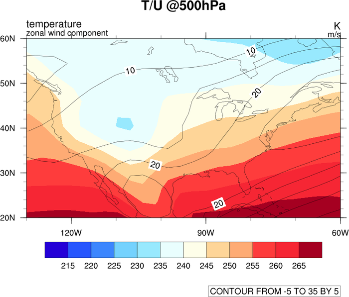
NCL_overlay_1.py#
- This script illustrates the following concepts:
Overlaying line contours on filled contours
Explicitly setting contour levels
Adding custom formatted contour labels
Manually selecting where contour labels will be drawn
Adding label textbox
- See following URLs to see the reproduced NCL plot & script:
Original NCL script: https://www.ncl.ucar.edu/Applications/Scripts/overlay_1.ncl
Original NCL plots: https://www.ncl.ucar.edu/Applications/Images/overlay_1_lg.png
Import packages:
import numpy as np
import xarray as xr
import matplotlib.pyplot as plt
import cartopy.crs as ccrs
import cartopy.feature as cfeature
from cartopy.mpl.gridliner import LongitudeFormatter, LatitudeFormatter

import geocat.datafiles as gdf
import geocat.viz as gv
import cmaps
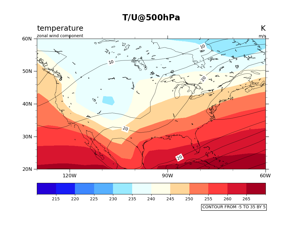
Read in data:
# Open a netCDF data file using xarray default engine and load the data into xarrays
ds = xr.open_dataset(gdf.get("netcdf_files/80.nc"))

# Extract slice of data
u = ds.U.isel(time=0, drop=True).isel(lev=10, drop=True)
t = ds.T.isel(time=0, drop=True).isel(lev=10, drop=True)
Specify levels and color map for contour
t_lev = np.arange(210, 275, 5)
cmap = cmaps.BlueDarkRed18
u_lev = np.arange(-5, 40, 5)
Crate plot:
plt.figure(figsize=(10, 8))
ax = plt.axes(projection=ccrs.PlateCarree())

# Set extent around US
ax.set_extent([230, 300, 20, 60], crs=ccrs.PlateCarree())

# Draw map features
ax.add_feature(cfeature.LAKES, linewidth=0.5, edgecolor='black', facecolor='None')
ax.add_feature(cfeature.COASTLINE, linewidth=0.5)

# Plot filled contour
temp = t.plot.contourf(
    ax=ax,
    transform=ccrs.PlateCarree(),
    cmap=cmap,
    levels=t_lev,
    extend='neither',
    add_colorbar=False,
    add_labels=False,
)
plt.colorbar(
    temp, ax=ax, ticks=np.arange(215, 270, 5), orientation='horizontal', pad=0.075
)

# Plot line contour
wind = u.plot.contour(
    ax=ax,
    transform=ccrs.PlateCarree(),
    vmin=-5,
    vmax=35,
    levels=u_lev,
    colors='black',
    linewidths=0.5,
    add_labels=False,
)

# Manually specify where contour labels will go using lat and lon coordinates
manual = [(-107, 52), (-79, 57), (-78, 47), (-103, 32), (-86, 23)]
ax.clabel(wind, u_lev, fmt='%d', inline=True, fontsize=10, manual=manual)

# Set label backgrounds white
[
    txt.set_bbox(dict(facecolor='white', edgecolor='none', pad=2))
    for txt in wind.labelTexts
]

# Add lower text box
ax.text(
    1,
    -0.3,
    "CONTOUR FROM -5 TO 35 BY 5",
    horizontalalignment='right',
    transform=ax.transAxes,
    bbox=dict(boxstyle='square, pad=0.25', facecolor='white', edgecolor='black'),
)

# Use geocat.viz.util convenience function to set titles and labels
gv.set_titles_and_labels(
    ax, maintitle=r"$\bf{T/U @500hPa}$", lefttitle=t.long_name, righttitle=t.units
)
# Add secondary title below the one placed by gv
ax.text(0, 1.01, u.long_name, transform=ax.transAxes)
ax.text(0.97, 1.01, u.units, transform=ax.transAxes)

# Use geocat.viz.util convenience function to make plots look like NCL plots by
# using latitude, longitude tick labels
gv.add_lat_lon_ticklabels(ax)

# Remove the degree symbol from tick labels
ax.yaxis.set_major_formatter(LatitudeFormatter(degree_symbol=''))
ax.xaxis.set_major_formatter(LongitudeFormatter(degree_symbol=''))

# Use geocat.viz.util convenience function to add minor and major tick lines
gv.add_major_minor_ticks(ax, x_minor_per_major=3, y_minor_per_major=5, labelsize=12)

# Use geocat.viz.util convenience function to set axes tick values
gv.set_axes_limits_and_ticks(
    ax, xticks=np.arange(-120, -30, 30), yticks=np.arange(20, 70, 10)
)

plt.show()
Total running time of the script: (0 minutes 4.125 seconds)