

Note
Go to the end to download the full example code.
NCL_xy_16.py#
- This script illustrates the following concepts:
Drawing a legend inside an XY plot
Drawing an X reference line in an XY plot
Reversing the Y axis
Using log scaling and explicit labeling
Changing the labels in a legend
Creating a vertical profile plot
- See following URLs to see the reproduced NCL plot & script:
Original NCL script: https://www.ncl.ucar.edu/Applications/Scripts/xy_16.ncl
Original NCL plots: https://www.ncl.ucar.edu/Applications/Images/xy_16_1_lg.png and https://www.ncl.ucar.edu/Applications/Images/xy_16_2_lg.png
Import packages:
import numpy as np
import xarray as xr
import matplotlib.pyplot as plt
from matplotlib.ticker import ScalarFormatter, NullFormatter
import matplotlib.ticker as tic

import geocat.datafiles as gdf
import geocat.viz as gv
Read in data:
# Open a netCDF data file using xarray default engine and load the data into xarrays
ds = xr.open_dataset(gdf.get("netcdf_files/atmos.nc"), decode_times=False)
U = ds.U.isel(time=0, lon=0, drop=True)

# Extract slices of the data at different latitudes using the index of the desired value
U20 = U.isel(lat=39, drop=True)
U30 = U.isel(lat=42, drop=True)
U40 = U.isel(lat=46, drop=True)
U50 = U.isel(lat=49, drop=True)
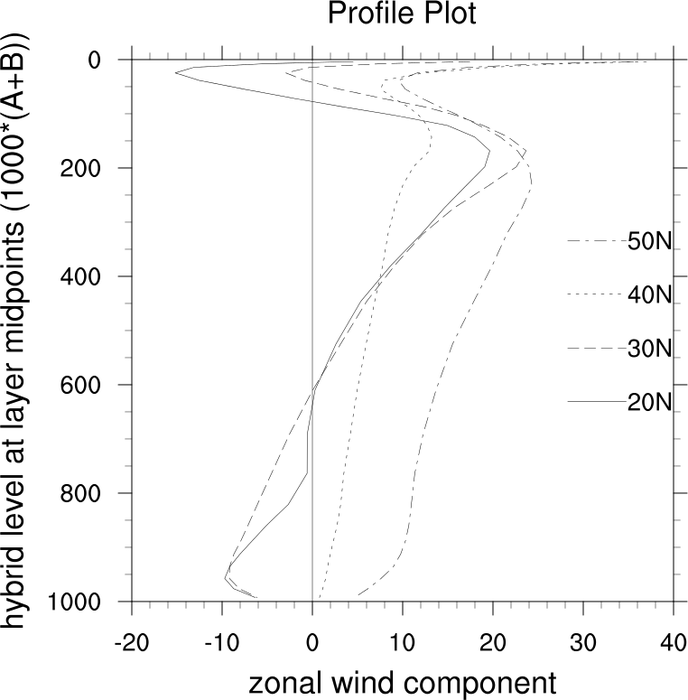
Plot with linear y axis:
# Generate figure (set its size (width, height) in inches) and axes
plt.figure(figsize=(8, 8))
ax = plt.axes()

# Use geocat.viz.util convenience function to add minor and major tick lines
gv.add_major_minor_ticks(ax, x_minor_per_major=5, y_minor_per_major=4, labelsize=14)

# Use geocat.viz.util convenience function to set axes parameters
gv.set_axes_limits_and_ticks(
    ax,
    xlim=(-20, 40),
    ylim=(1000, 0),
    xticks=np.arange(-20, 60, 10),
    yticks=np.arange(0, 1200, 200),
)

# Use geocat.viz.util convenience function to set titles and labels
gv.set_titles_and_labels(
    ax, maintitle='Profile Plot', xlabel=U.long_name, ylabel=U['lev'].long_name
)

# Add reference line x=0
ax.axvline(x=0, color='black', linewidth=0.5)

# Plot data
plt.plot(
    U20.data, U20.lev, color='black', linestyle='solid', label='20N', linewidth=0.5
)
plt.plot(U30.data, U30.lev, color='black', dashes=[15, 5], label='30N', linewidth=0.5)
plt.plot(U40.data, U40.lev, color='black', dashes=[4, 5], label='40N', linewidth=0.5)
plt.plot(
    U50.data, U50.lev, color='black', dashes=[15, 5, 5, 5], label='50N', linewidth=0.5
)

# Add legend
handles, labels = ax.get_legend_handles_labels()

plt.legend(
    handles,
    labels,
    loc='center right',
    frameon=False,
    fontsize=14,
    labelspacing=1,
    reverse=True,
)

plt.show()
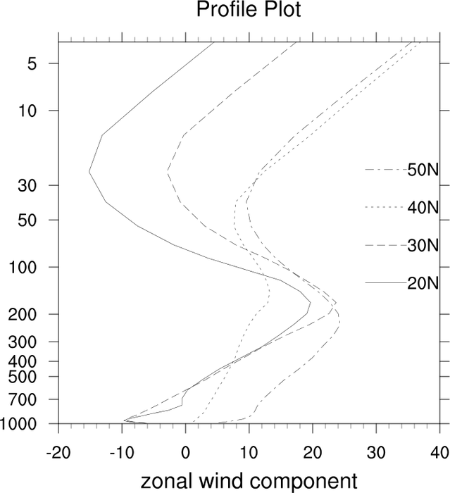
Plot with logarithmic y axis:
# Generate figure (set its size (width, height) in inches) and axes
plt.figure(figsize=(8, 8))
ax = plt.axes()

# Note: Currently geocat-viz does not have a utility function for formatting
# major and minor ticks on logarithmic axes.
plt.yscale('log')
ax.yaxis.set_major_formatter(ScalarFormatter())
ax.yaxis.set_minor_formatter(NullFormatter())
ax.tick_params(labelsize=14)
ax.minorticks_on()
ax.xaxis.set_minor_locator(tic.AutoMinorLocator(n=5))
# Specify no minor ticks on log y axis
ax.yaxis.set_minor_locator(tic.LogLocator())
# Length and width are in points and may need to change depending on figure size
ax.tick_params(
    "both",
    length=8,
    width=0.9,
    which="major",
    bottom=True,
    top=True,
    left=True,
    right=True,
)
ax.tick_params(
    "both",
    length=4,
    width=0.4,
    which="minor",
    bottom=True,
    top=True,
    left=True,
    right=True,
)

# Use geocat.viz.util convenience function to set axes parameters
pressure_lvls = [1, 5, 10, 30, 50, 100, 200, 300, 400, 500, 700, 1000]
gv.set_axes_limits_and_ticks(
    ax,
    xlim=(-20, 40),
    ylim=(1000, 4),
    xticks=np.arange(-20, 60, 10),
    yticks=pressure_lvls,
)

# Use geocat.viz.util convenience function to set titles and labels
gv.set_titles_and_labels(ax, maintitle='Profile Plot', xlabel=U.long_name)

# Plot data
plt.plot(
    U20.data, U20.lev, color='black', linestyle='solid', label='20N', linewidth=0.5
)
plt.plot(U30.data, U30.lev, color='black', dashes=[15, 5], label='30N', linewidth=0.5)
plt.plot(U40.data, U40.lev, color='black', dashes=[4, 5], label='40N', linewidth=0.5)
plt.plot(
    U50.data, U50.lev, color='black', dashes=[15, 5, 5, 5], label='50N', linewidth=0.5
)

# Add legend
handles, labels = ax.get_legend_handles_labels()
# Default order is the order in which the data was plotted

plt.legend(
    handles,
    labels,
    loc='center right',
    frameon=False,
    fontsize=14,
    labelspacing=1,
    reverse=True,
)

plt.show()
Total running time of the script: (0 minutes 0.263 seconds)