

Note
Go to the end to download the full example code.
NCL_polyg_8.py#
- This script illustrates the following concepts:
Drawing a scatter plot on a map
Changing the marker color and size in a map plot
Plotting station locations using markers
Manually creating a legend using markers and text
Adding text to a plot
Generating dummy data using “random_uniform”
Binning data
- See following URLs to see the reproduced NCL plot & script:
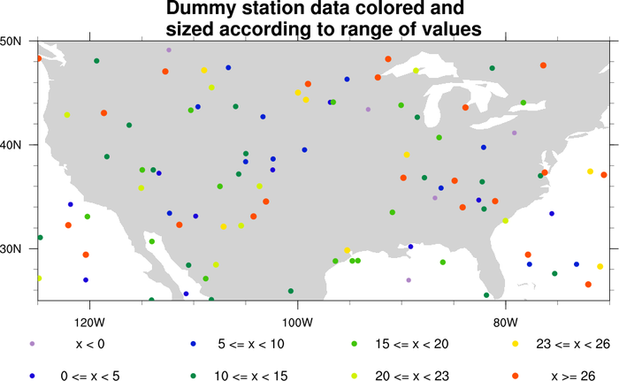
Original NCL script: https://www.ncl.ucar.edu/Applications/Scripts/polyg_8.ncl
Original NCL plot: https://www.ncl.ucar.edu/Applications/Images/polyg_8_lg.png
Import packages:
import numpy as np
import cartopy.crs as ccrs
import cartopy.feature as cfeature
from cartopy.mpl.gridliner import LongitudeFormatter, LatitudeFormatter
import matplotlib.pyplot as plt

import geocat.viz as gv
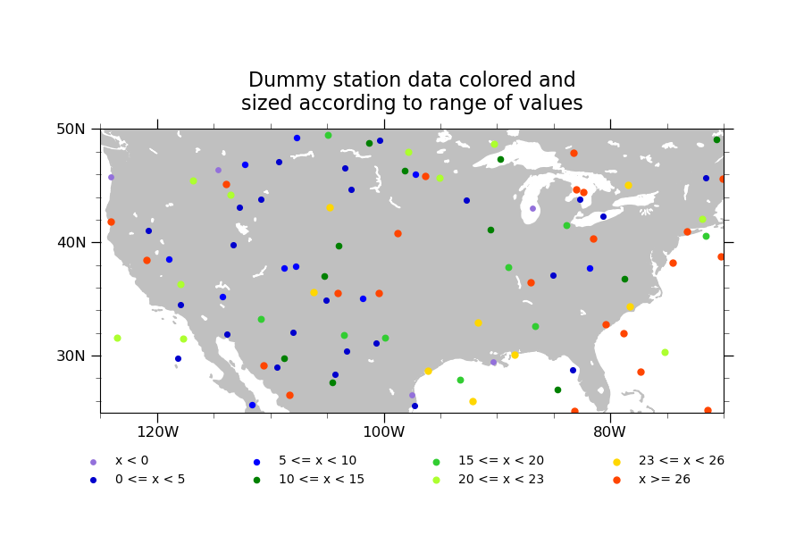
Generate dummy data
npts = 100
random = np.random.default_rng(seed=1)
# Create random coordinates to position the markers
lat = random.uniform(low=25, high=50, size=npts)
lon = random.uniform(low=-125, high=-70, size=npts)
# Create random data which the color will be based off of
r = random.uniform(low=-1.2, high=35, size=npts)

bins = [0, 5, 10, 15, 20, 23, 26]
colors = [
    'mediumpurple',
    'mediumblue',
    'blue',
    'green',
    'limegreen',
    'greenyellow',
    'gold',
    'orangered',
]
# increasing sizes for the markers in each bin
sizes = np.linspace(15, 25, len(bins))
Plot:
plt.figure(figsize=(9, 6))
projection = ccrs.PlateCarree()
ax = plt.axes(projection=projection)
ax.set_extent([-125, -70, 25, 50], crs=projection)

# Draw land
ax.add_feature(cfeature.LAND, color='silver', zorder=0)
ax.add_feature(cfeature.LAKES, color='white', zorder=0)

# Use geocat.viz.util convenience function to set axes tick values
gv.set_axes_limits_and_ticks(
    ax, xticks=np.linspace(-120, -80, 3), yticks=np.linspace(30, 50, 3)
)

# Use geocat.viz.util convenience function to make latitude and longitude tick
# labels
gv.add_lat_lon_ticklabels(ax)
# Removing degree symbol from tick labels to more closely resemble NCL example
ax.yaxis.set_major_formatter(LatitudeFormatter(degree_symbol=''))
ax.xaxis.set_major_formatter(LongitudeFormatter(degree_symbol=''))

# Use geocat.viz.util convenience function to add minor and major tick lines
gv.add_major_minor_ticks(ax, x_minor_per_major=4, y_minor_per_major=5, labelsize=12)

# Use geocat.viz.util convenience function to add titles
gv.set_titles_and_labels(
    ax,
    maintitlefontsize=16,
    maintitle="Dummy station data colored and\nsized according to range of values",
)

# Plot markers with values less than first bin value
masked_lon = np.where(r < bins[0], lon, np.nan)
masked_lat = np.where(r < bins[0], lat, np.nan)
label = "x < " + str(bins[0])
plt.scatter(masked_lon, masked_lat, label=label, s=sizes[0], color=colors[0], zorder=1)

# Plot all other markers but those in the last bin
label_format = "{} <= x < {}"
for x in range(1, len(bins)):
    masked_lon = np.where(bins[x - 1] <= r, lon, np.nan)
    masked_lon = np.where(r < bins[x], masked_lon, np.nan)
    masked_lat = np.where(bins[x - 1] <= r, lat, np.nan)
    masked_lat = np.where(r < bins[x], masked_lat, np.nan)
    label = label_format.format(bins[x - 1], bins[x])
    plt.scatter(
        masked_lon, masked_lat, label=label, s=sizes[x], color=colors[x], zorder=1
    )

# Plot markers with values greater than or equal to last bin value
masked_lon = np.where(r >= bins[-1], lon, np.nan)
masked_lat = np.where(r >= bins[-1], lat, np.nan)
label = "x >= " + str(bins[-1])
plt.scatter(
    masked_lon, masked_lat, label=label, s=sizes[-1], color=colors[-1], zorder=1
)

# `ncol` being equal to half of the number of labels makes the legend appear
# horizontal with two rows
legend = ax.legend(
    bbox_to_anchor=(-0.05, -0.3),
    ncol=4,
    loc='lower left',
    columnspacing=4.75,
    frameon=False,
)
plt.show()
Total running time of the script: (0 minutes 0.130 seconds)