

Note
Go to the end to download the full example code.
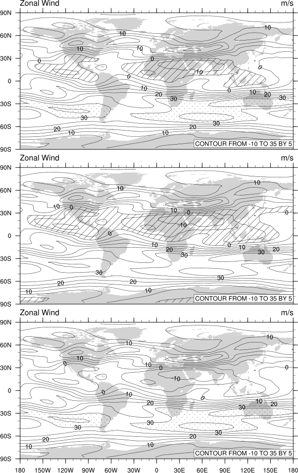
NCL_panel_7.py#
- This script illustrates the following concepts:
Paneling three plots vertically on a page
Removing tickmarks and labels from paneled plots so they can be drawn closer together
Drawing shaded contours with hatching
Moving the contour informational label into the plot
- See following URLs to see the reproduced NCL plot & script:
Original NCL script: https://www.ncl.ucar.edu/Applications/Scripts/panel_7.ncl
Original NCL plot: https://www.ncl.ucar.edu/Applications/Images/panel_7_lg.png
Import packages:
import numpy as np
import xarray as xr
import cartopy
from cartopy.mpl.gridliner import LatitudeFormatter
import cartopy.crs as ccrs
import matplotlib.pyplot as plt
import matplotlib as mpl

import geocat.datafiles as gdf
import geocat.viz as gv
Read in data:
# Open a netCDF data file using xarray default engine and load the data into xarrays, choosing the 2nd timestamp
ds = xr.open_dataset(gdf.get("netcdf_files/uv300.nc")).isel(time=1)
U = ds.U
Plot:
# Make three panels (i.e. subplots in matplotlib)
# Specify ``constrained_layout=True`` to automatically layout panels, colorbars and axes decorations nicely.
# See https://matplotlib.org/tutorials/intermediate/constrainedlayout_guide.html
# Generate figure and axes using Cartopy projection
projection = ccrs.PlateCarree()
fig, ax = plt.subplots(
    3, 1, constrained_layout=True, subplot_kw={"projection": projection}
)

# Set figure size (width, height) in inches
fig.set_size_inches((6, 9.6))

# Add continents
continents = cartopy.feature.NaturalEarthFeature(
    name="coastline",
    category="physical",
    scale="50m",
    edgecolor="None",
    facecolor="lightgray",
)
[axes.add_feature(continents) for axes in ax.flat]

# Specify which contour levels to draw
levels = np.arange(-10, 40, 5)

# Specify locations of the labels
labels = np.arange(0, 40, 10)

# Using a dictionary makes it easy to reuse the same keyword arguments twice for the contours
kwargs = dict(
    levels=levels,  # contour levels specified outside this function
    xticks=np.arange(-180, 181, 30),  # nice x ticks
    yticks=np.arange(-90, 91, 30),  # nice y ticks
    transform=projection,  # ds projection
    add_colorbar=False,  # don't add individual colorbars for each plot call
    add_labels=False,  # turn off xarray's automatic Lat, lon labels
    colors="black",  # note plurals in this and following kwargs
    linestyles="-",
    linewidths=0.5,
)

# Set contour labels, titles, text box and ticks for all panels
for axes in ax.flat:
    # Contour-plot U data (for borderlines)
    contour = U.plot.contour(
        x="lon",
        y="lat",
        ax=axes,
        **kwargs,
    )
    # Label the contours and set axes title
    axes.clabel(contour, labels, fontsize="small", fmt="%.0f")

    # Add lower text box
    axes.text(
        0.995,
        0.03,
        "CONTOUR FROM -10 TO 35 BY 5",
        horizontalalignment='right',
        transform=axes.transAxes,
        fontsize=8,
        bbox=dict(boxstyle='square, pad=0.25', facecolor='white', edgecolor='gray'),
        zorder=5,
    )

    # Use geocat.viz.util convenience function to add left and right title to the plot axes.
    gv.set_titles_and_labels(
        axes,
        lefttitle="Zonal Wind",
        lefttitlefontsize=12,
        righttitle=U.units,
        righttitlefontsize=12,
    )

# Panel 1: Contourf-plot U data with '//' and '..' hatch styles
U.plot.contourf(
    ax=ax[0],
    transform=projection,
    levels=levels,
    yticks=np.arange(-90, 91, 30),
    cmap='none',
    hatches=['//', '//', '', '', '', '', '', '', '', '..', '..'],
    add_colorbar=False,
    add_labels=False,
    zorder=4,
)

# Panel 2: Contourf-plot U data (for shading)
U.plot.contourf(
    ax=ax[1],
    transform=projection,
    levels=levels,
    yticks=np.arange(-90, 91, 30),
    cmap='none',
    hatches=['//', '//', '//', '', '', '', '', '', '', '', ''],
    add_colorbar=False,
    add_labels=False,
    zorder=4,
)

# Panel 3: Contourf-plot U data (for shading)
U.plot.contourf(
    ax=ax[2],
    transform=projection,
    levels=levels,
    yticks=np.arange(-90, 91, 30),
    cmap='none',
    hatches=['', '', '', '', '', '', '', '', '', '..', '..'],
    add_colorbar=False,
    add_labels=False,
    zorder=4,
)

# Customizing line width and dot size of shading patterns
mpl.rcParams['hatch.linewidth'] = 0.5

# Use geocat.viz.util convenience function to add minor and major tick lines
[gv.add_major_minor_ticks(axes) for axes in ax.flat]

# Use geocat.viz.util convenience function to make plots look like NCL plots by using latitude, longitude tick labels
[gv.add_lat_lon_ticklabels(axes) for axes in ax.flat]

# Remove ticklabels on X axis
[axes.xaxis.set_ticklabels([]) for axes in ax.flat]

# Removing degree symbol from tick labels to more closely resemble NCL example
[
    axes.yaxis.set_major_formatter(LatitudeFormatter(degree_symbol=''))
    for axes in ax.flat
]

# Show the plot
plt.show()
Total running time of the script: (0 minutes 0.557 seconds)