

Note
Go to the end to download the full example code.
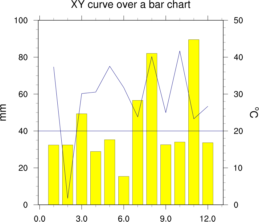
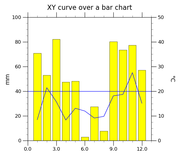
NCL_bar_14.py#
- This script illustrates the following concepts:
Drawing an XY curve on top of filled bars
Filling the bars in a bar plot with different colors
Setting the minimum/maximum value of the X and Y axis in a bar plot
Rotating the Y axis string 270 degrees
Drawing a Y reference line in an XY plot
Changing the color and thickness of a Y reference line
- See following URLs to see the reproduced NCL plot & script:
Original NCL script: https://www.ncl.ucar.edu/Applications/Scripts/bar_14.ncl
Original NCL plots: https://www.ncl.ucar.edu/Applications/Images/bar_14_lg.png
Import packages
import numpy as np
import matplotlib.pyplot as plt
import geocat.viz as gv
Generate data:
# Generate 12 numbers from 0 to 100 in a uniform distribution
y1 = np.random.uniform(0, 100, 12)

# Generate 12 numbers with an average of 30 and a standard deviation of 10
y2 = np.random.normal(30, 10, 12)

# Create an array from 1 to 12 with 12 numbers
months = np.linspace(1, 12, 12)
Plot:
# Create figure with figure size (width, height) in inches and create axes
fig = plt.figure(figsize=(6, 5.25))
ax = plt.axes()

# Plot the bar chart, line chart, and a horizontal line with varying colors and linewidths
plt.bar(months, y1, color="yellow", edgecolor="k", linewidth=0.5)
plt.plot(months, y2, color="b", linewidth=1)
plt.hlines(40, 0, 13, color="b", linewidth=1)

# Use geocat.viz.util convenience function to add titles and set their size
gv.set_titles_and_labels(
    ax,
    maintitle="XY curve over a bar chart",
    maintitlefontsize=16,
    ylabel="mm",
    labelfontsize=14,
)

# Use geocat.viz.util convenience function to set axes tick values and labels
gv.set_axes_limits_and_ticks(
    ax,
    xticks=np.linspace(0, 12, 5),
    xticklabels=np.linspace(0, 12, 5),
    xlim=(0, 13),
    yticks=np.linspace(0, 100, 6),
    ylim=(0, 100),
)

# Create the right axis
axRHS = ax.twinx()

# Set the right axis title and size while rotating it 270 degrees and adding a whitespace padding
axRHS.set_ylabel(("\u00b0" + "C"), size=14, rotation=270, labelpad=25)

# Use geocat.viz.util convenience function to set axes tick values and labels for the right axis
gv.set_axes_limits_and_ticks(
    axRHS, yticks=np.linspace(0, 100, 6), yticklabels=np.linspace(0, 50, 6, dtype=int)
)

# Use geocat.viz.util convenience function to add major and minor tick lines
gv.add_major_minor_ticks(ax, x_minor_per_major=3, y_minor_per_major=4)

# Adjust tick and ticklabel sizes for each axis
ax.tick_params(axis="x", size=12, labelsize=12)
ax.tick_params(axis="y", size=12, labelsize=12)
axRHS.tick_params(axis="y", size=12, labelsize=12)

# Display plot
plt.tight_layout()
plt.show()
Total running time of the script: (0 minutes 0.119 seconds)