

Note
Go to the end to download the full example code.
NCL_native_2.py#
- This script illustrates the following concepts:
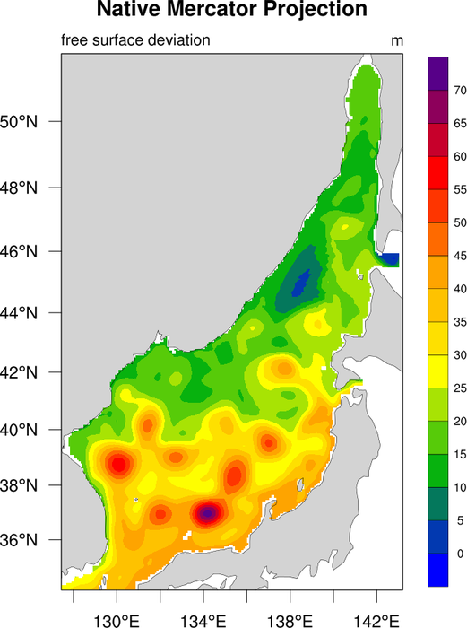
Drawing filled contours over a mercator map
Overlaying contours on a map without having latitude and longitude coordinates
Turning on map tickmark labels with degree symbols
Selecting a different color map
Zooming in on a particular area on a mercator map
Using best practices when choosing plot color scheme to accommodate visual impairments
- See following URLs to see the reproduced NCL plot & script:
Original NCL script: https://www.ncl.ucar.edu/Applications/Scripts/native_2.ncl
Original NCL plot: https://www.ncl.ucar.edu/Applications/Images/native_2_lg.png
# Import packages:

import numpy as np
import xarray as xr
import cartopy.crs as ccrs
import cartopy.feature as cfeature
import matplotlib.pyplot as plt

import geocat.datafiles as gdf
import geocat.viz as gv
Read in data:
# Open a netCDF data file using xarray default engine and
# load the data into xarrays
ds = xr.open_dataset(gdf.get("netcdf_files/1994_256_FSD.nc"), decode_times=False)
t = ds.FSD.isel(time=0)
Plot:
# Generate figure (set its size (width, height) in inches)
fig = plt.figure(figsize=(10, 10))

# Generate axes using Cartopy and draw coastlines
ax = plt.axes(projection=ccrs.Mercator())
ax.coastlines(linewidths=0.5)
ax.add_feature(cfeature.LAND, facecolor="lightgray")

# Set extent to include latitudes from 34 to 52 and longitudes from 128
# to 144
ax.set_extent([128, 144, 34, 52], ccrs.PlateCarree())

# Plot data and create colorbar
pt = t.plot.contourf(
    ax=ax,
    transform=ccrs.PlateCarree(),
    vmin=0,
    vmax=70,
    levels=15,
    cmap="inferno",
    add_colorbar=False,
)

cbar_ticks = np.arange(0, 71, 5)
cbar = plt.colorbar(pt, orientation='vertical', extendrect=True, ticks=cbar_ticks)

# Draw gridlines
gl = gv.add_lat_lon_gridlines(
    ax,
    xlocator=[130, 134, 138, 142],
    ylocator=[36, 38, 40, 42, 44, 46, 48, 50],
    labelsize=15,
    linewidth=1,
    color='black',
    alpha=0.25,
)

# Remove lat/lon labels on top and right sides of plot
gl.top_labels = False
gl.right_labels = False

# Add title
plt.title("Native Mercator Projection", y=1.05, size=15, fontweight="bold", pad=0)
plt.title(t.units, loc="right", y=1.0, size=14)
plt.title("free surface deviation", loc="left", y=1.0, size=14)

# Show the plot
plt.show()
Total running time of the script: (0 minutes 1.501 seconds)