

Note
Go to the end to download the full example code.
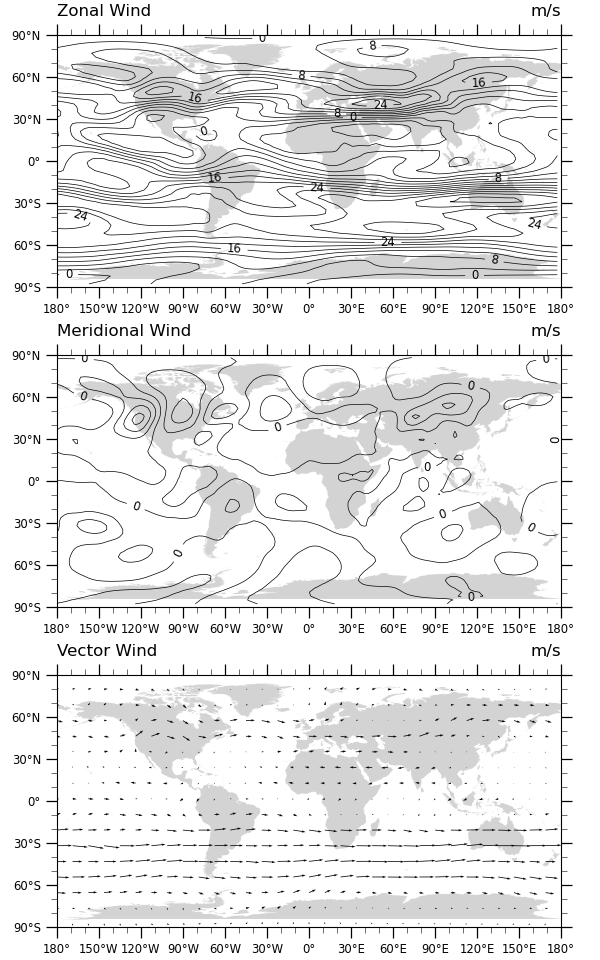
NCL_panel_1.py#
- This script illustrates the following concepts:
Three panel (subplot) image with shared colorbar and title
Adding a common title to paneled plots
Adding a common labelbar (or colorbar) to paneled plots
Subsetting a color map
- See following URLs to see the reproduced NCL plot & script:
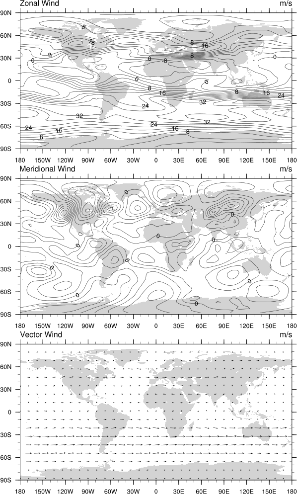
Original NCL script: https://www.ncl.ucar.edu/Applications/Scripts/panel_1.ncl
Original NCL plot: https://www.ncl.ucar.edu/Applications/Images/panel_1_lg.png
Import packages:
import numpy as np
import xarray as xr
import cartopy
import cartopy.crs as ccrs
import matplotlib.pyplot as plt

import geocat.datafiles as gdf
import geocat.viz as gv
Read in data:
# Open a netCDF data file using xarray default engine and load the data into xarrays, choosing the 2nd timestamp
ds = xr.open_dataset(gdf.get("netcdf_files/uv300.nc")).isel(time=1)
Plot:
# Make three panels (i.e. subplots in matplotlib)
# Specify ``constrained_layout=True`` to automatically layout panels, colorbars and axes decorations nicely.
# See https://matplotlib.org/tutorials/intermediate/constrainedlayout_guide.html
# Generate figure and axes using Cartopy projection
projection = ccrs.PlateCarree()
fig, ax = plt.subplots(
    3, 1, constrained_layout=True, subplot_kw={"projection": projection}
)

# Set figure size (width, height) in inches
fig.set_size_inches((6, 9.6))

# Add continents
continents = cartopy.feature.NaturalEarthFeature(
    name="coastline",
    category="physical",
    scale="50m",
    edgecolor="None",
    facecolor="lightgray",
)
[axes.add_feature(continents) for axes in ax.flat]

# Define the contour levels
levels = np.arange(-48, 48, 4)

# Using a dictionary makes it easy to reuse the same keyword arguments twice for the contours
kwargs = dict(
    levels=levels,  # contour levels specified outside this function
    xticks=np.arange(-180, 181, 30),  # nice x ticks
    yticks=np.arange(-90, 91, 30),  # nice y ticks
    transform=projection,  # ds projection
    add_colorbar=False,  # don't add individual colorbars for each plot call
    add_labels=False,  # turn off xarray's automatic Lat, lon labels
    colors="black",  # note plurals in this and following kwargs
    linestyles="-",
    linewidths=0.5,
)

# Panel 1 (Subplot 1)
# Contour-plot U data (for borderlines)
hdl = ds.U.plot.contour(
    x="lon",
    y="lat",
    ax=ax[0],
    **kwargs,
)

# Label the contours and set axes title
ax[0].clabel(hdl, np.arange(0, 32, 8), fontsize="small", fmt="%.0f")

# Use geocat.viz.util convenience function to add left and right title to the plot axes.
gv.set_titles_and_labels(
    ax[0],
    lefttitle="Zonal Wind",
    lefttitlefontsize=12,
    righttitle=ds.U.units,
    righttitlefontsize=12,
)

# Panel 2 (Subplot 2)
# Contour-plot V data (for borderlines)
hdl = ds.V.plot.contour(x="lon", y="lat", ax=ax[1], **kwargs)

# Label the contours and set axes title
ax[1].clabel(hdl, [0], fontsize="small", fmt="%.0f")

# Use geocat.viz.util convenience function to add left and right title to the plot axes.
gv.set_titles_and_labels(
    ax[1],
    lefttitle="Meridional Wind",
    lefttitlefontsize=12,
    righttitle=ds.V.units,
    righttitlefontsize=12,
)

# Panel 3 (Subplot 3)
# Draw arrows
# xarray doesn't have a quiver method (yet)
# the NCL code plots every 4th value in lat, lon; this is the equivalent of u(::4, ::4)
subset = ds.isel(lat=slice(None, None, 4), lon=slice(None, None, 4))
ax[2].quiver(
    subset.lon,
    subset.lat,
    subset.U,
    subset.V,
    width=0.0015,
    transform=projection,
    zorder=2,
    scale=1100,
)

# Set axes title
ax[2].set_title("Vector Wind", loc="left", y=1.05)

# Use geocat.viz.util convenience function to add left and right title to the plot axes.
gv.set_titles_and_labels(
    ax[2],
    lefttitle="Vector Wind",
    lefttitlefontsize=12,
    righttitle=ds.U.units,
    righttitlefontsize=12,
)

# cartopy axes require this to be manual
ax[2].set_xticks(kwargs["xticks"])
ax[2].set_yticks(kwargs["yticks"])

# Use geocat.viz.util convenience function to add minor and major tick lines
[gv.add_major_minor_ticks(axes) for axes in ax.flat]

# Use geocat.viz.util convenience function to make plots look like NCL plots by using latitude, longitude tick labels
[gv.add_lat_lon_ticklabels(axes) for axes in ax.flat]

# Show the plot
plt.show()
Total running time of the script: (0 minutes 0.614 seconds)