

Note
Go to the end to download the full example code.
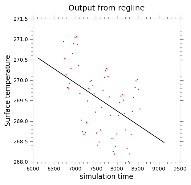
NCL_scatter_4.py#
- This script illustrates the following concepts:
Drawing a scatter plot with a regression line
Drawing a time series plot
Calculating the least squared regression for a one dimensional array
Smoothing data so that seasonal cycle is less prominent
Changing the markers in an XY plot
Changing the marker color in an XY plot
Changing the marker size in an XY plot
- See following URLs to see the reproduced NCL plot & script:
Original NCL script: https://www.ncl.ucar.edu/Applications/Scripts/scatter_4.ncl
Original NCL plot: https://www.ncl.ucar.edu/Applications/Images/scatter_4_lg.png
Import packages:
import numpy as np
import xarray as xr
import matplotlib.pyplot as plt

import geocat.datafiles as gdf
import geocat.viz as gv
Read in data:
# Open a netCDF data file using xarray default engine and load the data into xarrays
ds = xr.open_dataset(gdf.get("netcdf_files/b003_TS_200-299.nc"), decode_times=False)
# Extract variable
ts = ds.TS.sel(lat=60, lon=180, method='nearest')
Preprocess data:
# Smooth data so that seasonal cycle is less prominent.
# This is for demo purposes only  so that the regression line is more sloped.
ts_rolled = ts.rolling(time=40, center=True).mean().dropna('time')

# Calculate regression line
m, b = np.polyfit(ts_rolled.time, ts_rolled.values, 1)
regline_vals = [m * x + b for x in ts.time]
Plot:
# Generate figure (set its size (width, height) in inches) and axes
plt.figure(figsize=(6.2, 6))
ax = plt.gca()

# Scatter-plot the data
plt.scatter(ts_rolled.time, ts_rolled.values, c='red', s=3)

# Plot a regression line
plt.plot(ts.time, regline_vals, 'black')

# specify X and Y axis limits
plt.xlim([6000, 9500])
plt.ylim([268.0, 271.5])

# Use geocat.viz.util convenience function to add minor and major tick lines
gv.add_major_minor_ticks(ax, x_minor_per_major=5, y_minor_per_major=5, labelsize=12)

# Use geocat.viz.util convenience function to set titles and labels without calling several matplotlib functions
gv.set_titles_and_labels(
    ax,
    maintitle="Output from regline",
    xlabel="simulation time",
    ylabel="Surface temperature",
)

# Show the plot
plt.tight_layout()
plt.show()
Total running time of the script: (0 minutes 0.186 seconds)