

Note
Go to the end to download the full example code.
NCL_lb_3.py#
- This script illustrates the following concepts:
Drawing a horizontal colorbar
Changing the colorbar labels
Changing the angle of colorbar labels
Changing the font size of the colorbar’s labels
Adding a title to a colorbar
Adjusting colorbar position relavtive to plot axes
- See following URLs to see the reproduced NCL plot & script:
Original NCL script: https://www.ncl.ucar.edu/Applications/Scripts/lb_3.ncl
Original NCL plot: https://www.ncl.ucar.edu/Applications/Images/lb_3_lg.png
Import packages:
import numpy as np
import xarray as xr
import cartopy.crs as ccrs
from cartopy.mpl.gridliner import LongitudeFormatter, LatitudeFormatter
import matplotlib.pyplot as plt
import cmaps

import geocat.datafiles as gdf
import geocat.viz as gv
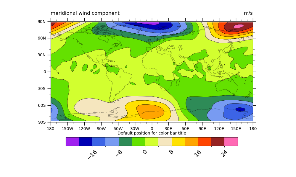
Read in data:
# Open a netCDF data file using xarray default engine and load the data into xarrays
ds = xr.open_dataset(gdf.get("netcdf_files/atmos.nc"), decode_times=False)

# Extract slice of data
V = ds.V.isel(time=0, lev=3)

# Fix the artifact of not-shown-data around 0 and 360-degree longitudes
V = gv.xr_add_cyclic_longitudes(V, "lon")
Plot:
# Generate figure (set its size (width, height) in inches)
fig = plt.figure(figsize=(10, 6))

# Generate axes using Cartopy and draw coastlines
ax = plt.axes(projection=ccrs.PlateCarree())
ax.coastlines(linewidths=0.5, alpha=0.6)

# Use geocat.viz.util convenience function to set axes limits & tick values
gv.set_axes_limits_and_ticks(
    ax,
    xlim=(-180, 180),
    ylim=(-90, 90),
    xticks=np.linspace(-180, 180, 13),
    yticks=np.linspace(-90, 90, 7),
)

# Use geocat.viz.util convenience function to add minor and major tick lines
gv.add_major_minor_ticks(ax, labelsize=10)

# Use geocat.viz.util convenience function to make latitude, longitude tick labels
gv.add_lat_lon_ticklabels(ax)
# Remove degree symbol from tick labels
ax.yaxis.set_major_formatter(LatitudeFormatter(degree_symbol=''))
ax.xaxis.set_major_formatter(LongitudeFormatter(degree_symbol=''))

# Use geocat.viz.util convenience function to add titles
gv.set_titles_and_labels(
    ax,
    lefttitle=V.long_name,
    righttitle=V.units,
    lefttitlefontsize=12,
    righttitlefontsize=12,
)

# Import an NCL colormap
cmap = cmaps.wgne15

# Specify which contour levels to draw
contour_lev = np.arange(-20, 28, 4)
# Plot filled contour
contour = V.plot.contourf(
    ax=ax,
    transform=ccrs.PlateCarree(),
    cmap=cmap,
    levels=contour_lev,
    add_colorbar=False,
    add_labels=False,
)
# Plot line contour
V.plot.contour(
    ax=ax,
    transform=ccrs.PlateCarree(),
    colors='black',
    linewidths=0.5,
    linestyles='solid',
    levels=contour_lev,
    add_colorbar=False,
    add_labels=False,
)

# Create horizontal colorbar
# By changing the kwarg `pad`, the colorbar can be moved closer to or farther away from
# the axis parallel to it.
# `pad` defaults to 0.15 for horizontal colorbars
# `extendrect` and `extendfrac` format the ends of the colorbar, default is
# pointed ends to show there are values beyond the given contour levels
cbar = plt.colorbar(
    contour,
    ax=ax,
    orientation='horizontal',
    shrink=0.75,
    pad=0.11,
    extendrect=True,
    extendfrac='auto',
)
# Make colorbar tick labels larger and rotate them
cbar.ax.tick_params(labelsize=14, rotation=45)
# Format colorbar title, this will make the title appear above the colorbar
cbar.ax.set_title('Default position for color bar title', fontsize=10)
plt.show()
Total running time of the script: (0 minutes 0.335 seconds)