

Note
Go to the end to download the full example code.
NCL_xy_4.py#
- This script illustrates the following concepts:
Drawing a scatter plot
Changing the markers in an XY plot
Changing the marker color in an XY plot
Changing the marker size in an XY plot
Creating your own markers for an XY plot
Drawing a legend
- See following URLs to see the reproduced NCL plot & script:
Original NCL script: https://www.ncl.ucar.edu/Applications/Scripts/xy_4.ncl
Original NCL plots: https://www.ncl.ucar.edu/Applications/Images/xy_4_1_lg.png and https://www.ncl.ucar.edu/Applications/Images/xy_4_2_lg.png
- Ways of specifying marks:
Import packages:
import numpy as np
import xarray as xr
import matplotlib.pyplot as plt
import matplotlib.path as mpath
import math

import geocat.datafiles as gdf
import geocat.viz as gv
Read in data:
# Open a netCDF data file using xarray default engine and load the data into xarrays
ds = xr.open_dataset(gdf.get('netcdf_files/AtmJan360_xy_4.nc'), decode_times=False)

# Extract a slice of the data
ds = ds['T']
t = ds.isel(lev=0, lat=32, lon=29, drop=True)
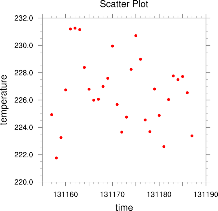
Plot with standard markers:
plt.figure(figsize=(8, 8))
ax = plt.axes()

plt.scatter(t.time, t.data, color='red')

# Use geocat.viz.util convenience function to set titles and labels
gv.set_titles_and_labels(
    ax, maintitle="Scatter Plot", xlabel=t['time'].long_name, ylabel=t.long_name
)

# Use geocat.viz.util convenience function to add minor and major tick lines
gv.add_major_minor_ticks(ax, x_minor_per_major=5, y_minor_per_major=4, labelsize=14)

# Calculate xlim by rounding the min value down and the max value up to a
# multiple of 5
xmin = 5 * math.floor(t.time.min().data / 5)
xmax = 5 * math.ceil(t.time.max().data / 5)

gv.set_axes_limits_and_ticks(
    ax,
    xlim=(xmin, xmax),
    ylim=(220.0, 232.0),
    xticklabels=[' ', 131160, ' ', 131170, ' ', 131180, ' ', 131190],
    yticklabels=np.arange(220.0, 233.0, 2.0),
)

plt.show()
/home/docs/checkouts/readthedocs.org/user_builds/geocat-examples/conda/latest/lib/python3.14/site-packages/geocat/viz/util.py:679: UserWarning: set_ticklabels() should only be used with a fixed number of ticks, i.e. after set_ticks() or using a FixedLocator. Otherwise, ticks may be mislabeled.
  ax.set_xticklabels(xticklabels)
/home/docs/checkouts/readthedocs.org/user_builds/geocat-examples/conda/latest/lib/python3.14/site-packages/geocat/viz/util.py:682: UserWarning: set_ticklabels() should only be used with a fixed number of ticks, i.e. after set_ticks() or using a FixedLocator. Otherwise, ticks may be mislabeled.
  ax.set_yticklabels(yticklabels)
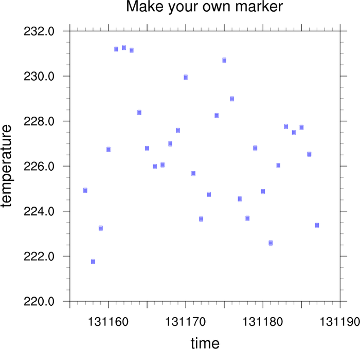
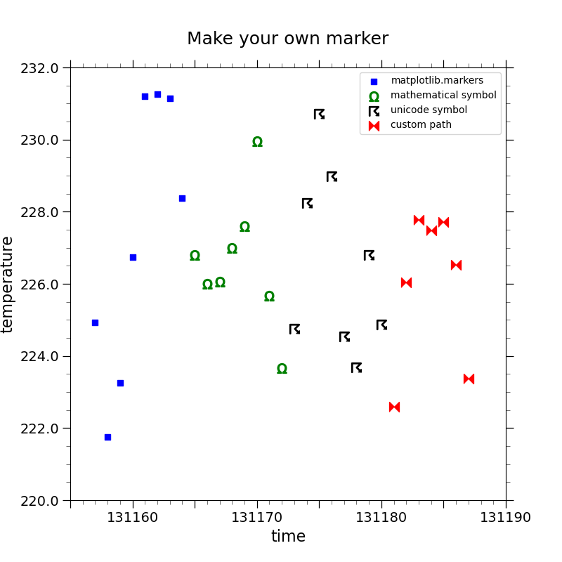
Plot with custom markers:
plt.figure(figsize=(8, 8))
ax = plt.axes()

# Divide the data into arbitrary sections so each can be drawn with a different
# type of marker
data1 = t.data[0:8]
time1 = t.time[0:8]

data2 = t.data[8:16]
time2 = t.time[8:16]

data3 = t.data[16:24]
time3 = t.time[16:24]

data4 = t.data[24:]
time4 = t.time[24:]

# marker='s' creates a square. This is from matplotlib.markers
# This is not to be confused with the kwarg `s` which sets the marker size
plt.scatter(time1, data1, color='blue', marker='s', label='matplotlib.markers')

# Use a mathematical symbol for a marker
plt.scatter(
    time2, data2, color='green', marker=r'$\Omega$', s=100, label='mathematical symbol'
)

# Unicode symbol marker
plt.scatter(
    time3, data3, color='black', marker='$\u2608$', s=100, label='unicode symbol'
)

# Create custom path for marker
verts = [(-0.5, -0.5), (-0.5, 0.5), (0, 0), (0.5, 0.5), (0.5, -0.5), (0, 0)]
path = mpath.Path(verts)
plt.scatter(time4, data4, color='red', marker=path, s=100, label='custom path')

# Add legend
plt.legend()

# Use geocat.viz.util convenience function to set titles and labels
gv.set_titles_and_labels(
    ax, maintitle="Make your own marker", xlabel=t['time'].long_name, ylabel=t.long_name
)

# Use geocat.viz.util convenience function to add minor and major tick lines
gv.add_major_minor_ticks(ax, x_minor_per_major=5, y_minor_per_major=4, labelsize=14)

gv.set_axes_limits_and_ticks(
    ax,
    xlim=(xmin, xmax),
    ylim=(220.0, 232.0),
    xticklabels=[' ', 131160, ' ', 131170, ' ', 131180, ' ', 131190],
    yticklabels=np.arange(220.0, 233.0, 2.0),
)

plt.show()
/home/docs/checkouts/readthedocs.org/user_builds/geocat-examples/conda/latest/lib/python3.14/site-packages/geocat/viz/util.py:679: UserWarning: set_ticklabels() should only be used with a fixed number of ticks, i.e. after set_ticks() or using a FixedLocator. Otherwise, ticks may be mislabeled.
  ax.set_xticklabels(xticklabels)
/home/docs/checkouts/readthedocs.org/user_builds/geocat-examples/conda/latest/lib/python3.14/site-packages/geocat/viz/util.py:682: UserWarning: set_ticklabels() should only be used with a fixed number of ticks, i.e. after set_ticks() or using a FixedLocator. Otherwise, ticks may be mislabeled.
  ax.set_yticklabels(yticklabels)
Total running time of the script: (0 minutes 1.173 seconds)