

Note
Go to the end to download the full example code.
NCL_color_1.py#
- This script illustrates the following concepts:
Recreating a default NCL colormap
- See following URLs to see the reproduced NCL plot & script:
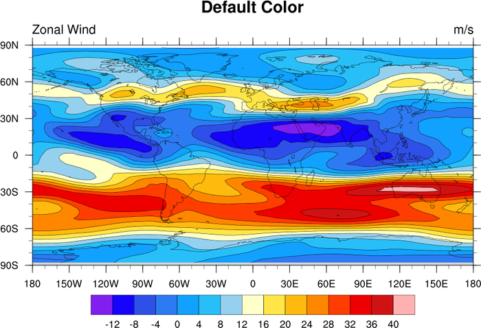
Original NCL script: https://www.ncl.ucar.edu/Applications/Scripts/color_1.ncl
Original NCL plot: https://www.ncl.ucar.edu/Applications/Images/color_1_lg.png
- Note:
This may not be the best colormap to interpret the information, but was included here in order to demonstrate how to recreate the original NCL colormap. For more information on colormap choices, see the Colors examples in the GeoCAT-examples documentation.
Import packages:
import matplotlib.pyplot as plt
import cartopy.crs as ccrs
import cmaps
import numpy as np
import xarray as xr

import geocat.viz as gv
import geocat.datafiles as gdf
Read in data:
# Open a netCDF data file using xarray default engine and load the data into xarray
ds = xr.open_dataset(gdf.get("netcdf_files/uv300.nc")).isel(time=1)
U = ds.U

# Use geocat-viz utility function to handle the no-shown-data
# artifact of 0 and 360-degree longitudes
U = gv.xr_add_cyclic_longitudes(U, 'lon')
Generate figure (set its size (width, height) in inches)
plt.figure(figsize=(12, 8))

# Generate axes, using Cartopy
projection = ccrs.PlateCarree()
ax = plt.axes(projection=projection)

# Use global map and draw coastlines
ax.set_global()
ax.coastlines()

# Import the default NCL colormap
newcmp = cmaps.ncl_default

# Contourf-plot data (for filled contours)
# Note, min-max contour levels are hard-coded. contourf's automatic contour value selector produces fractional values.
p = U.plot.contourf(
    ax=ax,
    vmin=-16.0,
    vmax=44,
    levels=16,
    cmap=newcmp,
    add_colorbar=False,
    transform=projection,
    extend='neither',
)

# Contour-plot data (for contour lines)
# Note, min-max contour levels are hard-coded. contourf's automatic contour value selector produces fractional values.
U.plot.contour(
    ax=ax,
    vmin=-16.0,
    vmax=44,
    levels=16,
    colors='black',
    linewidths=0.5,
    transform=projection,
)

# Add horizontal colorbar
cbar = plt.colorbar(
    p, orientation='horizontal', shrink=0.75, drawedges=True, aspect=16, pad=0.075
)
cbar.ax.tick_params(labelsize=14)
cbar.set_ticks(np.linspace(-12, 40, 14))

# Use geocat.viz.util convenience function to set axes tick values
gv.set_axes_limits_and_ticks(
    ax, xticks=np.linspace(-180, 180, 13), yticks=np.linspace(-90, 90, 7)
)

# Use geocat.viz.util convenience function to make plots look like NCL plots by using latitude, longitude tick labels
gv.add_lat_lon_ticklabels(ax)

# Use geocat.viz.util convenience function to add minor and major tick lines
gv.add_major_minor_ticks(ax, labelsize=14)

# Use geocat.viz.util convenience function to add titles to left and right of the plot axis.
gv.set_titles_and_labels(
    ax,
    maintitle="NCL Default Colors",
    lefttitle=U.long_name,
    lefttitlefontsize=16,
    righttitle=U.units,
    righttitlefontsize=16,
    xlabel="",
    ylabel="",
)

# Show the plot
plt.show()
Total running time of the script: (0 minutes 0.235 seconds)