

Note
Go to the end to download the full example code.
NCL_polar_8.py#
- This script illustrates the following concepts:
Drawing filled contours and streamlines over a polar stereographic map
Drawing the northern hemisphere of a polar stereographic map
- See following URLs to see the reproduced NCL plot & script:
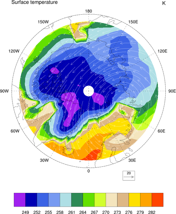
Original NCL script: https://www.ncl.ucar.edu/Applications/Scripts/polar_8.ncl
Original NCL plot: https://www.ncl.ucar.edu/Applications/Images/polar_8_lg.png
Import packages:
import numpy as np
import xarray as xr
import cartopy.feature as cfeature
import cartopy.crs as ccrs
import matplotlib.pyplot as plt
import matplotlib.ticker as mticker

import geocat.datafiles as gdf
import geocat.viz as gv
Read in data:
# Open a netCDF data file using xarray default engine
ds = xr.open_dataset(gdf.get("netcdf_files/atmos.nc"), decode_times=False)
U = ds.U[0, 1, :, :].sel(lat=slice(60, 90))
V = ds.V[0, 1, :, :].sel(lat=slice(60, 90))
T = ds.TS[0, :, :].sel(lat=slice(60, 90))

# Rotate and rescale the wind vectors following recommendations from SciTools/cartopy#1179
U_source_crs = U / np.cos(U["lat"] / 180.0 * np.pi)
V_source_crs = V
magnitude = np.sqrt(U**2 + V**2)
magnitude_source_crs = np.sqrt(U_source_crs**2 + V_source_crs**2)

U_rs = U_source_crs * magnitude / magnitude_source_crs
V_rs = V_source_crs * magnitude / magnitude_source_crs
Fix the artifact of not-shown-data around 0 and 360-degree longitudes
wrap_U = gv.xr_add_cyclic_longitudes(U_rs, "lon")
wrap_V = gv.xr_add_cyclic_longitudes(V_rs, "lon")
wrap_T = gv.xr_add_cyclic_longitudes(T, "lon")
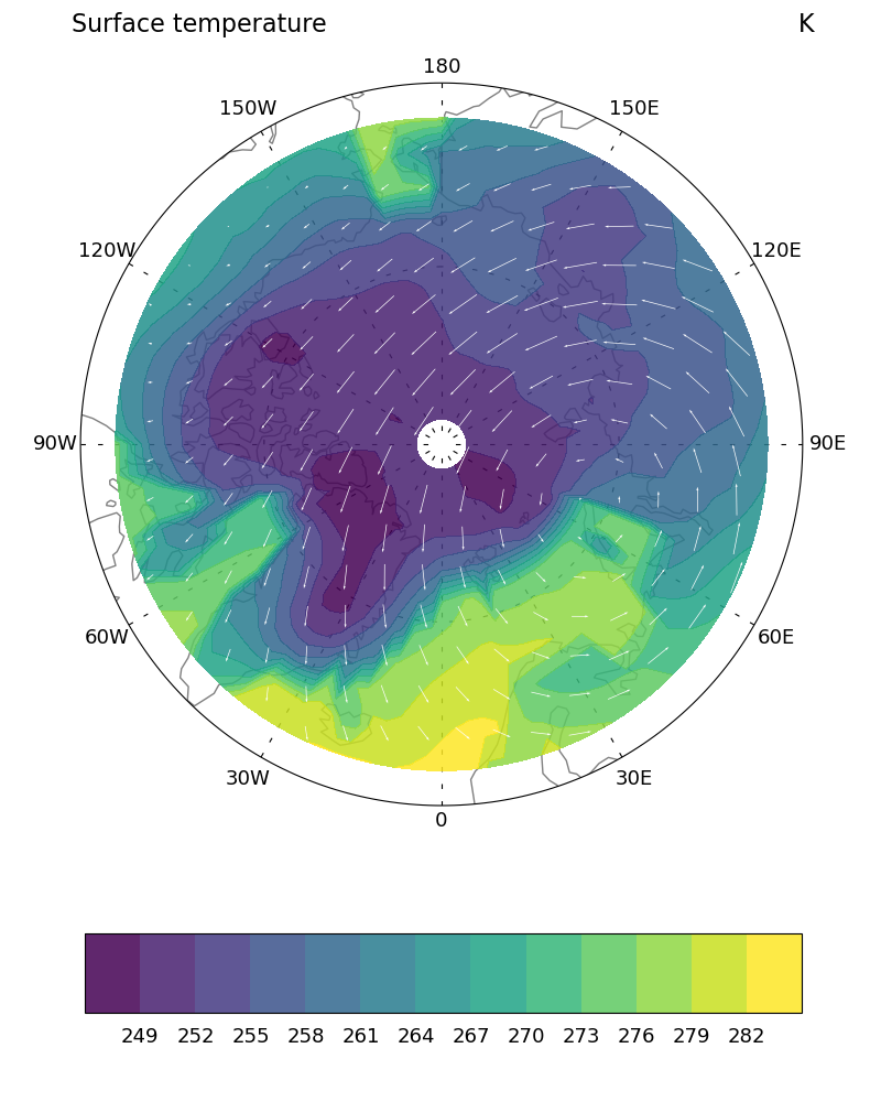
Plot:
# Generate axes with Cartopy projections
fig = plt.figure(figsize=(8, 10))
projection = ccrs.NorthPolarStereo()
ax = plt.axes(projection=projection)

# Use Cartopy to add land feature
land_110m = cfeature.NaturalEarthFeature('physical', 'land', '110m')
ax.add_feature(land_110m, facecolor='none', edgecolor='gray')

# Set map boundary to include latitudes between 0 and 40 and longitudes
# between -180 and 180 only
gv.set_map_boundary(ax, [-180, 180], [60, 90], south_pad=1)

# Set draw_labels to False to manually set labels later
gl = ax.gridlines(
    ccrs.PlateCarree(), draw_labels=False, linestyle=(0, (4, 10)), color='black'
)

# Manipulate latitude and longitude gridline numbers and spacing
gl.ylocator = mticker.FixedLocator(np.arange(60, 90, 15))
gl.xlocator = mticker.FixedLocator(np.arange(-180, 180, 30))

# Manipulate longitude labels (0, 30 E, 60 E, ..., 30 W, etc.)
ticks = np.arange(30, 151, 30)
etick = ['0'] + [r'%dE' % tick for tick in ticks] + ['180']
wtick = [r'%dW' % tick for tick in ticks[::-1]]
labels = etick + wtick
xticks = np.arange(0, 360, 30)  # Longitude of the labels
yticks = np.full_like(xticks, 58)  # Latitude of the labels

for xtick, ytick, label in zip(xticks, yticks, labels):
    if label == '180':
        ax.text(
            xtick,
            ytick,
            label,
            fontsize=13,
            horizontalalignment='center',
            verticalalignment='top',
            transform=ccrs.PlateCarree(),
        )
    elif label == '0':
        ax.text(
            xtick,
            ytick,
            label,
            fontsize=13,
            horizontalalignment='center',
            verticalalignment='bottom',
            transform=ccrs.PlateCarree(),
        )
    else:
        ax.text(
            xtick,
            ytick,
            label,
            fontsize=13,
            horizontalalignment='center',
            verticalalignment='center',
            transform=ccrs.PlateCarree(),
        )

# Set contour levels
levels = np.arange(249, 283, 3)

# Contourf-plot T-data
p = wrap_T.plot.contourf(
    ax=ax,
    alpha=0.85,
    transform=ccrs.PlateCarree(),
    levels=levels,
    cmap='viridis',
    add_labels=False,
    add_colorbar=False,
    zorder=3,
)

# Draw vector plot
# (there is no matplotlib equivalent to "CurlyVector" yet)
Q = ax.quiver(
    wrap_U['lon'],
    wrap_U['lat'],
    wrap_U.data,
    wrap_V.data,
    zorder=4,
    pivot="middle",
    width=0.0025,
    color='white',
    transform=ccrs.PlateCarree(),
    regrid_shape=20,
)

plt.quiverkey(
    Q,
    X=0.7,
    Y=0.2,
    U=40,
    label=r'$40\: \frac{m}{s}$',
    labelpos='E',
    coordinates='figure',
    color='black',
    fontproperties={'size': 12},
)

# Add colorbar
clb = plt.colorbar(
    p,
    ax=ax,
    pad=0.12,
    shrink=0.85,
    aspect=9,
    ticks=levels,
    extendrect=True,
    extendfrac='auto',
    orientation='horizontal',
)

# Set colorbar ticks
clb.ax.xaxis.set_tick_params(length=0, labelsize=13, pad=9)

# Use geocat.viz.util convenience function to add left and right titles
gv.set_titles_and_labels(
    ax,
    lefttitle="Surface temperature",
    righttitle="K",
    lefttitlefontsize=16,
    righttitlefontsize=16,
)

# Show the plot
plt.tight_layout()
plt.show()
Total running time of the script: (0 minutes 0.547 seconds)