

Note
Go to the end to download the full example code.
NCL_meteo_1.py#
- This script illustrates the following concepts:
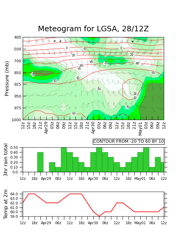
Drawing a meteogram
Creating a color map using hex values
Reversing the Y axis
Explicitly setting tickmarks and labels on the bottom X axis
Increasing the thickness of contour lines
Drawing wind barbs
Drawing a bar chart
Changing the width and height of a plot
Overlaying wind barbs and line contours on filled contours
Changing the position of individual plots on a page
- See following URLs to see the reproduced NCL plot & script:
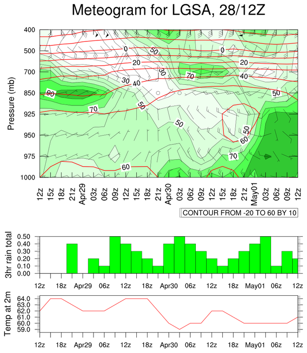
Original NCL script: https://www.ncl.ucar.edu/Applications/Scripts/meteo_1.ncl
Original NCL plot: https://www.ncl.ucar.edu/Applications/Images/meteo_1_lg.png
Import packages
import xarray as xr
import numpy as np
from matplotlib import pyplot as plt
from matplotlib.colors import ListedColormap, BoundaryNorm
import cartopy.crs as ccrs

import geocat.datafiles as gdf
import geocat.viz as gv
Read in data:
# Open a netCDF data file using xarray default engine and load the data into xarray
ds = xr.open_dataset(gdf.get("netcdf_files/meteo_data.nc"), decode_times=False)

# Extract variables from the data
tempisobar = ds.tempisobar
levels = ds.levels
taus = ds.taus
rh = ds.rh
ugrid = ds.ugrid
vgrid = ds.vgrid
rain03 = ds.rain03
tempht = ds.tempht
Plot:
# Generate figure (set its size (width, height) in inches)
fig = plt.figure(figsize=(6, 8))
spec = fig.add_gridspec(ncols=1, nrows=3, height_ratios=[4, 1, 1], hspace=0.4)

# Create axis for contour/wind barb plot
ax1 = fig.add_subplot(spec[0, 0], projection=ccrs.PlateCarree())

# Set aspect ratio of the first axis
ax1.set_aspect(2)

# Create a color map with a combination of matplotlib colors and hex values
colors = ListedColormap(
    np.array(
        [
            'white',
            'white',
            'white',
            'white',
            'white',
            'mintcream',
            "#DAF6D3",
            "#B2FAB9",
            "#B2FAB9",
            'springgreen',
            'lime',
            "#54A63F",
        ]
    )
)
contour_levels = [-20, -10, 0, 10, 20, 30, 40, 50, 60, 70, 80, 90, 100]
normalized_levels = BoundaryNorm(boundaries=contour_levels, ncolors=12)

# Plot filled contours for the rh variable
contour1 = ax1.contourf(
    rh,
    transform=ccrs.PlateCarree(),
    cmap=colors,
    norm=normalized_levels,
    levels=contour_levels,
    zorder=2,
)

# Plot black outlines on top of the filled rh contours
contour2 = ax1.contour(
    rh,
    transform=ccrs.PlateCarree(),
    colors='black',
    levels=contour_levels,
    linewidths=0.1,
    zorder=3,
)

# Plot contours for the tempisobar variable
contour3 = ax1.contour(
    tempisobar,
    transform=ccrs.PlateCarree(),
    colors='red',
    levels=[-20, -10, 0, 10, 20, 30, 40, 50, 60],
    linewidths=0.7,
    linestyles='solid',
    zorder=4,
)

# Create lists of coordinates where the contour labels are going to go
# Before creating an axes over top of the contour plot, hover your
# mouse over the locations where you want to plot the contour labels.
# The coordinate will show up on the bottom right of the figure window.
cont2Labels = [
    (1.71, 3.82),
    (5.49, 3.23),
    (9.53, 4.34),
    (9.27, 3.53),
    (14.08, 4.81),
    (19.21, 2.24),
    (17.74, 1.00),
    (22.23, 3.87),
    (12.87, 2.54),
    (10.45, 6.02),
    (11.51, 4.92),
]

cont3Labels = [
    (7.5, 6.1),
    (10.0, 4.58),
    (19.06, 1.91),
    (8.68, 0.46),
    (19.52, 4.80),
    (16.7, 6.07),
    (8.62, 5.41),
    (18.53, 5.46),
]

# Manually plot contour labels
cont2labels = ax1.clabel(
    contour2, manual=cont2Labels, fmt='%d', inline=True, fontsize=7
)
cont3labels = ax1.clabel(
    contour3, manual=cont3Labels, fmt='%d', inline=True, fontsize=7, colors='black'
)

# Set contour label backgrounds white
[
    txt.set_bbox(dict(facecolor='white', edgecolor='none', pad=0.5))
    for txt in contour2.labelTexts
]
[
    txt.set_bbox(dict(facecolor='white', edgecolor='none', pad=0.5))
    for txt in contour3.labelTexts
]

# Determine the labels for each tick on the x and y axes
yticklabels = np.array(levels, dtype=np.int32)
xticklabels = [
    '12z',
    '15z',
    '18z',
    '21z',
    'Apr29',
    '03z',
    '06z',
    '09z',
    '12z',
    '15z',
    '18z',
    '21z',
    'Apr30',
    '03z',
    '06z',
    '09z',
    '12z',
    '15z',
    '18z',
    '21z',
    'May01',
    '03z',
    '06z',
    '09z',
    '12z',
]

# Make an axis to overlay on top of the contour plot
axin = fig.add_subplot(spec[0, 0])

# Use the geocat.viz function to set the main title of the plot
gv.set_titles_and_labels(
    axin,
    maintitle='Meteogram for LGSA, 28/12Z',
    maintitlefontsize=18,
    ylabel='Pressure (mb)',
    labelfontsize=12,
)

# Add a pad between the y axis label and the axis spine
axin.yaxis.labelpad = 5

# Use the geocat.viz function to set axes limits and ticks
gv.set_axes_limits_and_ticks(
    axin,
    xlim=[taus[0], taus[-1]],
    ylim=[levels[0], levels[-1]],
    xticks=np.array(taus),
    yticks=np.linspace(1000, 400, 8),
    xticklabels=xticklabels,
    yticklabels=yticklabels,
)

# Make axis invisible
axin.patch.set_alpha(0.0)

# Make ticks point inwards
axin.tick_params(axis="x", direction="in", length=8)
axin.tick_params(axis="y", direction="in", length=8, labelsize=9)

# Rotate the labels on the x axis so they are vertical
for tick in axin.get_xticklabels():
    tick.set_rotation(90)

# Set aspect ratio of axin so it lines up with axis underneath (ax1)
axin.set_aspect(0.07)

# Plot wind barbs
barbs = axin.barbs(
    taus, np.linspace(1000, 400, 8), ugrid, vgrid, color='black', lw=0.1, length=5
)

# Create text box at lower right of contour plot
ax1.text(
    1.0,
    -0.28,
    "CONTOUR FROM -20 TO 60 BY 10",
    horizontalalignment='right',
    transform=ax1.transAxes,
    bbox=dict(boxstyle='square, pad=0.15', facecolor='white', edgecolor='black'),
)

# Create two more axes, one for the bar chart and one for the line graph
axin1 = fig.add_subplot(spec[1, 0])
axin2 = fig.add_subplot(spec[2, 0])

# Plot bar chart

# Plot bars depicting the rain03 variable
axin1.bar(taus, rain03, width=3, color='limegreen', edgecolor='black', linewidth=0.2)

# Use the geocat.viz function to set the y axis label
gv.set_titles_and_labels(axin1, ylabel='3hr rain total', labelfontsize=12)

# Determine the labels for each tick on the x and y axes
yticklabels = ['0.0', '0.10', '0.20', '0.30', '0.40', '0.50']
xticklabels = [
    '12z',
    '',
    '18z',
    '',
    'Apr29',
    '',
    '06z',
    '',
    '12z',
    '',
    '18z',
    '',
    'Apr30',
    '',
    '06z',
    '',
    '12z',
    '',
    '18z',
    '',
    'May01',
    '',
    '06z',
    '',
    '12z',
]

# Use the geocat.viz function to set axes limits and ticks
gv.set_axes_limits_and_ticks(
    axin1,
    xlim=[0, 72],
    ylim=[0, 0.5],
    xticks=np.arange(0, 75, 3),
    yticks=np.arange(0, 0.6, 0.1),
    xticklabels=xticklabels,
    yticklabels=yticklabels,
)

# Use the geocat.viz function to add minor ticks
gv.add_major_minor_ticks(axin1, y_minor_per_major=5, labelsize="small")

# Make ticks only show up on bottom, right, and left of inset axis
axin1.tick_params(bottom=True, left=True, right=True, top=False)
axin1.tick_params(which='minor', top=False, bottom=False)

# Plot line chart

# Plot lines depicting the tempht variable
axin2.plot(taus, tempht, color='red')

# Use the geocat.viz function to set the y axis label
gv.set_titles_and_labels(axin2, ylabel='Temp at 2m', labelfontsize=12)

# Determine the labels for each tick on the x and y axes
yticklabels = ['59.0', '60.0', '61.0', '62.0', '63.0', '64.0']
xticklabels = [
    '12z',
    '',
    '18z',
    '',
    'Apr29',
    '',
    '06z',
    '',
    '12z',
    '',
    '18z',
    '',
    'Apr30',
    '',
    '06z',
    '',
    '12z',
    '',
    '18z',
    '',
    'May01',
    '',
    '06z',
    '',
    '12z',
]

# Use the geocat.viz function to set inset axes limits and ticks
gv.set_axes_limits_and_ticks(
    axin2,
    xlim=[0, 72],
    ylim=[59, 64.5],
    xticks=np.arange(0, 75, 3),
    yticks=np.arange(59, 65),
    xticklabels=xticklabels,
    yticklabels=yticklabels,
)

# Use the geocat.viz function to add minor ticks
gv.add_major_minor_ticks(axin2, y_minor_per_major=5, labelsize="small")

# Make ticks only show up on bottom, right, and left of inset axis
axin2.tick_params(bottom=True, left=True, right=True, top=False)
axin2.tick_params(which='minor', top=False, bottom=False)

# Adjust space between the first and second axes on the plot
plt.subplots_adjust(hspace=-0.3)

plt.show()
Total running time of the script: (0 minutes 0.766 seconds)